


How to light your art for display like a pro
Feb 10, 2021
Dean McLeod

We love it when our readers get in touch with us to share their stories. This article was contributed to DIYP by a member of our community. If you would like to contribute an article, please contact us here.
Share:

Once you’ve made the decision to invest in a beautiful artwork that you absolutely love, it is important to know that there is one last step involved that will really make your new art piece get the attention it deserves- and that is to give it proper accent lighting.
Correctly illuminating art is essential for showing off the details, colors, and three-dimensionality that make it so amazing. You have to make the choice as to whether you are content with the natural light in the room or if you will illuminate your art to maximize its potential.
Remember that when they are properly lit, many premium-quality print materials have reactive properties that make them come alive with a glowing response that almost makes them appear back-lit. Adding this extra accent lighting will put your new art piece at the center stage so it commands attention as a breathtaking focal point in your home, especially in the evening when the ambient light of day has faded away.
This tutorial includes all of the information required to get your new lighting project underway and the knowledge you will need in learning how to light your art like a pro.


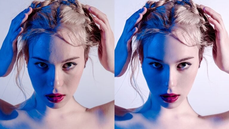
Click, hold and slide your cursor back and forth on the arrows in the photo above to see the dramatic difference of effective accent lighting.
During the day, the natural ambient light is sufficient to enjoy the fine details of this fine art print over the fireplace. At night, the purposed accent lighting on the artwork transforms it into a spectacular focal point in the room.
1. FIRST, WHAT TO AVOID
The first and most important thing is to make sure that you never place your art on a wall that receives direct sunlight. Even with the UV protection built into the acrylic or laminate on your photograph, sunlight contains infrared radiation and ultraviolet light which will damage and fade your print. Avoid direct sunlight at all costs.
Placing warm accent lights too close to your print can also cause heat damage. Put your hand in front of the print with your lights turned on; if you can feel any heat, those bulbs are too close.
Finally, never use fluorescent lighting. These bulbs not only emit a lot of ultraviolet light which can fade the print, but the color of the light distorts the natural colors in your photograph, making them appear unnatural.
2. LIGHT BULBS- THE GOOD, THE BAD AND THE UGLY
As mentioned above, it is not recommended to use fluorescent lighting for artwork, as it can damage your print and cause the colors to look unnatural and even ugly.
Halogen lighting came on to the scene many years ago and was very popular for all types of ambient or accent lighting in your home. But although halogen bulbs do a good job of replicating the color of natural sunlight and will make your art look great, there is a problem. It’s the heat. These bulbs can damage artwork, are inefficient, and are no longer the best choice for our application.
With today’s technology when it comes to lighting, it seems as though there is an endless stream of choices out there for many applications. But thankfully when it comes to lighting art, there is one choice that stands above the rest- LED bulbs. These are simply the best for lighting art. They are energy efficient and produce very little heat.
3. UNDERSTANDING LED LIGHT BULBS
There are six important terms to understand when purchasing LED bulbs to light up your art, but they are easy to understand. Have a look and you’ll be well on your way.
1.BULB TYPE. LED stands for ‘light-emitting diode’ and is by far the bestfor your artwork. They are energy efficient, produce very little heat, and are available in a wide range of color temperatures and CRI ratings. You will learn more about these terms below.
The two most common types of LED bulbs suitable for accent lighting use reflectors in their design to accurately control the beam angle. They are PAR bulbs (Parabolic Aluminized Reflector) and MR bulbs (Multifaceted Reflector). Common names like “PAR20” or “MR16” may sound familiar to you. PAR bulbs will usually have a screw-in style base, while MR16 bulbs may have either a ‘GU5.3’ push-pin base or a ‘GU10’ twist/lock style base.
In general, MR16 bulbs can produce reasonable brightness if your bulbs are not too far away from your art. If you need extra brightness, PAR 20 and PAR 30 bulbs are larger and generally much brighter. See the images below.

2. COLOR TEMPERATURE. This is a way to describe the appearance of the light provided by a bulb. It is measured in Degrees Kelvin (K) on a scale from 1,000 to 10,000. In a typical residential home, most common bulbs range in temperature from about 2000K to 6500K.
Bulbs in the 2000K to 3000K range have an ‘amber’ or ‘warm white’ appearance. Bulbs in the 3100K to 4500K range have a more neutral white color and are often referred to as ‘cool white’ or ‘bright white’. Finally, bulbs in the 4600K to 6500K range produce a very crisp light that even has a bluish tint to it.


3. COLOR RENDERING INDEX. Also known as ‘CRI’, this is a scale ranging from 0–100 that measures how accurately a light source renders eight specific pastel colors, known as ‘R1 to R8’ colors, as compared with a natural source like sunlight. Basically, the higher the CRI number, the more natural the colors will appearin your artwork. A CRI of 85 is good, 90 is even better and 95 or higher is simply the best.
4. CRI R9. This is a separate measurement of how faithfully the light source will render deep red (R9) colors. R9 is not included in the standard CRI scale, although some percentage of red is present in all of the colors which make up the CRI value. The ability of a bulb to accurately produce red is important to overall color rendering so that all of the vivid colors in your artwork will appear in their truest form. A good R9 score is similar to CRI, in that anything over 90 is considered excellent.

5. BEAM ANGLE. This is the set angle of the beam or ‘cone of light’ coming from the bulb, measured in degrees. The larger the number of degrees, the wider the light beam. Terms like ‘spot’ or ‘flood’ along with numbers like 10, 25, 40, 60, etc. are often used to describe the beam angle and are sometimes printed on the box. Most bulbs can be purchased in a variety of beam angles depending on your needs, but we will get to that later. Also, this term is not to be confused with the fixture angle, which you will learn about below.
6. LUMENS. Back in the old days, we all used incandescent light bulbswhere the brightness was measured in watts. A 100-watt bulb was really bright, compared to a 75, 60, or 40-watt bulb. Today, the terminology has changed and brightness is now measured in ‘lumens’. For perspective, an old 100-watt incandescent bulb is equivalent to about 1600 lumens. A 75-watt bulb is about 1100 lumens, a 60-watt bulb is 800 lumens and a 40-watt bulb is around 450 lumens.
And today, watts are a measure of how much energy the bulb consumes, not how bright it is.
4. WHERE TO INSTALL YOUR LIGHT FIXTURE
Museums and galleries around the world agree that when illuminating art on your wall, it will look its best if the fixture(s) are angled at approximately 30 degrees from vertical. The reason for this is twofold; it will help to prevent the viewer from seeing the reflection of the light bulbs on the shiny surface of the artwork, and it will also prevent casting a shadow of your own head on the art when you art standing in front of it.
Of course, in order to maintain the 30° fixture angle with different ceiling heights, you will need to install the light fixture at varying distances from the wall. Hanging the art on your wall such that the very center of it is approximately eye-height (or 5 feet 6 inches off the floor) is a good place to start.
As this may not always be possible, and you are hanging it HIGHER, then you would install the light fixture SLIGHTLY CLOSER to the wall. Conversely, if you are hanging the art SLIGHTLY LOWER, then you would install the fixture SLIGHTLY FURTHER from the wall. The diagram below explains this theory.

5. THE BASICS TYPES OF LIGHT FIXTURES
There is a vast array of lighting fixture styles available today that are able to illuminate your new artwork, and the choices can be dizzying. Rest assured, we can break them down into four basic categories, which may assist you in deciding what is right for your space.
1.Picture lights. These are the decorative fixture style that you may have seen in a museum, attached to the wall, or even onto the frame of a painting. Remember that they need a power source, so they will need to be either hard-wired to your wall or plugged into a nearby outlet with a cord.
2. Wall washers. These are fixtures that can be mounted to a ceiling, wall, or even the floor to cast a large volume of light over theentire wall, rather than shining a focused beam in one particular area. If you are not concerned with targeting your artwork directly, and just prefer to place it on a well-lit wall, this is always an option.

3. Track lighting. Small tracks of varying lengths can be installed on your ceiling, after which one or more fixtures are attached to the track. This is probably the most versatile setup for lighting art, as the fixtures can be angled in almost any direction, offering a lot of flexibility. Also, some of the newer designs are much more attractive than they used to be, making them an excellent option.
4. Ceiling mounted lights. These fixtures can be mounted on the surface or recessed into the ceiling for a flush, discreet look. You’ll want a style that can be aimed to provide light in the direction that you need it. These are probably the most labor-intensive to install, as you’ll often be cutting into your ceiling drywall to place them, and once they are there, may not be as versatile if you choose to move your art or change your mind later. But for a sleek look, they are hard to beat.

6. UNDERSTANDING BEAM ANGLES
Now that you have your artwork hung on the wall at the correct height, installed your light fixture(s) at the right distance from the wall, and pointed them down at 30 degrees towards the middle of your art piece, we have one final step- and that is to purchase your new bulbs with the proper beam angle to achieve even coverage of light on the artwork. As we said previously, this is the set angle of the beam or ‘cone of light’ coming from the bulb, measured in degrees.


In terms of the beam angle, there are two basic factors that will determine which bulbs are the right ones for your space; the distance of the bulbs to the artwork, and the size of the artwork. The chart above illustrates how the beam spread increases in size the further away the artwork is from the lightbulb.
Next, the size of the artwork will determine which beam angles are best, as well as estimating how many fixtures are necessary to evenly illuminate your artwork. For example, if your art piece is perfectly square, you may be able to light it quite evenly with just one fixture. But if your art piece is landscape oriented, portrait-oriented, or even a panoramic style, you will need at least two or maybe even three or more fixtures to light it evenly edge to edge.
CHOOSING THE BEAM ANGLE FOR YOUR SPACE
Let us work through an example together, and say that you have a 40″x60″ artwork (or 3 feet, four inches tall by 5 feet wide). You measure and determine that the distance from the bulbs to the center of the art piece is about five feet.
Using the chart below, you would use the ‘five feet away’ column because your bulbs are five feet from the surface of the art. Your art is 3′-4″ tall, so move down the column until you find a beam spread size which is close to the height of your artwork. The 40° bulb would cast a beam that is 3′-7″ in size which is TALL enough, but not WIDE enough for your print, so you know that you need at least TWO BULBS (in two fixtures) to evenly illuminate your print top to bottom and side to side.
Two 40° bulbs, with one aimed to the left side of your print and the other aimed to the right with an overlap in the middle would be the perfect choice for this scenario. Light beams have soft, feathered edges so the slight overlap of light from each bulb in the middle of your art will not cause any issues and will look very natural.

IN SUMMARY
Now that you are an expert on lighting, here is a summary of points to remember before you tackle your new lighting project
- ALWAYS hire a qualified professional when installing those new fixtures. Working with electricity is dangerous.2. As for the bulbs you purchase, make sure they are:
- LEDs
- color temperature of approximately 3000K to 4000K
- highest CRI rating and R9 value that you can find
- dimmable
- MR16 bulbs are best for smaller artworks or when the bulbs are closer to the art.
- PAR20 and PAR30 bulbs are larger and brighter, suitable for large art pieces or when the distance is further to the artwork.
- use the chart to determine the proper beam angle depending on art size and distance from the bulbs.
- Many light fixtures are designed to accept only certain types of bulbs. Before you purchase fixtures, BE SURE that the bulbs you purchase are compatible with them. It may be wise to consult a professional.
- If you are choosing ceiling mounted light fixtures (either surface mounted or flush mounted), BE SURE that once installed, you are able to aim them downnear that 30-degree angle that you are targeting. Some fixtures cannot be aimed, depending on the design.
- I recommend adding a dimmer switchto those new lights while you’re at it (this is why you need dimmable bulbs). It will give you much more control over the brightness of your artwork and the ambiance of the room. If you feel that the bulbs are too bright, you can easily turn them down with a dimmer.
And, if you already have some ceiling lights in the room for general illumination, you can also swap out that standard on/off switch for a dimmer at the same time at a reasonable cost. Make sure your old bulbs are dimmable too, but if not, it is not that much trouble to change them.
Having full control over all of your room lighting with dimmer switches can create an amazing atmosphere, putting your new fine art print at center stage.
MAKING IT ALL EASY
It only stands to reason that with all of the recent technological advancements in LED lighting, there are many companies that manufacture world-class fixtures and bulbs that make it simple for the consumer to achieve gallery-quality lighting in their home.
It is equally important to point out that the vast majority of mass-produced bulbs found in big-box stores are not the ones you want to purchase, in most cases. These bulbs are designed for general illumination in your home, not for pointing at your fine art.
Cheap bulbs are easy to spot because the CRI and R9 ratings are usually not printed on the box, and sometimes the beam angle or color temperature isn’t even listed. They’ll use terms like ‘flood’ or ‘cool white’ instead, which is anything but specific. Suffice it to say that if you have invested in fine art, it deserves to have quality illumination which will maximize it’s beauty.
To that end, I have listed some sources below where you can find excellent quality bulbs which will render the colors in your art as accurately as possible. It is important to note that I have absolutely no affiliation with any of these companies, and simply recommend these sources from my own experience.
A source I highly recommend is SORAA®, a California company manufacturing world-class LED bulbs for a variety of applications. Their VIVID® series is a nice lineup of dimmable, high CRI and R9 rated bulbs in a variety of temperatures and beam angles, seen HERE. These bulbs are reasonably priced and simple to order online from a variety of bulb dealers found on this page.
Lumicrest Professional LED Lighting, a Canadian company, are a retailer of high CRI dimmable LED bulbs in a few styles, found HERE. They also retail a variety of integrated track light fixtures, track systems, and dimmers for one-stop shopping.
A New York company called Tailored Lighting, Inc. are the manufacturers of the ColorView LED Artlight®, which is a track light fixture with a highly advanced bulb featuring a temperature of 3150K, a CRI of 94 and a continuously adjustable beam angle from 12 degrees to 60 degrees. Although they retail in the higher end of the price range, if you want the ultimate in flexibility this light is hard to beat. You can read about their products HERE.
A FINAL NOTE
Remember to consult with an expert to be sure that any of these bulbs will be compatible with your light fixture of choice. Do your homework and have a solid plan for your project before you begin purchasing.
Quality accent lighting is essential for maximizing the beauty of your art and has the power to transform a room. It will always be well worth the effort!
If you found this lighting guide useful, please recommend it to your friends. Feel free to share your lighting projects with me, and I wish you the best of luck in illuminating those beautiful works of art!
About the Author
Dean McLeod is a Canadian landscape and nature photographer, raised in the prairies of Saskatchewan where he learned to love the natural world at a young age. Dean’s work as a fine art landscape and nature photographer has allowed him to keep that joy throughout his life. You can find out more about Dean and see his work on his website. This article was also published here and shared with permission.
We love it when our readers get in touch with us to share their stories. This article was contributed to DIYP by a member of our community. If you would like to contribute an article, please contact us here.
Related Posts
 Apple’s new MacBook Pro features a second touchscreen retina display
 Touchbar? lol – ASUS crammed a second 4K display into the new ZenBook Pro Duo laptop
 Flickr now offers 6K display resolution for its Pro users
 Blackmagic’s new Studio Camera 4K Pro features a built-in 2,000 nits 7″ touchscreen display
Join the Discussion
DIYP Comment Policy
Be nice, be on-topic, no personal information or flames.