


Why The Golden Ratio Is Better Than The Rule Of Thirds
Oct 24, 2016
Jon Sparkman

We love it when our readers get in touch with us to share their stories. This article was contributed to DIYP by a member of our community. If you would like to contribute an article, please contact us here.
Share:

A long time ago I was a young art student, being told about the “Rule Of Thirds”. I was told it’s one of the most important fundamentals of art and photography, as it helps you get the right composure in your images. Overlay a tic-tac-toe/noughts and crosses grid over your image and crop or move your picture around so that the “points of interest” lie on the lines or line intersections. Sounds simple, it has been the basis of countless millions of images throughout the centuries. But is it perfect? No! Is there a better, more badass brother to the grid? Yes! Enter the Golden Ratio.
Just to slow things down a bit, here’s what the Rule Of Thirds (I’ll call it the ROT grid from now on) looks like on a plain black background. Chances are you’re familiar with it, you’ve seen it pop up on your cameras viewfinder or as an overlay in Photoshop or Lightroom.

Here’s its superior, wiser and elusive brother – the Golden Ratio, also sometimes called the Fibonacci Spiral. It is the result of when you do some complex maths on a rectangle to the tune of: a/b = (a+b)/a = 1.61803398875. Theres no need to memorise this, you can find the overlays everywhere on internet image searches to download and paste over your images, as well as being built in (but very well hidden) to Lightroom. To access this spiral, press R to get your cropping function open, then cycle through the available overlays with O until you find the spiral. Turning it around is done by pressing Shift + O. There are eight variations to it.

If I put the two overlays on top of each other, you can see how similarly they intersect. The tight spiral of the blue ratio almost marries up with the lower right intersection of the red overlay. There is a reason why the golden ratio gets oft pushed away, because it’s murder to have all its eight variations displayed on a screen at once.

So if the golden ratio is more hassle than the ROT grid, why should I care about it? It all comes down to the long sweeping arc of the spiral. Putting your subjects along a curved line rather than straight grid lines draws the viewers eyes around the picture, forcing it to go closer to the tight coil of the spiral where you’ve placed your point of interest. It’s like a giant subliminal road sign pointing the eyes towards where you want them to go.
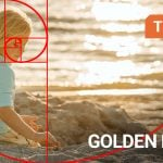
I hope I haven’t lost you yet – Here’s a few real world examples of the Golden Ratio in practice on a few of my images, one without an overlay and one with. Hopefully you can see how many times the images follow the sweeping curves and conclude with the focal point of the image in the tight coil.


There’s a whole host of different ways you can use the Golden Ratio, from portraits, landscapes, even sports and street photography. Start looking out for the Golden Section when editing your pictures in your favourite cropping post-production programme and see how it can take your pictures from “yeah” to “oh yeah!”. I have to admit once I discovered my love for the Ratio, I started flicking back through the past few years of shoots to re-crop images in the Ratio. These newly cropped pictures feel more dynamic, interesting and forcibly lead the eye around the pictures.
As always, it’s entirely up to you to take my advice, but I just want to be able to show that there’s more to the world of art than a criss-cross of lines. Lets just call the Golden Ratio “The Rule Of Thirds, Plus Some More” (TROTPSM for short.)
About the Author
Jon Sparkman is a Cheltenham, UK based fine art photographer. He discovered his love for using flash completely by accident and now centers his work around conveying a message through his photography. You can find his work at www.sparkman.photography and follow him @sparkman_uk on Instagram and Twitter. This article was also published here and shared with permission
We love it when our readers get in touch with us to share their stories. This article was contributed to DIYP by a member of our community. If you would like to contribute an article, please contact us here.


Join the Discussion
DIYP Comment Policy
Be nice, be on-topic, no personal information or flames.
24 responses to “Why The Golden Ratio Is Better Than The Rule Of Thirds”
why golden ratio is better…none of the example photo follow golden radio.
Man stop to follow recipe. golden ratio was a gimmick (i admit that i fall in it me to) http://www.lhup.edu/~dsimanek/pseudo/fibonacc.htm the “fall” of rule of thirds is that push subject too far from the center from of the image. eg a landscape 1/3 land 2/3 sky is unbalanced
I prefer the rule of nerds.
A photograph’s impact and strenth mainly depend on the subject and lighting.
Have a look at most successfull shots from inspiring photographers like Robert Doisneau, Man Ray, Cartier bresson, elliott erwitt, Brassaï, or the portraits made in the Studio Harcourt…
In art, rules will never beat talent !
As Italian cooks say: ‘eyeball it!’
Amen! lol
There are no rules in photography, I wish there were haha
just take the damn picture!
Could’ve actually shown an image that obeys the golden ratio, not ones that were “close”. There’s one or two pictures on the ol’ internet that would’ve worked better than these. #justsayin
I don´t like it, too many lines, I bet I can place it over any image and say “clearly is better than the ROT”…
I’ve seen many people using the golden ratio, but I feel it’s not for me.
I’m not sure I like the examples shown here, especially the mother-in-despair and car. In the former, the focus is clearly intended to be on the mother, with the child, someone disguised in front of the dark fireplace, seems to be a distraction. In the car photo, while the car doesn’t serve as a distraction, it seems silly to suggest that the open door becomes the focus of the photo when the only object in the photo that is lit is two people in the center.
Am I doing this wrong?
Not at all – the intention of my images is to divert the gaze from the obvious to something else within the frame, to give more context and story to it. I want the eye to be drawn to the subtleties and things not central to the image, to help add to the overall theme. Sorry if they’re a little complex and convoluted – blame my lecturers at uni for making me think that way :)
Okay, I see what you’re saying.
I think on order for either to work, you have to ask, “What’s the subject?”
Is it not the same thing but looked at a different way, the results are the same in the end.
Art should have no boundaries….
I just don’t see it. I could draw a spiral over many photos and make it broadly go through some of the things in the image such as this.
I just have to laugh when I see this nonsense. As a spiral which traverses the image and can be rotate eight different ways…..what image DOESN’T satisfy this Golden Ratio? To see how strained the application is, one need only look at the examples in the article.
Back to my Rule Of Thirds….
Doesn’t work for me I’m afraid. On every image apart from the 1st one I was drawn instantly away from what you are saying was the point of interest.
1 – I was drawn to the woman standing in doorway. Correct
2 – I was drawn to the woman sitting in the chair. Incorrect
3 – I was drawn to the man standing on the bed holding the lights. Incorrect
4 – I was drawn to the woman and child standing in the road. Incorrect
And if you check the images, what i was drawn to falls closer to ROT
I tried to pick where I thought the ‘main point’ would be and was wrong in most cases. I know about where the ye might start and ‘travel’ to, to an extent, but, just don’t see it with these examples.
Sorry. But, nice article just the same!
Su
Very interesting read…different take and worth trying and it does sum up just not the most conventional and what I learnt from this is sometimes it doesn’t hurt to be taken out of the comfort zone.
I didn’t naturally feel drawn to anything in any of these. Just the opposite. When I saw your spiral I wondered why anybody would want me to look there.
I’m down with the spiral, but these were not good examples for it.