


Lightroom’s New Color Variance Slider: A Game-Changer for Photo Editing
Nov 3, 2025
Anzalna Siddiqui
A psychology major in her third year of Bachelor’s, Anzalna Siddiqui has endless curiosity for the human mind and a deep love for storytelling – both through words and visuals. Though she hasn’t taken up photography as a profession, her Instagram is where her passion finds its home. In addition to this, she’s a travel enthusiast who never travels without her camera because every place has a story waiting to be captured.
Share:
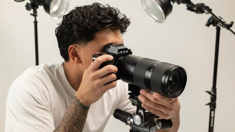
When Adobe reveals new features at their Max conference, as a loyal Lightroom user, you sit there hoping for something that could really enhance your landscape photography. Atleast that’s what Austin James Jackson, a well-known landscape photographer and content creator, believes, sharing his insights from the beautiful Badlands of Utah.
In his latest video, Austin says Adobe has introduced an exciting new feature for all of us outdoor photographers: Lightroom’s New Color Variance Slider. He suggests that this one tool is the standout update we need to focus on.
Lightroom’s New Color Variance Slider addresses a common issue we encounter during post-processing: uneven color grades. Austin describes this new feature as giving us more control over how colors mix within a single hue. It’s a subtle yet powerful tool that could turn our photos from “good” to “amazing.”
What Even is the New Color Variance Slider?
To grasp why Austin considers this a “must-see,” it’s important to first understand what the slider does. Its function is based on a straightforward yet powerful idea: controlling the variety of a chosen color.
When you move the slider to +100 (Increase Variance): Austin explains that this action spreads out colors. For instance, if you pick a green shade and raise the variance, you’re asking Lightroom to bring in a broader range of colors from that selection. You might see greens shifting to yellow-greens, blues, or even hints of orange. This is great for creating a bright and varied look like adding a “pop” of color in a refined way.
When you slide it to -100 (Decrease Variance): This is where it really benefits landscape photographers. He points out that lowering the slider brings colors closer together, making them more similar and harmonious. If your greens look uneven and chaotic, reducing the variance helps them unify into a single, consistent shade of green. It’s a quick way to achieve color balance.
When you choose a color, you’re not just picking one shade, but a small range of colors. Lightroom’s New Color Variance Slider controls how broad or narrow that range is.
Locating the Magic: Finding Lightroom’s New Color Variance Slider
Before you can begin playing around, you first need to locate your new toy. Austin guides you through accessing the Develop tab (or Edit module) in Lightroom.
- Head over to the Color Mixer.
- Look for the Point Color tool.
You’ll find the familiar sliders for Hue, Saturation, and Luminance, which adjust the traits of your chosen color. The new addition here is the Variance Slider. He points out that this slider works differently from the HSL sliders because it controls how much the chosen color spreads, rather than just its position on the wheel or its brightness.
To get started, use the Eyedropper tool to pick a neutral shade in your image, like a mid-yellow or sky blue, and then play around with the new slider. It really opens up a whole new level of color grading that you couldn’t achieve with just the old HSL panel.
Example 1: Making Your Fall Colors Sing with the Color Variance Slider
Austin starts with a common landscape photography issue: a fall scene with chaotic colors from leaves. You see yellows, oranges, and greens all jumbled together on a single tree, making it look a bit disorganized.
The aim is to blend these colors to create a more cohesive look overall.
To begin, choose a bright yellow from the leaves using the Eyedropper tool. Next, lower the Variance Slider. Austin suggests that a small change, rather than going all the way to -100, is enough to help harmonize the different colors.
As a result, the greens in the leaves start to align with the chosen yellow, and the deeper oranges shift toward it as well. This adjustment helps the tree’s colors feel more unified, all from just one slider move. Austin also points out that you can use the Range slider to decide which colors are affected by the Variance tool, allowing you to choose which hues to harmonize.
This feature looks like it will save a lot of time. Instead of adjusting multiple HSL sliders for yellow, orange, and maybe green, you can do it all in one go.
Example 2: Unifying the Sky’s Blues with the Color Variance Slider
A frequent challenge for landscape photographers, as Austin notes, is dealing with an uneven sky. When capturing a wide-angle shot, the blue can be a rich hue at the top but quickly turn into a pale, nearly white blue near the horizon. This difference can make the sky appear uneven and distracting.
To fix this, he outlines a simple process:
- Use the Eyedropper tool to pick a neutral blue from the sky.
- Lower the Variance Slider to a negative value.
You will soon see the sky becoming much more consistent. The rich and light blues blend together into a similar tone, making the sky look smoother. However, he warns about a possible issue: color banding. If you move the slider too far down, like to -100, you might end up with an unnatural look. The good thing is that you can often reduce this problem by adjusting the Range slider.
The Power of Masking and the Variance Slider
A key point that Austin highlights is that when you change the sky’s color, it can unintentionally alter similar shades in the foreground, such as blue rocks or water. This is where masking comes in handy.
You create a specific mask like a Sky Selection and then use the Point Color tool just in that area. He believes this offers the best control over color in specific locations. You can lower the blue tones only in the sky without affecting the blue in the foreground. I think this is where this feature goes from being a neat trick to a vital tool for professional editing. By applying color adjustments to specific parts of your image, you gain the control you’ve always wanted.
Example 3: Boosting or Harmonizing Forest Greens
In his last example, Denney focuses on forest scenes. We often like to tweak the greens for different effects, either to create a moody atmosphere or to make them pop with brightness.
To start, pick a representative green from the leaves. Austin recommends setting the Range slider to 100. This way, you’ll include all shades of green, from deep shadows to bright highlights.
The changes can be striking:
- Harmonized Look (Lower Variance): By lowering the Variance Slider, you bring all the greens and their related colors closer to that chosen average green. This makes the scene look calmer and more cohesive, giving it a moodier vibe.
- Vibrant Pop (Higher Variance): Raising the Variance Slider separates the greens, letting more yellows and oranges emerge in the foliage. Denney notes that this results in a livelier, less uniform appearance.
He wraps up by saying the ideal look typically lies somewhere in between. Instead of pushing the extremes to +100 or -100, a moderate adjustment maybe around +70 or -40, often gives you the best results without looking artificial.
It seems to me that Adobe is committed to enhancing the user experience for photographers who are passionate about color grading. The new Color Variance Slider provides you with the fine control needed to tackle common color problems easily. If you’re a landscape photographer dealing with tricky skies and uneven fall colors, give this tool a try. You might be pleasantly surprised at how quickly you can achieve beautiful color balance.
[Lightroom’s NEW Color Variance Slider – MUST SEE! I Austin James Jackson; Image credits: Envato]

Anzalna Siddiqui
A psychology major in her third year of Bachelor’s, Anzalna Siddiqui has endless curiosity for the human mind and a deep love for storytelling – both through words and visuals. Though she hasn’t taken up photography as a profession, her Instagram is where her passion finds its home. In addition to this, she’s a travel enthusiast who never travels without her camera because every place has a story waiting to be captured.


Join the Discussion
DIYP Comment Policy
Be nice, be on-topic, no personal information or flames.