


How to color-tone an image in Lightroom using RGB curves – an overview
Mar 8, 2020
Ole Henrik Skjelstad
Ole Henrik Skjelstad is a Norwegian math teacher and landscape photographer. He fell in love with photography in 2013 when he got a camera as a birthday present.
Share:

A very effective way to color-tone an image, is to use the RGB curves in Lightroom. This allows you to manipulate colors effectively, and you face no risk of adding any banding or harsh transition lines between colors. My goal is not to try to write an exhaustive tutorial, but I hope I can give you a few ideas so you can experiment on your own.
Colors
Before we start, let’s examine “opposite” colors and how they interact in Lightroom. Those are called complementary color harmonies and you can learn more about this topic here.
- Red – Cyan
- Magenta – Green
- Blue – Yellow
If for example, my foreground is too warm I would add cyan or green since they are complementary to the warm colors red and magenta. On the other hand, if my sunset clouds are too dull and I would like them more orange, I would add yellow and red. When I mix yellow and red I get orange.
The image below had rested a few days on my hard drive, and when I had a look at it again the foreground seemed too warm and the clouds a tad too dull.

The RGB curves
I wanted to get more pleasing colors and this is the process that I use
1. Go to the Tone Curve section in Lightroom.

2. The next step is to click on the curves icon – see image below.

This opens the RGB section where you can choose which color channel you would like to adjust.

Before you start to tone the image you need to know where to locate Highlights, Midtones, and Shadows on the curve. Those correspond to the bright, medium and dark areas of the image.

Adjusting the colors
The first thing you’d want do is to open the red channel and move the shadows’ point a little to the right, and the highlights’ point to the left – see image below. This will cool down the shadows and warm up the highlights. In other words, you add cyan to the shadows and red to the highlights. When you work with the color channels you will find that even a small adjustment makes a huge difference to the image.

You can easily add points to the curve by clicking it. If you make mistakes just right click on the curve, and in the pop-up menu you are offered two options: “Flatten the Curve” or “Delete Control Point”.
The final move is to adjust the Blue channel as shown in the next image. When you adjust the colors it’s not always necessary to adjust all the color channels.

Here I lifted up the shadows’ point and took down the highlights’ point. This is the same as adding blue to the shadows and yellow to the highlights. It is easy to get confused about which direction to move the Control Points. However, if you look at the image while adjusting it is easy to see what happens with the colors when you move the control points.
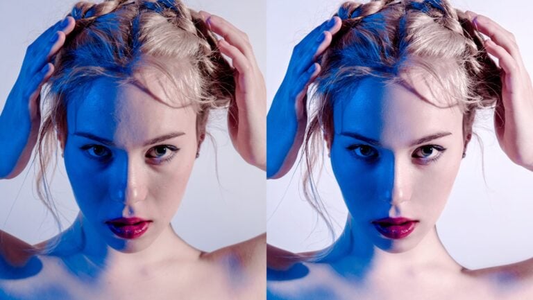
Below is a before and after comparison. I have exaggerated a bit with my adjustments so that it becomes easier to compare.

I hope this brief tutorial has provided you with yet another tool for your color work. Now it is up to you to explore the RGB section in Lightroom.

Ole Henrik Skjelstad
Ole Henrik Skjelstad is a Norwegian math teacher and landscape photographer. He fell in love with photography in 2013 when he got a camera as a birthday present.


Join the Discussion
DIYP Comment Policy
Be nice, be on-topic, no personal information or flames.
One response to “How to color-tone an image in Lightroom using RGB curves – an overview”
thank you