


Confused by the tone curves? This is how they work and how to use them
Mar 2, 2017
Dunja Đuđić
Dunja Djudjic is a multi-talented artist based in Novi Sad, Serbia. With 15 years of experience as a photographer, she specializes in capturing the beauty of nature, travel, concerts, and fine art. In addition to her photography, Dunja also expresses her creativity through writing, embroidery, and jewelry making.
Share:

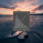
Tone Curve is one of the essential tools in photo editing. However, it may not be easy to understand how it actually works. This video shows exactly this – what logic stands behind the Tone Curve, how they work, and what you should and shouldn’t do with them. If you are new to Tone Curve and not exactly sure how it works, you’ll have it explained in just a few minutes. There are some useful tips for learning and exploring this tool further.
I have to admit, Tone Curve was the tool I dreaded for a long time. It’s always been pretty illogical and non-intuitive to me. Still, this is the tool you can use for all sorts of tonal adjustments, and even apply it to individual channels. You can find it in most editing software, such as Photoshop, Lightroom, Capture One, Premiere, After Effects, and even Lightroom Mobile. So, it’s pretty useful to understand how it works and to use it for your photography.
The video suggests you should start learning using Photoshop. But I learned it when I started using Lightroom, so I’d say there’s no rule here, as long as you learn and practice.
How to use Tone Curve
If you’re new to Tone Curve, you know it enhances the brightness and contrast of the image as you add dots or create a curve. But why does it do that?
Try adding a point in the middle of the line. There’s no change to the image. The software tries to make the tone in the bottom the same as the tone of the left. The ones on the bottom are from the input, and the ones on the left are from the output. When you add a point to the middle, it does nothing – as these two tones are the same.

When you pull the curve upwards, the software maps the tone in the bottom to be the same as the tone on the left, which is brighter. As a result, you get a brighter image.

The points you add will tell the software to remap the tones from the bottom chart to the left chart. If you create and “S” curve, it creates contrast, because this makes the shadows darker and highlights brighter.
Using the tone chart technique
It may be useful to memorize the shapes that give certain results, but you’ll soon notice it’s very limiting. Instead, you should develop an instinctive feeling for working with Tone Curve. One of the good ways to do this is by using a tone chart technique. You can download a free tone chart Photoshop action here, and here is the video to see how it works.
You can select the tones from the photo for automatic adjustment. But instead of selecting from the photo, use the Direct Selection tool and drag on the tone chart. The brightness and contrast of the image will change, and you’ll see the Tone Curve changing in real time. By following the changes, you’ll soon get the feeling how Tone Curve tool works.
Be careful of the “wiggly lines”, which occur when you have several points on the line that are too close to each other. If this happens, the tones will look weird and very unnatural. If this happens, remove some of the points and create a smooth curve.
Getting started with RGB Tone Curve
You can use the Tone Curve on individual channels to edit different tonal areas in the image. Choose the channel you want to edit from the drop-down menu. If your photo is in CMYK, you will see cyan, magenta, yellow and black channel. But the photos are usually RGB, so you’ll see red, green and blue.

Instead of tweaking these channels directly in the layer, you can do it via Tone Curve. You can edit each channel individually and change the brightness and contrast of each of them separately. These changes will affect the tint of the image.
For example, if you want to add a green tint to the shadows, you can lift the left side of the Green channel’s curve upwards. If you want to add purple tone, you can lift red and blue equally.

Again, you can use the tone chart technique to practice and get the feeling how each change works. You can get a lot of different looks and add a whole lot of effects to the images by using only one tool.
I hope this tutorial helped you understand better how the Tone Curve works and what exactly it does. If you’re new to them, don’t hesitate to play with this tool in any editing software you use. Practice a lot, use the tone chart technique and observe the changes. You should soon get the feeling how it works and you’ll be able to make all sorts of changes to your photos with equal success.
[How Tone Curves REALLY work |Photoshop Tutorials]

Dunja Đuđić
Dunja Djudjic is a multi-talented artist based in Novi Sad, Serbia. With 15 years of experience as a photographer, she specializes in capturing the beauty of nature, travel, concerts, and fine art. In addition to her photography, Dunja also expresses her creativity through writing, embroidery, and jewelry making.
Related Posts
 How to color-tone an image in Lightroom using RGB curves – an overview
 If you’re confused by curve and levels in Photoshop you need to watch this beginner’s guide
 Confused by colour grading? Watch this complete guide to the basic concepts and tools
 Confused by lighting terms? Here’s what they all mean
Join the Discussion
DIYP Comment Policy
Be nice, be on-topic, no personal information or flames.
One response to “Confused by the tone curves? This is how they work and how to use them”
Important information for the tone curves. Thanks for sharing.