


color
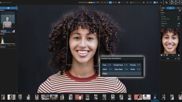
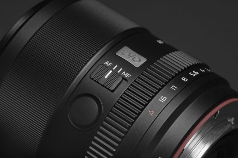
Is Color Science Really Important if You Shoot RAW?
May 24, 2026
Dunja Đuđić
Spend enough time among photographers, and you’ll inevitably stumble into heated debates about which camera brand has the best colors. I’ve always heard that about…
Two New Large Format Color Negative Films are Now Available
May 4, 2026
David Prochnow
It’s not very often that a new large-format color negative film appears on today’s market. Surprisingly enough, two new, reasonably-priced color negative 4×5-format films have…
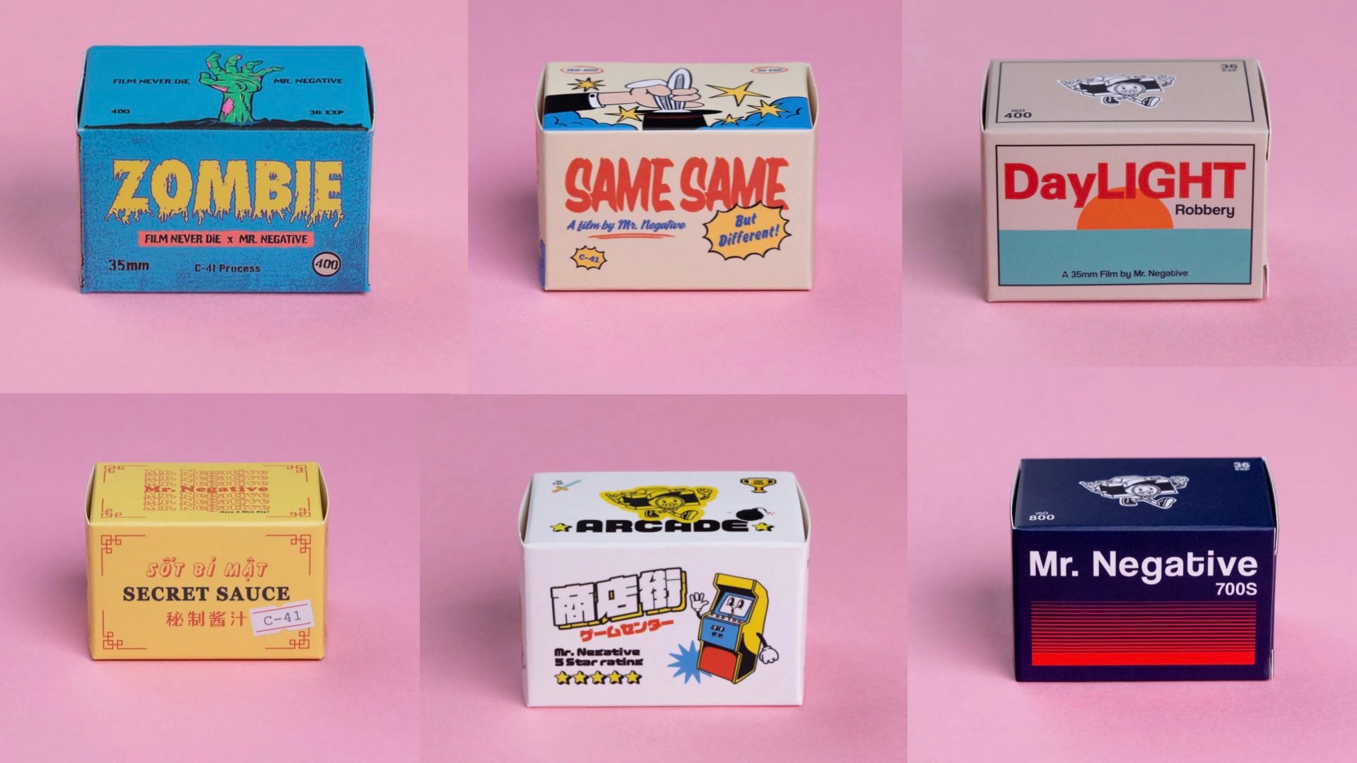
A New Down Under Film Company with a Very Curious Name and Brand
Apr 24, 2026
David Prochnow
What sounds like a worker at a conspiracy theory Web site is, in reality, the name of an Australian-based film company. Known as Mr. Negative,…

Kodak Rebirths an “Ekta-Lot” of Films in Glorious Retro Packaging
Mar 25, 2026
David Prochnow
Continuing the Kodak rejuvenation of former Alaris films, a new line of Ektapan and Ektacolor Pro films are returning to Kodak branding. This major film…
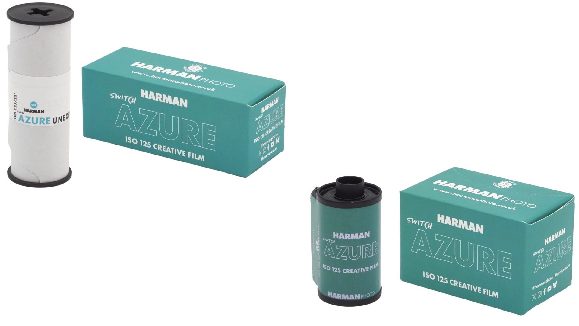
On Harman’s Menu for Lunch Today-Fresh Film for $12.99-All You Can Eat
Mar 9, 2026
David Prochnow
As avid DIYP readers will recall, we made the announcement earlier this week that Harman Photo would be releasing a new film stock at “midday”…

PSA: A New Film will be Coming to Lunch (Launch?) on 5 March
Mar 3, 2026
David Prochnow
In a coy announcement about a new film stock from the Harman Technology brand, Harman Photo, comes word that you have a lunch date on…
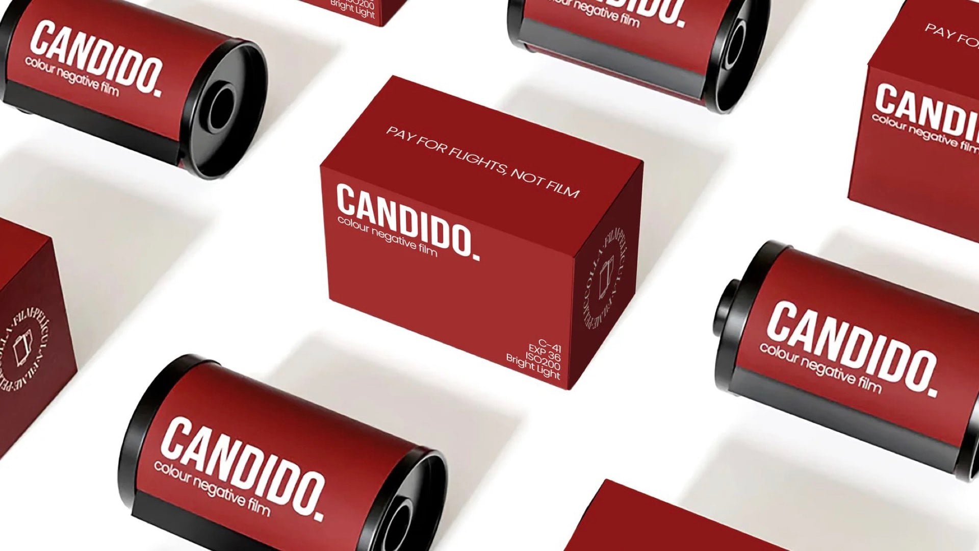
A Candid Look at the New Candido Collection of Color Film
Feb 16, 2026
David Prochnow
Greetings to the online shrine for three magical rolls of film. Imagine, if you will, a place where digital fatigue goes to die and analogue…
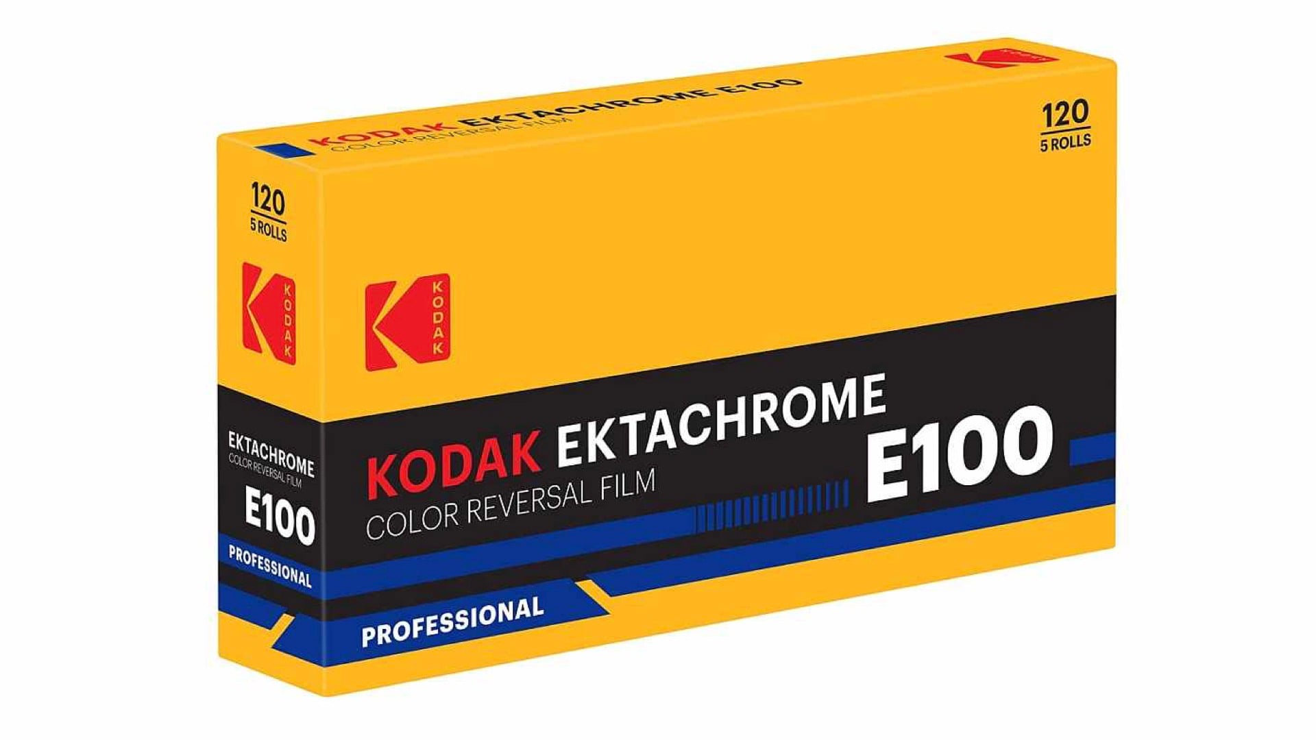
Kodak Returns EKTACHROME E100 to its Film Fold
Feb 12, 2026
David Prochnow
Imagine a film that refuses to act its age, a tiny cellulose superhero, cape fluttering in the breeze of analog photography’s renaissance. In a nutshell,…
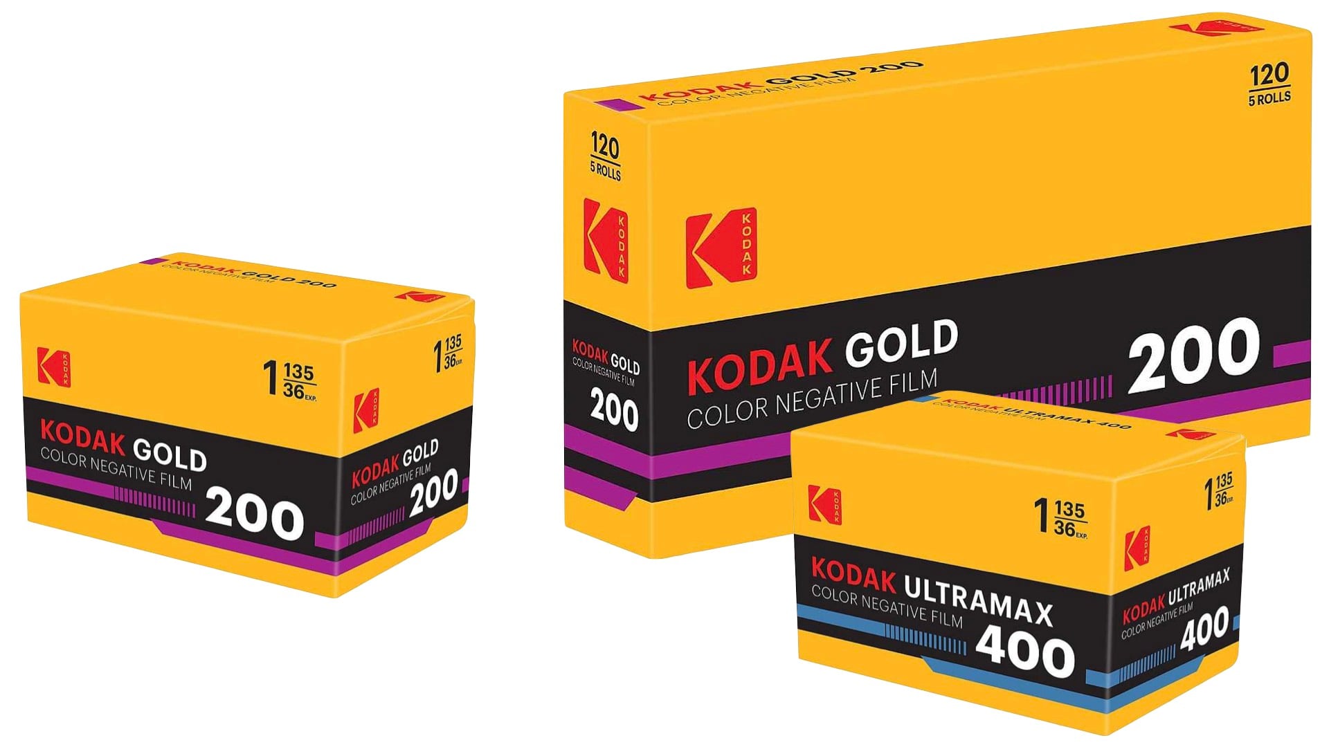
Kodak Keeps the New/Old Film Hits Rolling Along in Time for the Holidays
Nov 5, 2025
David Prochnow
Fresh on the heels of the newly (re)named KODACOLOR 100 and KODACOLOR 200 films that we recently highlighted, comes word that Kodak is at it…

This One Fuji Trick Will Make Your Photos Look Like They Were Shot by a Time-Traveling Hipster
Oct 26, 2025
David Prochnow
If you’ve got a Fujifilm camera and you’re not using its film simulations, congratulations—you’re leaving about 75% of your camera’s charm untapped. Fujifilm’s film sims…