


Follow these five tips if you don’t want to suck at color theory
May 11, 2021
Dunja Đuđić Kalinin
Dunja Djudjic is a multi-talented artist based in Novi Sad, Serbia. With 15 years of experience as a photographer, she specializes in capturing the beauty of nature, travel, concerts, and fine art. In addition to her photography, Dunja also expresses her creativity through writing, embroidery, and jewelry making.
Share:
Understanding color theory is one of the essential skills for photographers. It combines art and science and it’s what makes it so interesting, so complex… and so frustrating at times. If you want to be a good photographer, you don’t want to suck at color theory. And this video from Greg Gunn (The Futur Academy) offers five tips that will help you not to suck at it.
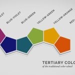
1. Color harmonies
If you don’t know where to start when learning about color, this is the answer: color harmonies. Even if you’re completely new to color theory, you’ve probably already heard of some color harmonies like monochromatic, analogous, or complementary. I even remember learning about them in art classes in elementary school, so I suppose all of us have at least some knowledge to start with.
The simplest way to start using color harmonies is by choosing one color that you like and build around it. Do you want to pair it with complementary colors? Perhaps with analogous? You can choose your color palette using various tools, and I find Adobe Color Wheel to be very helpful and easy to use.
2. Neutral colors
As Greg puts it, neutral colors are like the “supporting cast” for your lead colors. They can be warm or cool, light or dark, but they are all like the name describes: neutral. They offer a “visual relief” from your main colors and make them stand out even more. Neutral colors are usually black, white, all the grays in between; and browns.
3. Less is more
Oversaturating the colors is one of the most common mistakes newbies make. And the more colors you have in an image, the more difficult it is to edit them so that they look good together. I’ve found this especially challenging in landscape photos, especially in the spring and summer when there are so many colors all over the place. And even after this many years in photography, I sometimes struggle to make colors in these images look good.
But don’t let this discourage you. Before you start shooting, think about the mood that you want to convey. Consider starting with just one or two main colors and two neutrals. See how that works for you and remember – you can always add more later. And don’t crank up that saturation slider all the way up.
4. Contrast
If an image looks good in grayscale, it will likely look good in color. This means that it has good contrast between the images, which creates enough visual interest. This is particularly obvious in design: isn’t it annoying when the colors “blend in” together because they have the same values?

This also works in photography, so pay attention to how your colors interact in terms of contrast. The easiest way to check it: convert your image to black and white.
5. Aim for balance
Greg advises seeing the colors in your work as musical notes in a song. You want a range of hues, values, and saturation. Not every color needs to be a star – choose one or two, and let the neutral colors be “the rhythm section.”
Use the “60-30-10” rule as the place to start when determining how many colors you should use. It refers to 60% of your main color, 30% of the neutrals, and 10% of the accent color. It’s not easy striking the right balance of colors, and this tip is basically a summary of the previous four. But when you learn them, this will likely come naturally.
Bonus tip: make your own rules
Sure, there are some rules of thumb, some theories, and recommendations when using colors. But remember that a lot of it comes down to your intuition, too. So, as I always advise, learn the theory and the “rules” first, but then make your own rules and rely on your intuition.
[How to Not Suck at Color – 5 color theory tips every designer should know via FStoppers]

Dunja Đuđić Kalinin
Dunja Djudjic is a multi-talented artist based in Novi Sad, Serbia. With 15 years of experience as a photographer, she specializes in capturing the beauty of nature, travel, concerts, and fine art. In addition to her photography, Dunja also expresses her creativity through writing, embroidery, and jewelry making.


Join the Discussion
DIYP Comment Policy
Be nice, be on-topic, no personal information or flames.
One response to “Follow these five tips if you don’t want to suck at color theory”
Very good practicle guideline advices blend with the standard Colors theories. This talk is reveiling a few important and useful avenues to practisioners. All the best . ??