


Using Gelled Lighting For In-Camera, Color-Theory Driven Stories
Jan 18, 2016
Glenn Norwood
Glenn Primarily works as a social and fashion photographer specializing in editorial, advertising and portrait photography, based in Belfast, Northern Ireland.
Share:
I pretty much shoot exclusively color images – I don’t know why, I just always tend to resonate towards color rather than a monochrome image. Maybe it was my formative years when I spent most of my days color printing in a darkroom. Anyway what I realized a few years ago, when I analysed a selection of my work was that that almost all of my images were composed from a very select group of color palettes. I guess this was done intuitively, maybe from my early years of color printing, or from my mis-spent youth at Art college, but from this point I have purposely tried to finesse and perfect the color palettes and theory in all my images.
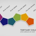
So firstly I guess its important to lay down some basics. As photographers we are all aware of the Primary colors of Red, Blue & Green [RGB] and the printing Primaries, Yellow, Magenta and Cyan [CYMK including Black] but when thinking about my color palette I tend to think within the traditional Primaries as taught to painters and artists, Yellow, Red and Blue [YRB]. From these Primaries we can off course create secondary and Tertiary Colors. see the Goethe Color wheel below.

Ok folks, now stay with me – I don’t want this post to read like a boring text-book! Once we become familiar with the color wheel we can then start to understand color harmonies – and thats were it gets interesting!
We have three variables of a color: Hue, Saturation, and Luminosity. These are the basic building blocks of every shade of color.
- Hue: The name of the color
- Saturation: The intensity of the color
- Luminosity: The brightness of the color
Once we understand this, there are several of these harmonies to consider, but the most obvious and straightforward are Monochromatic and Complementary color harmonies. To help visualize this I tend to use Adobe Color CC formerly known as Kuler.
With monochromatic color harmony the hue stays the same and only the saturation and luminosity changes. Whereas Complementary color harmony is about using two colors that are directly opposite from one another on a color wheel. Adobe Color CC can also produce Analogous, Triad and Compound harmonies.

With a little of this knowledge we can start to construct our images. To crate successful harmonious images, I use Rosco gel sheets placed over Bowens strobes, various color seamless paper rolls whilst also taking into great consideration the styling and makeup options of the subject photographed. All of these things must work in tandem to produce a successful image. I constantly use Adobe Color CC to create colour palettes based on these theories and it is remarkable how often specific palettes show up in my work. Take this palette for example.
Orange Hue/Analogous

This Palette uses an Orange Hue as the base color and with the Analogous harmony rule. You can see how these colours are utilised in the following images.

Both of these images were lit with a Beauty dish as the main light, with two regular strobes with reflector dishes with orange and yellow gels positioned towards the background to produce the warm color. Both of these images have simple set up but I have placed huge emphasis on the both the color of the gels and the clothing used on the models.
Red/Analogous
I can use a similar color palette but use more saturated color and use a deeper red as the base color. Created in color CC, the palette uses the following colors.

This palette was used in the following images: Once again beauty dish as main and two gelled lights to color the background.

Warm oranges, yellows & red/Complementary
Another palette I use frequently combines the warm oranges, yellows and red of the previous palette, but introduces a Complementary color harmony. Complementary color is off course opposite to the base color orange, which is blue.


In both these cases the complementary blue is used to contrast the yellows, reds and oranges. In the first image the blue coat comprises a large percentage of the image, with the yellow top and orange bag used as complementary color. Two strobes with red gels are added as rim lights to accent the hair to complete the color palette. In the second image red, yellow and orange comprise the majority of the images with two strobes with cyan gels used as accent lights to highlight the subject.
deep navy blue/Analogous
I typically do tend to lean towards the cooler spectrum when I shoot fashion portraits and this next palette is one that pops up on a regular basis.

This uses a deep navy blue as the base colour and the Analogous rule to produce the palette. As shown with the images below:

Both of these images use blue and magenta gels placed on soft boxes to give an overall blue/magenta color wash over the images.
blue/complementary
Again we can add some complementary colors to the cool theme to bring contrast – in this case red and orange.


green-blue/Analogous
Using the Analogous harmony once more I move the color spectrum towards green/blue.


green and red / complementary
Using this cool muted color palette can produce very subtle tones. Both these images used a combination of hard light and soft light with the blue cyan and green gels placed in soft boxes. Sometimes when I want to produce a very striking image, I will use a very limited complementary palette…green and red can at times be quite jarring, but when used correctly I can get great results.


Just remember you don’t always have to use strong primary or secondary colors, keeping a simple monochromatic color harmony can produce amazing results. when shooting a lot of beauty images I prefer to keep my palette very neutral.


These are some of the setups I’ve played around with, and I’m sure you will come up with many more if you like the idea of experimenting with color palettes and gels. Let us know what you come up with!

Glenn Norwood
Glenn Primarily works as a social and fashion photographer specializing in editorial, advertising and portrait photography, based in Belfast, Northern Ireland.


Join the Discussion
DIYP Comment Policy
Be nice, be on-topic, no personal information or flames.
6 responses to “Using Gelled Lighting For In-Camera, Color-Theory Driven Stories”
One of the best articles I have read here. Thank you!
Thanks !
Great article, very useful, especialy the color palettes used!! Thanks!
Great article on an important topic! Would have been perfect with the before/after (not for the retouching part I mean only for the color management) to see the impact of the palette and the importance of artistic direction on the shoot!
Interesting.
Very good read, how do you determine what is the base colour is it the main colour in the image?