


Watch: All you wanted to know about color theory and color grading
Oct 12, 2020
Dunja Đuđić Kalinin
Dunja Djudjic is a multi-talented artist based in Novi Sad, Serbia. With 15 years of experience as a photographer, she specializes in capturing the beauty of nature, travel, concerts, and fine art. In addition to her photography, Dunja also expresses her creativity through writing, embroidery, and jewelry making.
Share:
Understanding color is one of the crucial things to understand, no matter if you’re a photographer or a video creator. Understanding color theory and psychology will help you add more meaning and impact to your work. So, if you’d like to master the use of color, Joanna Kustra has an amazing video for you.
Joanna is a fashion and commercial photographer whose work is largely inspired by the color and light of classical paintings. In the video, you’ll hear her talking about what she learned about colors throughout her career. She teaches you about color harmonies and the psychology behind it, color relativity, and other color phenomena.
Knowing the color theory means a lot if you want to color grade your photos. However, it’s also important to combine the right colors in the photo itself. This is why Joanna also talks about the importance of preparation before the photoshoot: what to look for when choosing clothes, location, and background, and how to use color theories in this context. Joanna also shows her color grading workflow in Photoshop and shares what her images look like before and after editing them.
Since the video is over an hour long, I think it would make no sense to make a write-up. After all, Joanna gives you so many great explanations along with tons of examples. So, here are the time stamps for the video. You can skip to the part you’re most interested in, although I highly recommend you watch the whole thing, it’s really educational and helpful!
- 0:00 – About me
- 4:17 – Gear
- 6:24 – Color Psychology
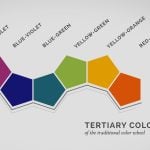
- 9:26 – Color Harmony
- 22:33 – Color Management
- 30:02 – Color Relativity & other color phenomena
- 37:59 – Color Inspirations
- 42:24 – Tips on how to achieve a harmony
- 50:08 – Before and After Examples of Color-grading
- 56:09 – Learn to achieve a Unique Color Style
- 58:52 – Iconic Portraits dissected
- 1:03:13 – Masterclass Ad
- 1:05:09 – Color-grading in Adobe Photoshop
[Secrets of color-grading in photography via Reddit]

Dunja Đuđić Kalinin
Dunja Djudjic is a multi-talented artist based in Novi Sad, Serbia. With 15 years of experience as a photographer, she specializes in capturing the beauty of nature, travel, concerts, and fine art. In addition to her photography, Dunja also expresses her creativity through writing, embroidery, and jewelry making.


Join the Discussion
DIYP Comment Policy
Be nice, be on-topic, no personal information or flames.
One response to “Watch: All you wanted to know about color theory and color grading”
WoW! Nice to see here details about color theory. Really informative and inspiring post for correction about colour management. If anyone require photoshop color correction services Please learn more from Photo Editing Service Center