


The brilliant use of complementary colors in “The Queen’s Gambit”
Dec 15, 2020
Dunja Đuđić Kalinin
Dunja Djudjic is a multi-talented artist based in Novi Sad, Serbia. With 15 years of experience as a photographer, she specializes in capturing the beauty of nature, travel, concerts, and fine art. In addition to her photography, Dunja also expresses her creativity through writing, embroidery, and jewelry making.
Share:
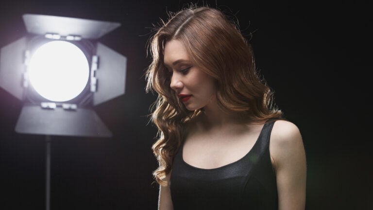
I recently finished Netflix’s The Queen’s Gambit and I have so many great impressions. It’s not just the story and characters I liked, but this TV show is a real treat for photographers. Martin Kaninsky is also enchanted by it, and in his recent video, he guides you through the brilliant use of complementary colors in The Queen’s Gambit.
Martin previously guided you through seven composition techniques you can learn from this beautiful TV series. It’s just one of the reasons why photographers love it. Another reason is the brilliant use of color, and it’s also something I’ve noticed, although Martin put it in words really nicely.
The Queen’s Gambit has lots of beautiful patterns from the 1950s and 1960s which add to the mood and to the beauty of every frame. But the lighting, décor, props, and clothes: they’re often great examples of the use of complementary colors. For example, the use of green dresses or backgrounds in contrast with Beth’s red hair is something you’ll see a lot in the series
The use of color palette in color grading is another thing to pay attention to, and Martin gives some great examples in his video. Color grading is also very well done, and it sets the mood perfectly.
If you still haven’t seen The Queen’s Gambit, I have one question: why?! I’m joking a little of course, but really, I strongly suggest you watch it because it really is a treat for photographers. Martin’s video should be a pretty good “trailer” that will make you want to watch it. And if you already have, I have a question for you too: what did you like the most about the series? For me, it was an amazing composition in almost every single frame and the use of patterns.
[The Briliant Use Of Complementary Colors In The Queen’s Gambit | about photography]

Dunja Đuđić Kalinin
Dunja Djudjic is a multi-talented artist based in Novi Sad, Serbia. With 15 years of experience as a photographer, she specializes in capturing the beauty of nature, travel, concerts, and fine art. In addition to her photography, Dunja also expresses her creativity through writing, embroidery, and jewelry making.


Join the Discussion
DIYP Comment Policy
Be nice, be on-topic, no personal information or flames.
2 responses to “The brilliant use of complementary colors in “The Queen’s Gambit””
I guess all
Shots gave me Hints of Kubrick for sure!