


Product Photography: Shooting A “Papo Seco” Wine Bottle
Apr 17, 2015
Rui Bandeira

We love it when our readers get in touch with us to share their stories. This article was contributed to DIYP by a member of our community. If you would like to contribute an article, please contact us here.
Share:

Here it is a short description of the process for creating the image of the bottle “Papo Seco” to Pinto & Raposo.
For this shot I only had the 5 bottles my client gave me and the idea he wanted for the image… He wanted “fresh” “clean” and “young” he also needed some blank space for adding text later on…
In the beginning I was thinking on using only one bottle…but as I had 5 bottles available I decided to try to use them all.
The first thing I knew I wanted to use was the metal sheet for the bottom, because I wanted to use some water, and the background paper was out of the question, I already knew that the metal sheet would look good and fresh with the water.
Now I would have to come up with some idea for the back…and that was the moment that I remembered one idea that I had for a shoot some months ago…
So I picked up my phone to see the image of the idea that I saw…
This was the image:

This image was made one night on a local pub… I was there with some friends and while we were waiting for a table I saw what seemed to be the back of a glass cabinet that was full of bottles, and I just loved the effect, so I took a pic with my phone with the intention of using it one day in one shot…
…this was the day
This is the proof that we can find inspiration everywhere anytime.
So now that I had the idea I just need to start building it. I had the matte glass from an old desk, so using the backdrop tripod I mounted it in place

I knew I had to back light it, but I also wanted to give some color to the background…blue was my first option because to me, blue is fresh… to do that I used a flash with a panel on the back and I used some matte plastic to give it some diffusion, for the blue I used some gels, but wasn’t happy with the results, so I decided to try some blue curtain, and just loved it.

Now it was time to take care of the bottles.
I started by removing the back labels from all the bottles using a knife and some alcohol, then I cleaned them all and started to select the best one to be on front
The bottle on the front would have some water drops.
To do that I used a mix of water and glycerin and sprayed it on the glass.
I decided to shoot it at f/16 to have all the bottle in focus and that was not a problem for the background because the matte glass would give enough blur…
I started to look for the best placement for the bottles. The back bottles – I didn’t wand them all at the same distance, so I decided to have two bottles in the middle close to the glass and two bottles on the outside, away from the glass to make it more interesting.
After checking they were all in place I’ve spayed some water on the base of the front bottle.


Now I had to light the front bottle.
The first light was the overhead light, that one had a panel with a grid to give some light to the top of the bottle and also some light on the water on the bottom of the bottle…

For the front of the bottle and to have light on the label I used 2 stripbox , one in each side, the striboxes also added some light to the front of the bottles on the background.
At this point I had something like this…

That was ok for the base image, but it wasn’t finished yet…
The composition was as I wanted…the bottles were in the place I wanted and at the distance that I wanted…

But the interior of the front bottle was too dark…remember that I was shooting at f/16, ISO100 and at 1/125…
To solve this problem I had to put some light inside the bottle and then compose it in photoshop…
But I also needed to start shooting without the bottles on the back because the client would probably need one copy of the image with more space to have some text, and because the bottles on the back were reflecting on the front bottle. So only now I started really shooting the images I needed.
After marking the positions of the bottles on the back I remove them and started shooting…all was left in the same place except for the back bottles…
I made the first image with the backlight, the stirpboxes and the overhead.
This was my base image…

I needed some more light on the lettering of the label. So I used some white card…and my beautiful hand :-)

After getting all the images for the label I started shooting the interior of the bottle, also using the white card.

I removed one of the stirpboxes and changed it for a panel and moved it closer to the bottle pointing to the card.
Damn…I have beautiful hands :)
I made several images for the interior of the bottle until I was convinced that I had all the images that I needed to compose them.
Them the final image was the one for the back bottles.
I just put them back in place and made the final shot
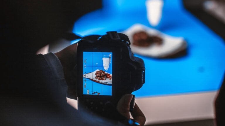
Now I had all that I needed to go to photoshop and compose it all into one image.

Gear
- Canon 5DMkII
- Canon EF 100mm f/2.8L Macro IS USM
- all images captured to CaptureOne edited on CaptureOne and exported as Tiffs to Photoshop.
About The Author
Rui Bandeira is a photographer based in Porto, Portugal. His Studio Specializes in Product Photography, Corporate, Concert & Event Photography, Promo Shots and Fashion Photography. You can see more of his work on his website, Behance profile and 500px.
We love it when our readers get in touch with us to share their stories. This article was contributed to DIYP by a member of our community. If you would like to contribute an article, please contact us here.
Related Posts
 How to create a classic and moody photograph of a wine bottle
 This simple product photography walkthrough offers everything you need to know to get started in product photography
 How to photograph a clear liquid bottle using inexpensive gear and unusual modifiers
 How to photograph wine bottles with speedlights and a kit lens
Join the Discussion
DIYP Comment Policy
Be nice, be on-topic, no personal information or flames.
10 responses to “Product Photography: Shooting A “Papo Seco” Wine Bottle”
I don’t know that the people that named that wine know what a “papo” is. If they did, they certainly would not have named it “seco” and expected anyone to enjoy it.
“Papo seco” is a kind of bread in Portuguese, in this case “seco” doesn’t mean it’s outdated, it is part of the name given to that kind of bread.
Interesting. In large parts of Central and South America, “papo” refers to something completely different.
Spanish and Portuguese have very similar words, but their meaning is usually very different.
How long did it take to composite in Photoshop? It’s a nice shot!
hi Tristan.
i dont know the time correctly but i would say about 4h
am not really a photoshop person, how do i go about it in lightroom ?
this image was composite
i had to composite some images in to a final pic.
you cant do it on Lightroom, you nead to use layers and you cant on lightroom.
Thanks for sharing this! Very informative.
Nice work. I think this idea has numerous possible applications.