


How to create a classic and moody photograph of a wine bottle
May 19, 2017
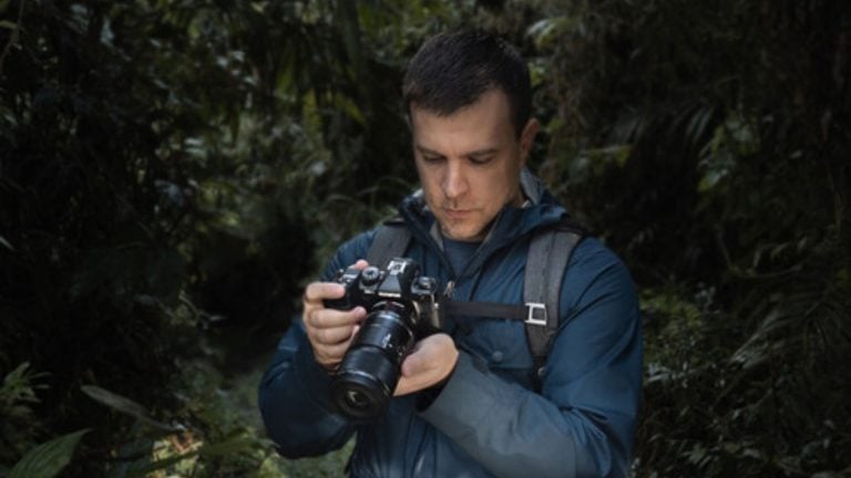
John Aldred
John Aldred is a photographer with over 25 years of experience in the portrait and commercial worlds. He is based in Scotland and has been an early adopter – and occasional beta tester – of almost every digital imaging technology in that time. As well as his creative visual work, John uses 3D printing, electronics and programming to create his own photography and filmmaking tools and consults for a number of brands across the industry.
Share:

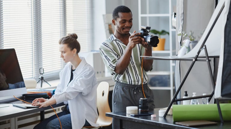
Photography Dustin Dolby has been putting a lot of effort into his short series on photographing wine and wine bottles. Part 1 introduced us to the basic principles shooting such a subject with minimal kit and getting good reflections. Part 2 focuses on getting a richer, more bold, hero-like shot. A look that’s become very popular recently. In this third part, we see the moodier side of photographing a wine bottle.
Using a strip softbox as his background, Dustin shows how we can photograph wine bottles for easy cut out selection. The principle, though, should work well for anything you wish to cut from its background. Sometimes it’s easier to get things perfect in-camera. But at other times, you or your client may need that option to put an object on a different background.
The first job is to get the background light just right for making that solid black & white selection mask. Too dark and white turns to grey. Too bright and white light leaks around the side of the bottle, softening the edges. You need to get it just right for it to work.

With the sides cut off, and the whole thing inverted, it turns into a pretty perfect mask. The only thing needed to be done is to get rid of the highlight reflections on the grapes. Using this black & white layer as a selection, you can apply a mask to your actual image and get a perfectly cut out result.

One thing you’ll notice is that the grapes aren’t quite the purple ones shown on the label. Dustin shows a quick way to change the colour of these over using a solid layer with the colour blending mode and masks. 
By default, the colour change is a little extreme, so you’ll want to dial back the opacity a bit. The exact amount will vary depending on the colour of the original subject, where you’re trying to end up, and personal taste. But pulling back the opacity will bring back some of that natural variation in colour.
Dustin also used several other adjustment layers such as curves and selective colour adjustments to help things match more evenly. Finally, Dustin creates a background gradient. This is why the image was cut out in the first place.

It’s a lot easier and faster to match the colour for something like this in Photoshop than it is using gels.
Using the techniques from all three parts of this series arms us with a lot of great information. And they all go to show that you really don’t need a whole lot of kit or a massive studio to get solid results.
This is the third and final part in this series. It’s been pretty informative. Combined, it’s about 40 minutes worth of tips and advice that can really help to take your product and still life photography to the next level.
I look forward to seeing what Dustin does next.

John Aldred
John Aldred is a photographer with over 25 years of experience in the portrait and commercial worlds. He is based in Scotland and has been an early adopter – and occasional beta tester – of almost every digital imaging technology in that time. As well as his creative visual work, John uses 3D printing, electronics and programming to create his own photography and filmmaking tools and consults for a number of brands across the industry.


Join the Discussion
DIYP Comment Policy
Be nice, be on-topic, no personal information or flames.
4 responses to “How to create a classic and moody photograph of a wine bottle”
Best episode yet!
this guy is going to be big in YouTube as a instructor… excellent content, simple and easy to understand… add to that using basic illumination and hardware and every single product photographer should be studying his technique very very closely… his workflow is efficient and VERY fast.
Thank-you so much Frank, I really appreciate all the feedback.
I hope your prediction is correct, I’ll work extra hard towards that goal now! (-:
Of course it’s simple and easy to understand. It is made for idiots like you, ugly face!