


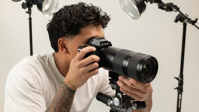


What it is like to be a colourblind photographer
Mar 10, 2017
Jason Futrill

We love it when our readers get in touch with us to share their stories. This article was contributed to DIYP by a member of our community. If you would like to contribute an article, please contact us here.
Share:

I have never tried to put this into written words before but here goes – I am colourblind. And I am a photographer. In my particular case, and in the majority of those that are “colour challenged”, being colourblind doesn’t actually mean we cannot see colours. Or at least, without borrowing your eyes and brain for a while and comparing what we see, I don’t believe this to be the case. Technically what it means is I have colour vision deficiency, which means my eyes and brain interpret things differently to you “normal” people. I lack the ability to interpret the full spectrum of colours, and quite often get confused by shades of colours that are very close together. My particular type of colourblindness has been diagnosed as “Strong Protan” and apparently I can only see anywhere from 5%-10% of the shades of those that have no form of colour vision deficiency.
The easiest way for me to explain this is to compare it to not being taught the name of many shades of colours. I can easily depict sky blue when it is a solid colour on its own. I can pick out shades of green that are very similar to grass when there is not a mish-mash of other greens (or yellows which technically greens are as I find out every time I try to saturate regions of images in Lightroom or Photoshop). I can fairly easily pick out shades of yellow such as canary yellow or those that are similar to the sun. I know fire trucks are red. But here is where things get really confusing – mash a lot of those colours together into a scene, throw in variations and mixtures of those colours that produce different shades, add some cyan or magenta or pink (what colours are those anyway and why does the world need them?) and what we have is a whole mess of confusion that just doesn’t make sense to me.

When I was in primary school my mother used to shave the ends off my pencils and write the names of the colours on all 12 of them. Then came along the Derwent Water Colour sets of pencils that had 256 individual pencils in them with the colours (or some made up colour name) on the ends of them. Who on earth needs 256 individual colours and variations of shades in pencils when you are 7 years old? When yellow is no longer yellow the world just becomes a confusing place to me. I can tell you now that all through school when there was any form of art class on, all I wanted to do is run outside and play basketball, cricket or anything else other than need to deal with colours! That may also be why the blackboard in the art class rooms were constantly covered with multi coloured spit-balls….
So as a photographer I find it extremely challenging when it comes time to modify colours through the hue slider, colour mix panels, and sometimes even just getting the white balance correct in an image. I have had occasions where apparently my skies become “candy coloured” because I have oversaturated them and adjusted the hue and luminance sliders too far, or when darker parts of streams in my waterfall shots turn some form of green when they shouldn’t be. I apparently also have a very distinct lack of pinks in images that I use anywhere on my social media feeds. My partner thinks the best parts of a sunset are the after glow when there is apparently a lot of pink in the sky. “What pink?” is my question just about every time she gets excited about this. It does my head in looking out at whatever she is looking at and just seeing a sky that is now devoid of any recognisable colours.

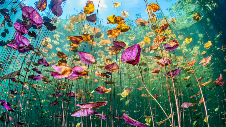
I believe the best images I produce are waterfalls in forests. I also believe that the simplicity of the shades of greens (and yellows) in those types of scenes are a big part of the reason why I seem to produce these types of images well. There are no blues, reds, oranges, pinks, purples and whatever made up colour names you non-colour retarded people want to throw into the mix to confuse my simple brain. Just simple greens with a good mix of yellow, nice white water and hopefully some awesome yellow rays of light that to add a nice touch to them. I can easily handle that. I don’t need to ask anyone if the colours are correct.
On top of being a photographer, I also do quite a lot of web development. And this can be quite interesting when it comes time to present initial designs to clients. The great thing about a web browser is that colours are interpreted via hex codes! When I can attribute 6 characters with a mix of numbers and letters to any specific shade of colour, I can guarantee getting it right every time. So more often as not when I am using Photoshop, rather than looking at the colour palette tools and picking some sort of burnt orange rather than the yellow I was hoping to pick, I try to use hex codes whenever I can.

So why don’t you just shoot in black and white you may ask? Well good black and white images are not just colour images that have been desaturated or turned into monochrome in your editing suite of choice. Good B+W images are just as hard to produce as good colour images as the reliance on such a limited set of shades in your images is a skill set of its own. And, where would the fun be in only trying to produce images with a lack of colour? Apparently the world is a very colourful place so thats what I still like to achieve in the images I produce. Sometimes it just takes me a little longer to achieve that than others. And when I get an image with heaps of colour variations such as a crazy colourful sunset or sunrise right and it does really well on social media, it almost feels like a little mini-achievement that I should celebrate.
We all have our challenges in life and there are far worse things that could impact on people than not seeing as many colours as other people. I have never seen it as a handicap. I am still not convinced that you are not the one who has an issue with whatever we are all seeing. Myself and the other 8% of adults who apparently have some form of colour vision deficiency may be the ones that see the world the way it really is. Or at least, thats what we “8%-ers” will all keep telling ourselves the next time we tell you some form of purple shade is actually really blue.
About the Author
Jason Futrill is a photographer based in Tasmania, Australia. He specializes in aerial photography and long exposure landscapes. He is one half of the Project RAWcast podcast team and also runs an online marketing company which specializes in tourism marketing. When he’s not out taking photos, you will most likely find him talking or writing about photography and trying to inspire others to get outside and produce beautiful images. For more of Jason’s work, check out his website, like his Facebook page and follow him on Instagram and Twitter. This article was also published here and shared with permission.
We love it when our readers get in touch with us to share their stories. This article was contributed to DIYP by a member of our community. If you would like to contribute an article, please contact us here.
Related Posts
 A black and white photography challenge by a colourblind photographer
 Photographer Spotlight: Q&A With Willie Dalton – Outdoor Lifestyle Photographer
 Photographer Spotlight: Q&A With Magdalena M – Editorial and Commercial Portraiture Photographer
 Now you don’t even have to be a professional photographer to be a certified professional photographer
Join the Discussion
DIYP Comment Policy
Be nice, be on-topic, no personal information or flames.
13 responses to “What it is like to be a colourblind photographer”
Probably a damn good black and white photog!
Well, cheers from another colorblind (deuteranopia actually) photographer.. I enjoyed so much reading this.. And yes, it is actually blue (:
It can be frustrating outside of photography, too. I’ll never forget when the lady in the store started laughing at me for not being able to see that the suitcase I wanted to buy wasn’t blue. Apparently it was purple.
I’m colorblind and only see about 25,000 colors.
When I shoot I look at light energy versus color; I cannot really describe color but I can see positive and negative spaces. Essentially, I think I break the photo down into what would work in B&W, then shoot.
Obviously, I am extremely concerned about screwing up an image, as a result, I do very little color adjustment – color sliders, etc.
I have a few methods I use to find color temp, frequently bouncing between settings until I fall on what I think is correct. I also carry a x-rite color checker, a grey card, and a piece of milk glass I can use to set custom color temp.
After I find balance most of my adjustments are via dodge, burn, gradients, and often, a bit of desaturation.
I have considered getting enchroma glasses.
My life!!!! Amateur photog+ colorblind
I was actually thinking about this very subject recently. Interesting article.
Would be great to see a visual representation.
There is an iphone app called “CVS Simulator” that simulates various kinds of colorblind.
If you download it, my specific colorblind is Protan (the letter P on the app). Because colorblind is a ratio of color sensitivity it can be more pronounced in some than others.
I downloaded the application so my wife and others can understand what I cannot see.
There is another app called “Binoculars” that shifts the colors so that color blind may see more colors – it works, to some degree.
Nothing quite like enchroma glasses, which I have looked through last year.
The color RED is hideous for you normal signed people – straight gross. I prefer my version.
I am with you – I prefer the version I see. Thanks for the app tip –
Shoot mono.
As a rule I rarely evaluate the color on the back of the camera, most look at histogram – I can fix color later, good data is what I need during the shoot.
Great write-up | I am in a similar situation, many years ago in grade school, (in the 60’s) it was determined that I wasn’t lazy and not learning my colors but I couldn’t see the difference between red, green, and brown. Fast forward in life and I find that it benefits me in my photography work. Most often, I can see shades of these colors in light but not reflective – eg wood, floors, clothing, etc | One interesting point | An eye doctor offered me a ‘set’ of contact lenses to correct color blindness (deficiency) and I tried them for a day and took them back stating “I don’t like how your world looks.” :D
“I don’t like how your world looks.” -> I love this! :D