


How to photograph artwork like a pro with just one light
Oct 21, 2020
Harry Durgin

We love it when our readers get in touch with us to share their stories. This article was contributed to DIYP by a member of our community. If you would like to contribute an article, please contact us here.
Share:

Scanning artwork certainly has its advantages, but it also has its limitations. Brushstrokes can benefit from a more unidirectional light source. Photographing in a controlled environment allows for fine-tuning of texture and shadows.
Until the past few years, photographing artwork required either a larger sensor or stitching together multiple shots to get printable resolution. With the advent of pixel shift technology in full frame cameras, medium and some larger artwork can be reproduced allowing for better workflow and hence, better value.
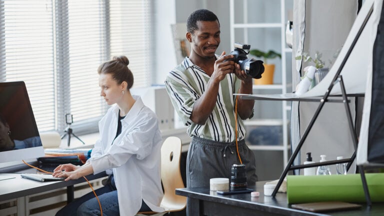
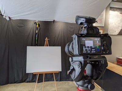
The theory behind using a strobe is that there is light infiltrating the scene from all over the room: from windows and walls and the floor too. All this light has many different colors and intensities. I don’t want to worry about them, so I use a strobe to overpower the ambient light. A typical lighting setup is 2 (or more) lights from the sides. This allows for wonderful control over both shadows and textures with either light source being dominant, or both being equal: an artistic choice. Another direction to light from is the top. This has the advantage of being a more intuitive direction for a light source to come from, but the disadvantage of not being able to place another light source opposite, on the bottom, due to the floor limiting how far away the light source can be. My setup is a Profoto B10 ,with a snood to control spillage, bouncing off a white sheet and onto the artwork.
If the artwork is small, you’re probably thinking about scanning it, and if it’s larger you won’t be able to get all of it tack sharp without stopping down your aperture so far that the image is softening from diffraction. So that means shooting at various focal points and stitching together in post. More work, but no way around this. In this project I used an 85mm lens at F/8 for 24’x16″ artwork. I was able to cover all of the artwork in 2 focal distances. After shooting each sequence, I check the shots for sharpness at various points and shoot another set if there’s a region that looks soft. Larger artwork might require multiple shots to get everything in focus. When that’s the case, I make sure to leave plenty of room around the artwork to account for focus breathing (where the image size changes with focusing).
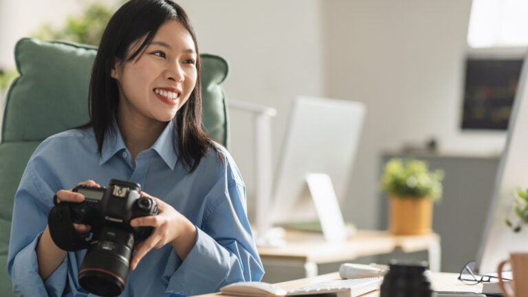
The camera I use for shooting artwork is a Sony A7Riii because it is full frame, high resolution and has pixel shift capability. Pixel shift is a process where the camera takes a shot, then moves the sensor 1 photoreceptor in both the horizontal and vertical axis for better color resolution and some better luminance resolution too. This requires 4 shots for each image that are combined in post.

The bounce panel is a lightweight wood frame held together and held up by 4 eyelet screws, each with fender washers and a nut. The sheet is a full-size flat sheet held on with lightweight clamps. The full-size flat sheet is the largest panel easily managed by a single person. The panel can be raised, lowered, and tilted by the straps holding it up. All in all, about $50 in stuff for a 6’x8′ bounce panel. The sheet has a real soft light which is perfect for what I want to achieve.
First step is to make sure my exposure is set so dark that mostly only the flash of the stobe shows up. Then I adjust the placement and direction of my stobe, and also the positioning of the bounce panel to get even lighting. Next step is to set the artwork on the wall or the easel and check the texture and shadows to see what might need adjusting for better effect. After fine-tuning the lighting to get just the right shadowing, a second flat sheet on the floor as a bounce wasn’t required but could have been easily added if desired.
Now it’s time to calibrate the scene. First step is to shoot a grey card for in-camera white balance. I like to shoot near the high end of the histogram; getting the white balance right helps me from clipping highlights when I’m reviewing my shots in the camera.
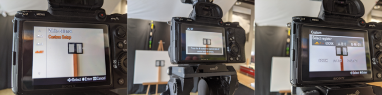
Next step is to shoot a color target. I use a Color Checker passport. The color target only works if you use the same settings for exposure and lighting. Since I’m using pixel shift for the artwork, I make sure to use the pixel shift for the color target too.

Close up of brush strokes on a final image. The amount and direction of the shadowing is an artistic choice, it can be a great idea to have the artist present during the shoot to help with this.

All went well and the brush strokes look good too. Time to shift to the computer. First I combine the sets of 4 pixel shifted images using Sony’s Imaging Edge Viewer software supplied with the camera. I don’t adjust anything in this software because I want to use the Color Checker to profile these images later on. The images are saved in a RAW format (DNG for my Sony) which I import into Lightroom. First image I import is the one with the color target. Selecting File/Export with Preset/X-Rite Presets/ColorChecker Camera Calibration finds the target on the image and asks me for a profile name to save as. After this, I close and reopen Lightroom because Lightroom only initializes the color profiles once, when it first opens.
Now I can open one of the RAW images of the artwork in the Develop mode and apply the newly created color profile (it should show up lower down on the list of available ones). Also, I turn off the sharpening and noise reduction and apply corrections for chromatic aberrations and lens profile. I synchronize these settings and save each of the images as 16 bit TIFF files. I’ve been keeping in Adobe RGB the whole way.
With TIFF files, I can open as layers each of the various focal point versions of the artwork in Photoshop. In this case, I’ve got 2 for each; larger artwork could require more. Selecting all layers, I use Edit/Auto-Align Layers with the default setting. Then Edit/Auto-Blend Layers with the default setting. This does a really good job of finding the most in-focus parts of each image and blending them together. But we’re not quite done yet, because the software may be excellent, but not perfect and sometimes there’s artistic judgement involved. So, a minor amount of hand adjusting of the masks may be required to get your best results.
I end up with a focused high-resolution image that’s been color corrected when the layers are flattened. Still need to check for blemishes, dust and such and clean that stuff up. Then, using Filter/Camera Raw Filter, I adjust the Geometry and Distortion as required to get a flat image perspective. Finally, a crop, and then export from Photoshop, again as a 16 bit TIFF in AdobeRGB.

There is no way to get all the colors correct. So you’ll have to decide which ones are the most important. I print a proof using a Canon Pro-1000 and a high quality photo paper. I then take a shot of both the artwork and the printed sample next to each other (no need for pixel shift here). After opening in a lightroom. I can apply changes to just the proof portion until the proof and the artwork look similar. I don’t care about the lighting and the quality, since I’m just comparing the printed version with the actual artwork. A couple of rounds of minor tweaks and I apply these same settings with the 16bit TIFF final scan I had. Since artists tend to use the same palette for multiple pieces, you might be able to apply these minor tweaks to each of the final TIFFS.
Actually with this project, it was close enough on the first run through and no tweaking was required, though it often is. Sometimes you’re shooting a painting with glitter or deep colors like cobalt. Then you’re looking for a good looking digital version, but have no chance of exactly matching the original.
Lastly, I want to reduce the canvas pattern a little. There are many ways to do this, but for this project I selected a wavelet-based noise reduction program called Neat. Some final sharpening with Topaz Denoise (I like the sharpen module on the Denoise application for artwork better than the sharpening options in their Sharpen program.) It’s AI based and can produce results that are fantastic, especially if used very lightly. I used no denoise and only a setting of 1 (out of 100) on the sharpening.
I repeated the steps for all the artwork. All in all, 1 hour of set up and shooting and 1 hour of processing for 5 pieces. If I had to do multiple rounds of color correction it usually takes an additional 10 minutes per round. Good luck and stay creative.
About the Author
Harry Durgin is a professional photographer in Hawaii who specializes in landscape astrophotography. His work during the 2018 volcanic eruption on the Big Island has been published in magazines and newspapers around the country. He and his wife have a print shop and studio in Pahoa, Hawaii. You can find more of their work on their website and Facebook. This article was also published here and shared with permission.
We love it when our readers get in touch with us to share their stories. This article was contributed to DIYP by a member of our community. If you would like to contribute an article, please contact us here.
Related Posts
 Five tips for creating cyberpunk artwork
 Getty Museum challenges people to recreate famous artwork in quarantine, and the results are hilarious
 Artist burns $11,2 million worth of artwork after selling it as NFTs
 This creative duo photoshops people out of famous artwork to “send them home” during coronavirus outbreak
Join the Discussion
DIYP Comment Policy
Be nice, be on-topic, no personal information or flames.