

The Vanity Fair Whitehouse Photos Are Messy, Awkward, and Totally on Purpose
Dec 19, 2025
Alex Baker
Alex Baker is a portrait and lifestyle driven photographer based in Valencia, Spain. She works on a range of projects from commercial to fine art and has had work featured in publications such as The Daily Mail, Conde Nast Traveller and El Mundo, and has exhibited work across Europe
Share:
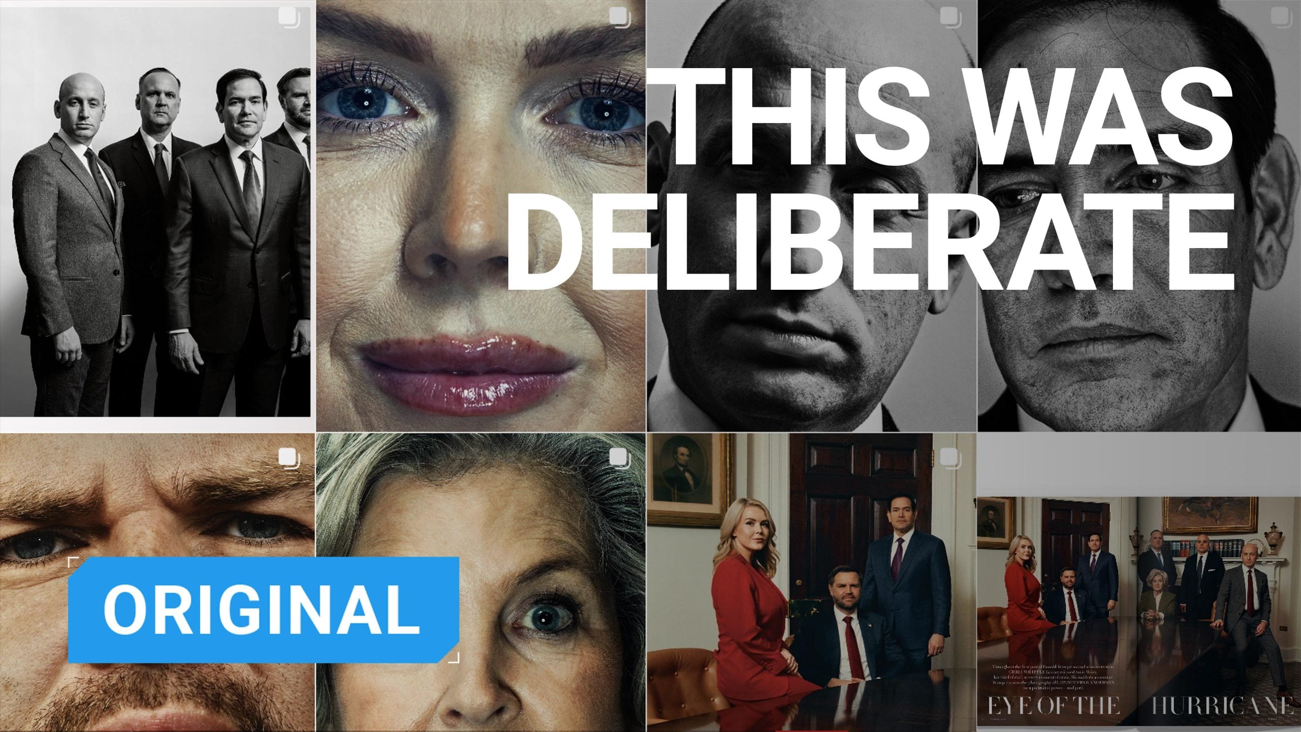
Everyone right now, it seems, is talking about those photos. You know, the ones of the current White House administration that accompany a particularly damning pair of interviews with White House Chief of Staff Susie Wiles in Vanity Fair Magazine.
A couple of years ago, if I’d been forced to make a bet, I probably wouldn’t have put money on a fashion magazine being the one to create one of the hardest-hitting pieces of political photojournalism of 2025. But well, here we are.
Why These Photos Shocked Everyone
When Vanity Fair first published these photos, they threw everyone into a brief state of confusion. They were shot by Christopher Anderson, and I believe the initial reaction was one more of ‘huh?’ than anything else. These were not your usual journalistic images of powerful political figures. In fact, if anything, they almost look as though they were hurriedly shot by the white house intern rather than an established and celebrated photojournalist and fashion photographer.
The photos range from monstrous extreme close-ups to pure messiness. You’d be forgiven for thinking they were accidental, but I can assure you that these images are anything but.
Nothing Here Is Accidental
At first glance, the images may look a little chaotic at best and downright unflattering at worst. “Perhaps Christopher Anderson doesn’t know how to take a better photo?” you may ask. Well, that’s a completely incorrect analysis, and it’s pretty clear when you read Anderson’s biography and view his extensive body of work that this argument just doesn’t stand up.
Anderson is a veteran photojournalist. He began as a war and documentary photographer, winning accolades such as the Robert Capa Gold Medal. You don’t win that by accident. He then moved on to working with a list of publications that reads like the ‘best of’ in the world of publishing, including 3 years as the photographer in residence for New York Magazine. He later worked in fashion, portraiture, and film, achieving similar success.
In Anderson’s defence, he has stated that the White House images are a piece of pure photojournalism, and he actually shot them with both film and digital. Clearly, he intended to document the scenes as they were, without tidying up either on-scene or in post-production. He also has a vast portfolio, which includes many extreme close-up portraits of other politicians. He stated to The Washington Post that the most recent images are merely an extension of this work, and he didn’t have a personal agenda.
That being said, we must also acknowledge that the eye of a photographer will always contain some sort of bias. In this particular shoot, decisions were made, very deliberately, in order to create these images.
Clutter, Imperfection, and the Airport-Hotel Effect
Anderson says that he was drawn to the assignment because he wasn’t expected to create visually perfect political portraits. And so what we are left with is a set of images which, at first glance, are quite jarring. There’s no attempt to flatter the subjects, no running around in advance by a stylist unplugging power cords or straightening lamp shades.
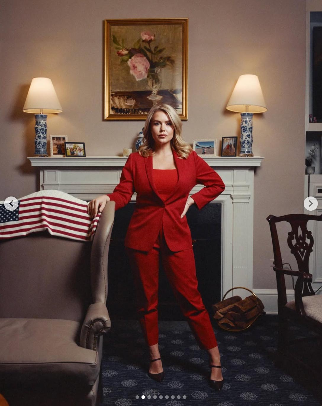
The full-length image of Karoline Leavitt features a rumpled blanket and a bum indent in the chair she’s standing next to. Somehow, the White House is made to look like a cheap conference Hotel next to an airport, not the seat of power, and perhaps that is the point.
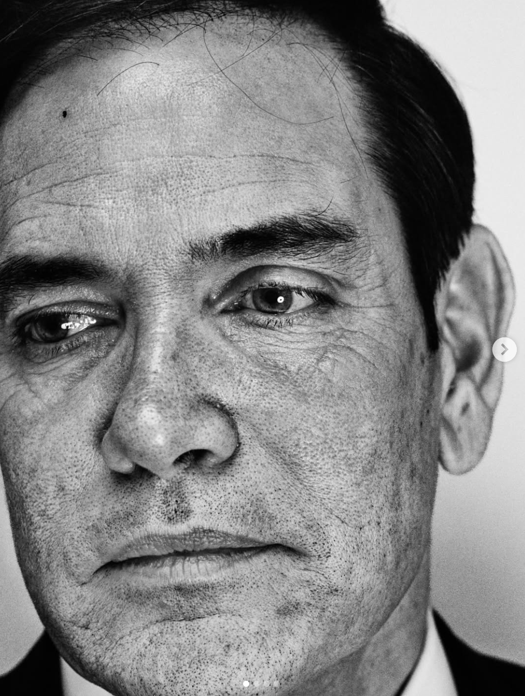
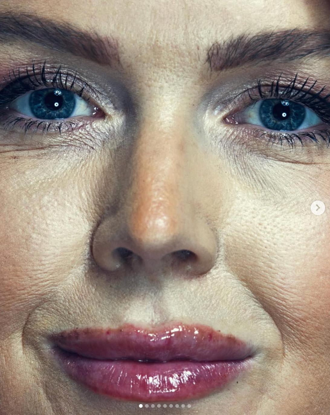
Then there are the extreme close-ups. These are so uncomfortably close that I believe no human could stand up to this level of scrutiny. Anyone who has looked at their face in a magnifying mirror will know what I’m talking about.
We can see what look like filler injection marks on lips, orange contouring down the nose (no ‘brown nosing’ here), and in the close-up image of Marco Rubio, pores that look worthy of a sun damage imaging map. It appears that Anderson used a beauty dish to shoot these close-ups. Any photographer knows that you generally don’t use hard direct light on older skin unless you want to make a statement. Anderson knew what he was doing and made choices accordingly.
Making Power Look Awkward
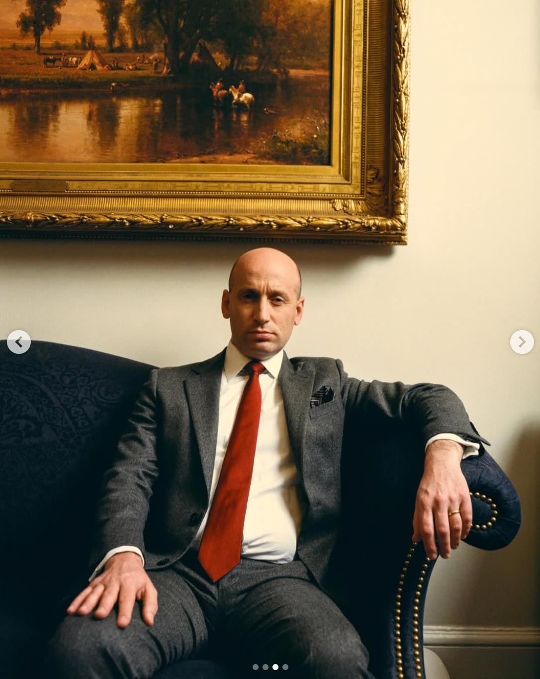
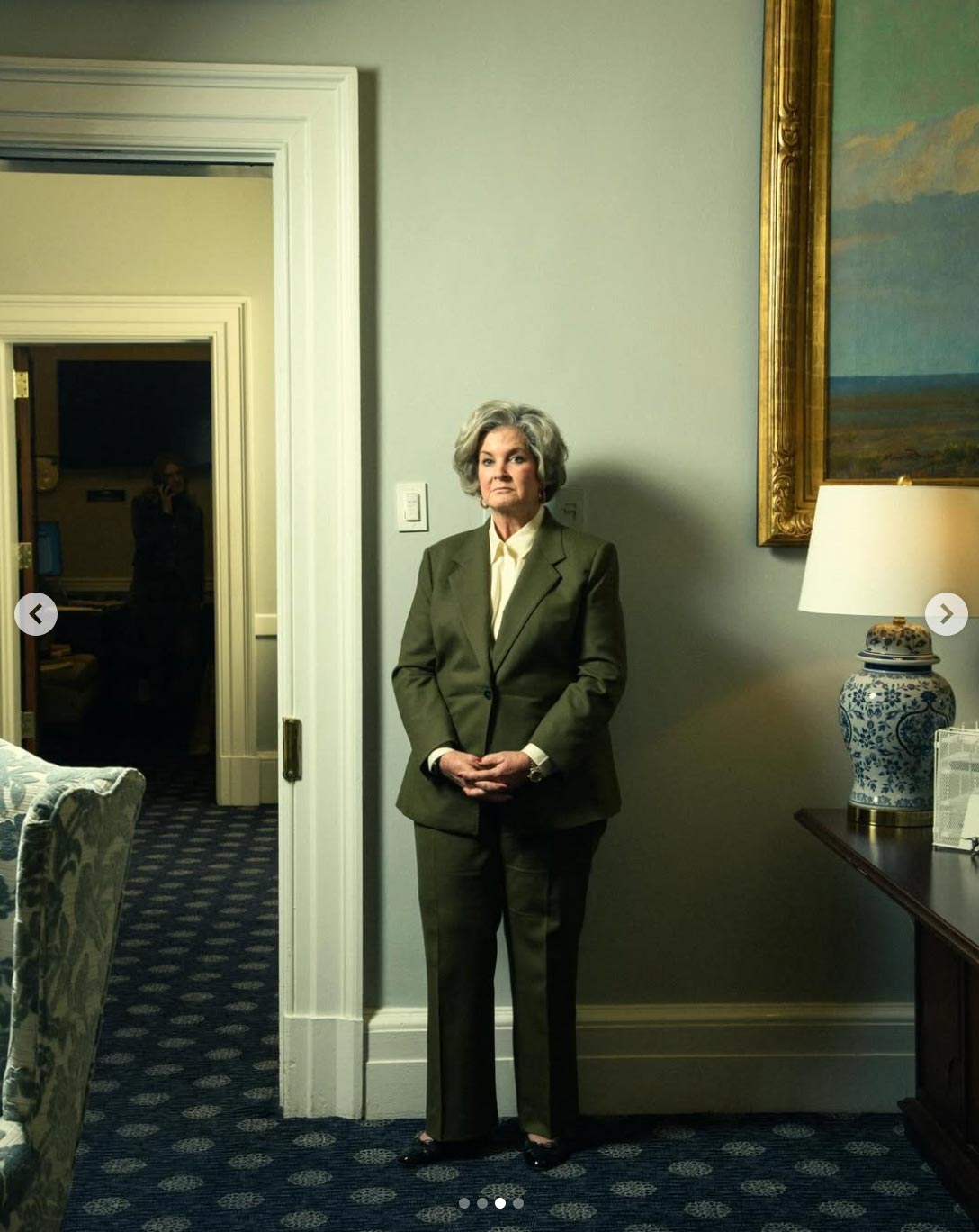
The politicians are posed in awkward positions, while the compositions in these portraits further diminish the sense of authority. The subjects appear smaller and less imposing than usual political portraiture, often backed up against walls next to light switches. Their reflections are often cropped out of frame, leaving figures visually incomplete or distorted.
At the same time, the images occasionally draw the eye toward peripheral, shadowy figures in hallways or props in corners. These are subtle, almost incidental presences that hint at action happening beyond immediate view, such as on the left of the image of Susie Wiles. We can’t help but be drawn to the dark shadow of a man on the other side of the hallway.
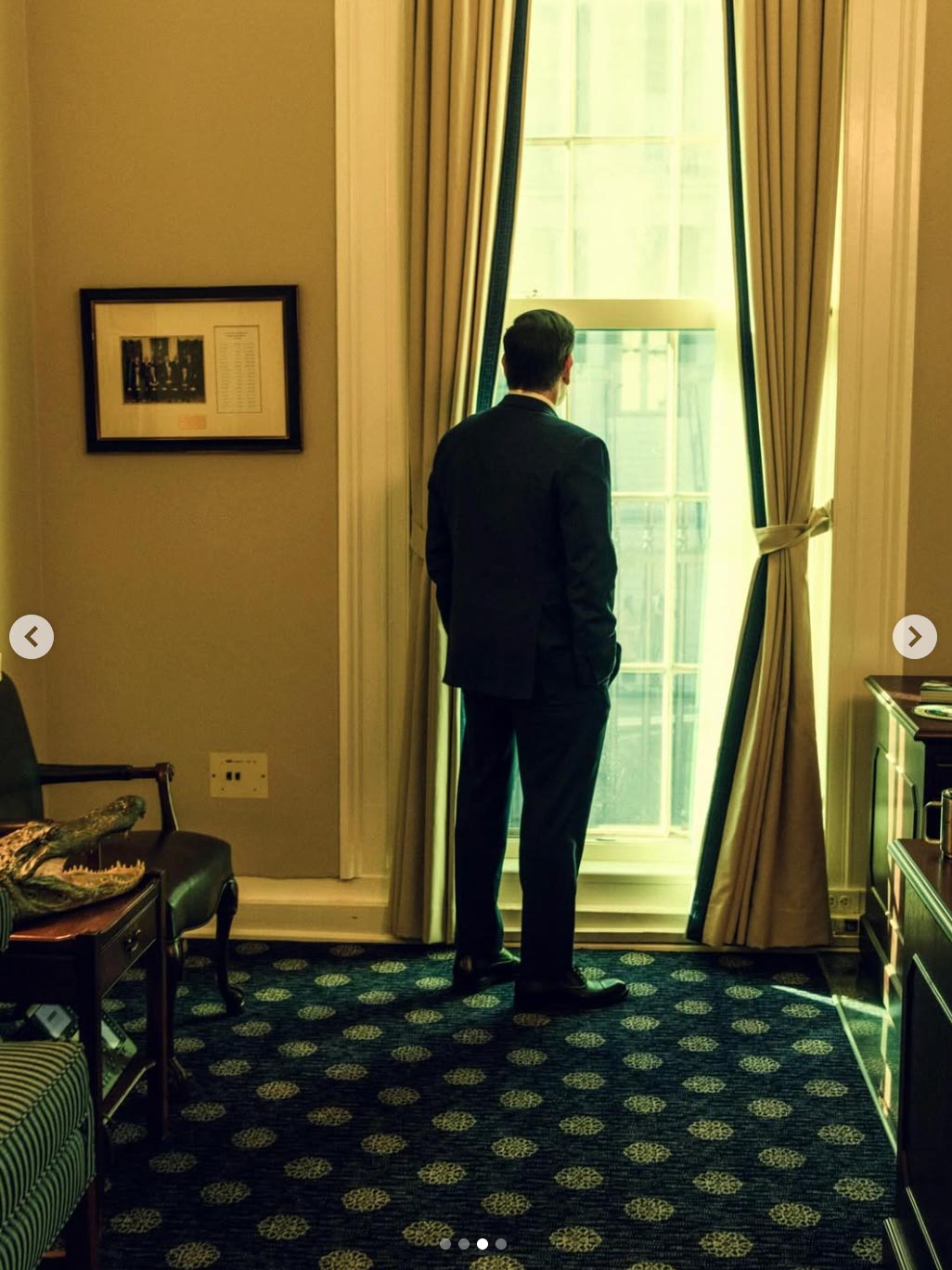
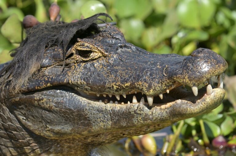
The addition of the crocodile head of Marco Rubio’s image is pure theatre, with a strong nod to his Florida seat. Similarly, the choice to seat Stephen Miller beneath a painting of Native Americans was a bold one, and honestly, worthy of a Pulitzer in itself. The irony here is almost palpable.
In the past, these compositional choices would have been used to unnerve or dominate, but here they are repurposed to humanise the subject, provoking echoes of the past and a sense of visual unease.
Not Monarchs, Just Elected Officials
What Anderson has done so well is not to ridicule the White House staff or make them appear absurd. He has focused his lens purely on his subjects in an unflinching way, letting the scenes unfold by themselves without needing to do much more. What we are seeing here is the White House without the polish or retouched veneer. These politicians desperately wanted to be seen in a flattering light, and Anderson has stripped all of that away.
Anderson’s photos remind us that these are essentially just ordinary people, serving the public as elected officials for four years. They are not monarchs anointed by God. They are human and have flaws. In making that observation, Anderson demotes the White House staff back down to the same status as the rest of the American people. That in itself is a powerful statement.
The Photographer’s Invisible Hand
Anderson has deflected many of the critiques by saying that political portraiture is closer to documentary photography and should be approached as such. When the choice to not airbrush a subject is so controversial, we must take a moment and consider where we’ve got to.
“The internet seems shocked by the choice to not retouch any blemishes or wrinkles,” says Anderson. “It’s shocking to me that the world expects reality to be removed from a picture. My intention is not mockery or cheap shots. I’d like to think I’m a stone-faced but critical observer. Celebrity photos are celebrity photos. Politicians are not celebrities. Let’s not mix things up.”
What These Photos Reveal About Power
Taken together, the Vanity Fair portraits make a clear point: clutter, awkward framing, and extreme close-ups all serve to strip away the usual sense of authority afforded to those in power. The eye often falls on shadows, background figures, or spaces between people, suggesting that the real work of power happens out of view while the public focuses on the spectacle. We may want to ask ourselves what is happening this week in the background while we are all losing our heads over a few unflattering photos. Perhaps nothing…
In these images, the White House feels human, temporary, and decidedly unkingly. It’s not showing us the usual pomp and ceremony that a space like the Oval Office usually transmits. Instead, the White House feels like a place occupied for a short time, not a symbol of lasting power. By showing power this way, the photographs quietly remind us that authority is temporary and can always be held accountable. In a post-truth world, Anderson’s images have brought us back to raw reality.
See more from DIYPhotography.net on Google
Add DIYPhotography.net as a trusted source. This makes
our stories more likely to appear in your Google Search results.
 Add as a preferred source on Google
Alex Baker
Alex Baker is a portrait and lifestyle driven photographer based in Valencia, Spain. She works on a range of projects from commercial to fine art and has had work featured in publications such as The Daily Mail, Conde Nast Traveller and El Mundo, and has exhibited work across Europe
Related Posts
 Hilarious Photoshop fail of Vanity Fair cover adds extra limbs to Reese Witherspoon and Oprah Winfrey
 Rumer Willis calls out Vanity Fair photographers for ‘bullying’ with unrealistic Photoshop picture
 Vanity Fair photographers respond to Rumer Willis, say it was lens correction that warped her features
 For the first time in history, “Vanity Fair” cover shot was taken by Black photographer
Join the Discussion
DIYP Comment Policy
Be nice, be on-topic, no personal information or flames.
3 responses to “The Vanity Fair Whitehouse Photos Are Messy, Awkward, and Totally on Purpose”
Thirteen year old mean girl mentality posing as political heroism.
Have any of these haters ever looked at Richard Avedon’s portraits? I didn’t think so. (eye roll)
LOL – shitty human beings deserve accurate photos – these people lie so much about everything, let’s all see the ugly truth.