


Ready Player One poster ridiculed for bad Photoshop, turns out to be accurate
Dec 17, 2017
Udi Tirosh
Udi Tirosh is an entrepreneur, photography inventor, journalist, educator, and writer based in Israel. With over 25 years of experience in the photo-video industry, Udi has built and sold several photography-related brands. Udi has a double degree in mass media communications and computer science.
Share:
If you are a sci-fi geek like me there is a good chance you’ve read Ready Player One. I read it a while back, and while I really loved the general idea, I think that the plot was lacking. This is why I was very excited to hear they are making a movie. Maybe they’ll correct what needs to be corrected.
But, this is not a Sci-Fi blog, it’s a photo blog, so today we explore the “was that a photoshop error” that is the Ready Player One poster.
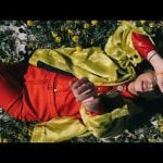
The movie poster was released about 6 days ago, one day ahead of the trailer. And faster than you can end a game of Pacman, fans started to mock the poster for poor compositing. Specifically, for giving Tye (the hero) a borderline-freakish long right leg. Judge for yourself:
 Not seeing it? here it is again:

Now, the internets were all over this, but is this a case of bad photoshopping? Some analysis shows that this may just be a camera perspective trick.
A lengthy (yet interesting) thread from Captain Disillusion breaks down Tye’s body by perspective and body proportions, to show that the knee (and overall leg length) are just right. (click here for the full breakdown)
Well, what do you know? The half-way point, as dictated by the rules of perspective, lands squarely on his crotch! The part of the body below the crotch, a.k.a. the leg, appears to take the amount of space in the bounding box it's typically supposed to. pic.twitter.com/zNooHFgEXD
— Captain Disillusion (@CDisillusion) December 10, 2017
And another artist actually went through the length of putting a skeleton demo on the photo to show that it’s anatomically correct. (this was sent here, so if you know who to credit, please let me know)
 Sometimes, it’s not on the compositing artist, it’s simply on a poor angle selection.

Udi Tirosh
Udi Tirosh is an entrepreneur, photography inventor, journalist, educator, and writer based in Israel. With over 25 years of experience in the photo-video industry, Udi has built and sold several photography-related brands. Udi has a double degree in mass media communications and computer science.


Join the Discussion
DIYP Comment Policy
Be nice, be on-topic, no personal information or flames.
19 responses to “Ready Player One poster ridiculed for bad Photoshop, turns out to be accurate”
Plot was lacking? Sorry I stopped reading after that.
It looked normal to me from the beginning. What is the point of the analysis anyways,the outcome doesn’t matter.
Great, So the conclusion is that it isn’t bad PS but bad composition…?
It’s only a poor angle for those with weak minds.
Simply sneering from untalented and incompetent losers, from the get go. Furthermore, if that leg *was* ungodly long, what would it matter? Especially in a poster for a science fiction film :-)
If his leg were longer than the other he would be walking in circles the whole movie ;-)
That might make it a Modern Dance movie, not a bad idea! Or, if it was a horror movie and a woman… “No Escape from Matt Lauer!” :-)
It’s not “poor angle selection” it is the armchair artists who never had a proper founding in anatomy for artists…
What about that poor rim light on the hero’s face? It looks more awkward to me than his leg :)
Exactly what I thought lol
Err…is there a reason that the right leg in that skeleton appears to be completely detached from the rest of the skeleton?
you can’t see the end of the femur where it plugs into the hip.
Hero’s name is not Tye, where the heck did you get that from? His name is Wade Watts and his avatar’s name is Parzival but that’s just someone who read the book or did a quick Google search. Also could throw in there that none of the other side characters have the name Tye. Well done on doing research before publishing.
Tye is the actor’s name.
The actor playing him in the movie is named Tye. You know the movie the poster is for. The guy on the poster. Try doing some research before commenting
This is like all the internet tears shed over cgi ? Clueless trolls think they’re experts on things they themselves can’t do
LOL the top of the femur isn’t even attached the the skeleton
Added: the top of the femur should be angled backward and inward
Glad I’m not the only one who sees that.
It still looks off to me. Somehow it doesn’t work with the perspective or something.