


How Reading Comics Will Improve Your Photography
Nov 3, 2014
Guy Viner
Guy Viner is a conceptual photographer based in Carmiel, Israel. You can follow his (Hebrew) musing here, his Facebook here, and his art on 500px
Share:

In June 1938 ‘action comics’ were published and Superman was introduced to the world. Not only was the character of Superman was born that day, but also comics as we know it. Today, 76 years later, comics is a multi-billion dollar industry.
Over the years comics became less cartoonish and more realistic, to the degree where today many refer to it as “graphic novel” rather than “comics”. Comic artists are great story tellers and by inspecting their art we can extrapolate and get inspiration for our own art. As an art form, comic books have a lot to teach us about photography.
Before we start, it is important for me to explain that I didn’t focus on a specific character or series, I tried to find examples from all around the comic universe, both male and female characters, well known and anonymous characters, DC and Marvel, old and new. With the main premise that Photographers can benefit from comics in a similar way that comics artist have benefited from photography.
Let’s start with something we all relate to comics, the superheroes!
I call it ‘The Hero Shot’

Notice something common among all the frames?
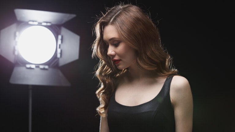
In all the frames we see the hero, shown from a slightly lower angle, making us feel that the hero is bigger and stronger. Most of the time the background is filled with action: lightning, explosions and bodies. Those make us thing that the hero lived through the battle and won. To translate it to photography terms, if you want to shoot a portrait that shows a strong character place the camera a bit lower than eye level. That way the torso will look bigger and more authoritative. Blurry background will make the viewer think that the character has been though a lot. This type shot is used a lot in movie posters and sport portraits.

These sports portraits were also shot from a lower angle, making the athletes look stronger and more epic (can I say Epic-er?).

Here is another, less epic example. Two pictures of me, taken with a smartphone camera, same pose, and same clothes – the only difference is the camera angle.

Death and Defeat
Another famous pose that comics illustrators embraced is the “death pose”

This pose was first used in 15th century by Michelangelo the renaissance artist in his sculpture called ‘The Pieta‘.

The sculpture depicts Marry and Jesus, and maybe that’s why comics illustrators use it so much. By using that particular pose they give their heroes a religious look, and to us, the readers, the feeling that the person who died is not a normal men but a god. Another way the comics illustrators love to show the deaths of their heroes is by using a top down vantage point…

These are the exact opposite of the ‘hero shot’ we talked about in the beginning. The hero is lying down, defeated, the higher angle making him look small and fragile, the fact that the hero is shown from that angle makes us feel that he is no longer invincible and almighty. In the picture of superman the shadow of his enemy falls on his broken body, showing how much he is broken and showing who broke him.
There is another great way that I picked up from reading comics that show the downfall of someone. Most of the superheroes associated with something, like Superman and his cape, Batman and his mask, Wolverine and his metallic claws and Captain America and his shield. So how can we show the demise of a hero in an alternative way? We can destroy the thing he is most associated with.

Another interesting thing I learned from comics is how to use colors correctly. I want to start with showing some covers of the Batman series against some covers of the Deadpool series.

Notice anything each group has in common? If you don’t see it, “zoom out” from the screen and try again. Can you see it now? All the Batman covers are dark colored while Deadpool’s are bright and colorful. What can we learn from it? Let’s pretend we don’t know who Batman is and we don’t know who Deadpool is. (which may actually be true for some readers) What would we think? That one is a funny and not that serious while the other is a dark and sinister character. That is spot on! Deadpool is the kind of character who doesn’t take anything too seriously, and Batman… Batman… why so serious?
Even if we will we look at the same characters, but in a different stories, the art and atmosphere will not be the same. The next picture shows a page from the comics ‘The Killing Joke’ by Alan Moore and Brian Bolland and a page the comics ‘Joker’ by Brian Azzarello and Lee Bermejo.

We can see that one book is funnier because it has colorful and bright colors. While the other is darker and more serious. That doesn’t mean that when you want to give an image a dark feeling you need to lower the saturation. But it shows a way to control the feeling of the viewer by choosing the right colors and brightness.
The last thing I want to talk about is Black & White
We talked about colors, and the atmosphere they give to the story. Black & White can give a similar feel only by using ‘High key’ and ‘Low key’ instead of saturation and desaturation. The comics below are The Walking Dead vs. Sin City.

This is a great example of using High key’ and ‘Low key’.
Both comics describe very dark stories and atmospheres: one describes a world filled with zombies and the other a world full of crime and prostitution. Using brighter colors (high key) in The Walking Dead provides an optimistic perspective. On the other hand the use of black colors (low key) on Sin City provides a constant feeling of a wrong world.
To show how this applies to photography, here are two versions of the same photo. I took those to show how significant the difference can be and how it really changes the mood. Even without a person in the frame you get different “vibes” from each shot.

In the comic Watchman they took the concept to a higher level and combined a low key frame (the first frame) with a high key frame (the last frame) to make the scene look more dramatic. Using a slower transformation of colors they made a story of an atomic bomb look real in a picture.

Being a good photographer means drawing inspiration from everything. And comics are a great way to get ideas. Be open-minded, try several types of comics, try looking for more photographic angles or color-themes, analyze the pictures you see and be inspired by that.


Guy Viner
Guy Viner is a conceptual photographer based in Carmiel, Israel. You can follow his (Hebrew) musing here, his Facebook here, and his art on 500px
Related Posts
 The Art Of Reading Captured By New York City Photographer During 20 Year Career As A Photojournalist
 Princess in Hot Water for Posting a Photo of a Homeless Person Reading Vogue
 This “mind-reading” AI turns your thoughts into photos
 Kai’s photography tips for newbies: where to start and how to improve your photography
Join the Discussion
DIYP Comment Policy
Be nice, be on-topic, no personal information or flames.
13 responses to “How Reading Comics Will Improve Your Photography”
Look like someone just discover that comics and photography are both from painting.
@lancekingphoto I’d rather prefer a book on photography, but hey, we all strive to justify things we like in many weird ways
great!!
It’s “The Killing Joke”, not “The Killer Joke.”
good to see another comic fan. fixed that.
I apologize if I came off too blunt with my previous post. I’m glad to have been able to help. I’ve grown up reading them, and I still read graphic novels (which includes “The Killing Joke”). BTW, a little interesting bit of info: George A. Romero, the director of “Night of the Living Dead” admitted that he used to read comics when he was younger, and that helped him understand how to tell stories in a visual medium, which helped him out in his early commercial/documentary work and “Night of the Living Dead.” :D
I was thinking of looking at book and album covers, and movie posters for inspiration. Never considered comic books.
This is beyond ridiculous…
This thought me a lot!
Thank You!!
SUPER MANN !!!!
I just started coloring comics as a side job/hobby. I wont say which ones but they are on Amazon. Anyway, I have always been a photographer who used a lot of off access light / 3 point. I now use a lot of the same lighting principles when I color. It creates dept and sculpts the characters.
Axis not access… sorry. :1-