


How To Create The Tastiest Vintage Themed Coffee Ad
Mar 9, 2015
Lars Brandt Stisen

Udi Tirosh is an entrepreneur, photography inventor, journalist, educator, and writer based in Israel. With over 25 years of experience in the photo-video industry, Udi has built and sold several photography-related brands. Udi has a double degree in mass media communications and computer science.
Share:

I recently did a vintage themed coffee ad and documented the process to show what goes into making stuff like this.
While the ad is centered around the product packaging rather than its content (more on that further down), the basic idea was to return the object, a coffee tin from the 1960’s Denmark, to its own time period in a nostalgic veil of bygone times, playing on atmosphere rather than the practical benefits of coffee.


The slogan on the slip-on cover is in Danish and reads “the best name in coffee”. This was to be carried over as an integrated part of the ad.
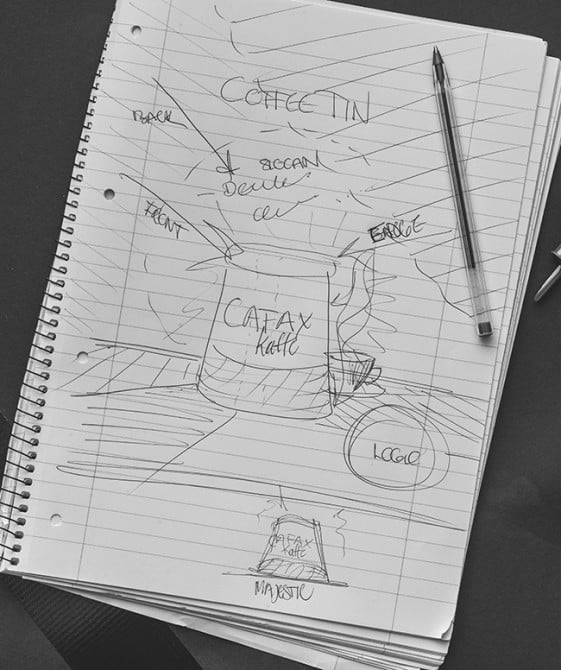
A quick sketch outlining the concept: As in many vintage ads for consumables the product packaging rather than its content has a central spot, naturally because you want people to recognize the packaging on the shelves at the grocery store etc. Today you typically create a story around the product and promote the brand instead.
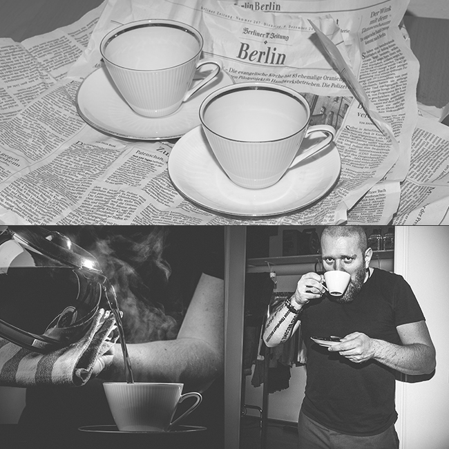
I acquired the gold rimmed china from one of Berlin’s many secondhand stores and it was exactly what I was looking for. Now it was time to get in the mood with an appropriate cup of coffee!

I fitted black cardboard on the saucer eliminating part of the light bouncing back onto the cup. I then re-shot the saucer without the cardboard on a lower output to be edited in during post. This will make the cup rest more in the background of the scene and preserve attention to the coffee tin, while keeping important highlights alive.

The lighting setup with a soft sidelight, snooted edgelight and a circular splash on the backdrop. The cardboard strip hanging down in front is used to create a reflection in the product, emphasizing its three-dimensional shape. I shot the products with an 85mm prime lens for moderate compression.


The cup and saucer before and after touch-ups with enhancements to underline the golden theme.

I hand-traced the slogan (“the best name in coffee”) from the slip-on cover to create the brass lettering. The graphics are comprised from several displaced layers and blended with a shine to create the dreamy three-dimensional effect of the floating letters (no 3D here).

Thank you for watching! I hope you enjoyed this little peek behind the scenes and let me know if you have any questions.
About The Author
Lars Brandt Stisen is a commercial photographer from Denmark serving international clients in advertising and fashion from his studio in downtown Berlin Germany.
You can follow his work at his website, Behance, on his blog and on Twitter
We love it when our readers get in touch with us to share their stories. This article was contributed to DIYP by a member of our community. If you would like to contribute an article, please contact us here.


Join the Discussion
DIYP Comment Policy
Be nice, be on-topic, no personal information or flames.
2 responses to “How To Create The Tastiest Vintage Themed Coffee Ad”
Nice final image, any advice on how to get the steam?
Thank you Robin! The real thing was too busy looking for what had imagined, so I created a few shapes in Photoshop and blended them together with different opacities. I finally added some grain to give it a convincing vapor look that would stand up to a closer inspection on the highres file, and look nice on print etc. :)