


How to get killer selections with Channels and Vivid Light
Jul 31, 2016
Joseph Parry
Joseph Parry is a Commercial and Editorial photographer based in the UK that provides cinematic photography and ounces of humour. Follow him on Instagram for stories and kick ass imagery.
Share:

Ever since wanting to focus on colour in my images I’ve found that often times due to budget or location, that I just quite simply cannot get the colours I’d like right in the camera. This means that I’ll often have to change colours in post and that, of course, in turn requires decent selections! There’s a million ways to do that in Photoshop, but I want to give you a kick start guide right here with a basic setup that I truly believe will change your life in selection if you’re unsure of this process.
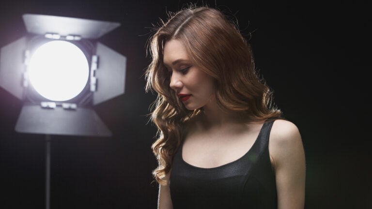
Take this image we’re working on today for example, it’s a hand made custom dress that is white in colour (though tea stained) meaning unless I want to change the colour of the dress drastically I’m pretty much limited to working either monochromatically, complimentary or tertiary harmony based around it.
Since I’m trying out a new way of working in post with regards to changing colours I decided to keep it simple and go for a basic complimentary colour scheme edging on the side of dark blue / magenta + yellow this is twisted in it’s hue slightly to match a more muted tone rather than the usual Orange / Teal people are used to seeing.
I base my colour harmonies on the Goethe colour wheel and using Colour Scheme Designer 3 to make it all come together by eye. But the key thing here, is that I’m using a colour palette to guide my choices. There’s a goal in mind.
Step 1: Our image

Step 2: What we want to select
Obviously we want to select either the background / the dress and that gives us the separation we need in order to change the colours to our taste.

Step 3: Upping Saturation / Hue.
First things first we’re going to be using channels for our selection because I honestly believe it to be one of the best tools you can use in Photoshop, it’s not the only one, but man it’s killer! Upping the saturation here allows us to put the image firmly into a colour rather than a more muted / blended set.

Step 4: Channels (Which one looks best?)
Swap over to your channels tab and click through them to see which one looks best (you may have to untick the eye on the RGB channel first and then click through the layers). Normally “Red” will give you a decent selection on skin, because skin has a lot of well.. Red in it :D.

Step 5: Pick a channel
The reason we are using Hue / Saturation as opposed to pure saturation is because we are working with “Channels” that are primary colours (Red, Green Blue). The dress and rocks etc are all yellowish meaning we’re looking at a blend between red and green (at a first guess) so we can either click through the channels and see what we have OR change the hue on a channel to move it more towards a primary colour if needed!
Here you can clearly see that whether we move the hue on “Red” or select “Blue” both come out looking the same, so in this instance it’s purely personal preference, though I would pick “Blue” for a cleaner workflow.


Step 6: Refine the mask (Saturation).
Here we want to refine the mask as much as possible and we can do that in 4 steps (the first we’ve already done with Hue / Channel Selection). Step 2 in this process is using saturation to help give us even more separation, for me I found it was the best by dragging the saturation down a touch from where it was initially.

Step 7: Duplicate the channel.
OK this is where we move from temporary mask work (seeing what we can achieve with non destructive adjustment layers etc) and into the realms of making and working on a selection / mask. First things first here is to right click on your chosen layer (Blue in this instance) and select “duplicate”. Name it whatever you wish.

Step 8: Select the channel
Sounds silly, but make sure after duplicating this layer you actually select it, it doesn’t always select it by default so you can end up working on the original RGB channel and messing up your image!

Step 9: Refine the mask (Levels)
Step 3 of refining the mask is hitting CMD / CTRL + L to bring up levels and dragging the blacks / whites inwards to find the biggest contrast you can that still retains detail (you can choose to remove this detail later for a purer selection but it’s better to have the detail first in my opinion).

Step 10: Tools (“Vivid Light”)
OK, here’s the bit that will blow your mind. We are going to take a brush, set it to “Vivid Light” and a low flow (5% or so). Gently start painting over your selection and you’ll see the magic start to happen. You see what’s happening here is when you paint with black, anything from mid grey down to black is painted and anything above that is ignored. Likewise with white, anything from mid grey upwards to white is ignored.
The magic of this means that as long as skin is a grey colour / black we can easily paint over our clothing in white to get a killer selection.

Why is Vivid Light useful? Imagine painting over a string vest or a dress with holes in it.. The skin would likely be grey in certain areas and so comparing painting with “Normal” vs Vivid light means we can either zoom in and paint like a madman to get everything separate OR we can paint rather bluntly and in a way “Not giving a shit” (though we do of course) and achieve a flawless result in seconds.
Here’s a crude example I say crude because you could use levels here to achieve the same thing, but I’m hoping you can see the benefits here when skin would be grey from light falloff and shadows etc:
Step 11: After “Vivid Light”
After a quick brush around you can see we’ve easily managed to create a clean cut around the dress which now gives us the option to clean up teh rest of the selection with a “Normal” brush.

Step 12: After “Normal” brush.
Select “Normal” and a high flow and paint the rest away / fill in what you want!

Step 13: Selection
Now we want to select our hard work! Hold CMD / CTRL + Click on the thumbnail and VIOLA your selection will be made.

Step 14: Using the selection
Click back over to your “Layers” tab and add whatever you wish (I chose a curves adjustment layer) this will automatically add the mask onto whatever you add. If you want to put it onto something you already have, just click on the layer you have and then click on the “layer mask” button (the rectangle with a white circle in it).

Step 15: Turning off Hue/Sat Layer
Now let’s make our image look normal again, turn off the temporary layer we made earlier (or delete it!).

Step 16: Fixing mask display
If it looks like this afterwards make sure the eye is turned off on the selection under the “Channels” tab (you should just have RGB and the R,G,B channels turned on).


Step 19: Blend mode + Curves
Now use your curves or whatever you chose to edit away! I shoe to invert the mask for my final image and change the colour of the background to complement the dress. I highly recommend swapping your blend mode over to “colour” if you plan on shifting colour and want to keep the same luminosity.

Step 20: Final Use
All done!


Hope this helps you in those selections out there folks! Keep rockin!
-JP

Joseph Parry
Joseph Parry is a Commercial and Editorial photographer based in the UK that provides cinematic photography and ounces of humour. Follow him on Instagram for stories and kick ass imagery.


Join the Discussion
DIYP Comment Policy
Be nice, be on-topic, no personal information or flames.
14 responses to “How to get killer selections with Channels and Vivid Light”
How did the photo come out so yellow? Why didn’t you shoot raw and save yourself all those steps in photoshop? I hope you only had one photo to fix.
Did you even read the article at all before throwing your two cents worth in? The article is not about correcting white balance from a jpeg at all. There was reason why the original picture is more yellow and that is because the OP was aiming for a complimentary color scheme between subject and background as the article clearly points out.
The article makes no sense, how could the dress be white but tea stained? Did someone spill tea on it? The reason why it is tea stained is because of the bad lighting he used or that the photo was shot in jpeg, which baked the bad color in. If he shot it in raw the white dress will be white or be able to easily corrected without all those steps in photoshop. Maybe he is one of those ” I’ll fix it in photoshop, type of photographer” It’s always best to get it right in camera so you won’t have to spend hours correcting in photoshop. You do also realize that the stones and model’s skin are also tea stained. Did someone just throw tea everywhere before the photographer arrived..lol
Again, the whole point of this article isn’t about the white dress should be white, RAW VS jpge or even “how to colour correct the dress/skin tone”. It is about creating complimentary colours between the subject and background through a section method.
He didn’t even change the colours of the dress and the model for the final image.
If you don’t like the dress being too “tea stain like”, that’s fine. Maybe it isn’t the best image to express the idea. However, the same method editing method is still applicable.
Also, you have to understand that a lot of them purposely “over do things” to make things more obvious.
I totally get the method is he using to create a selection. This is nothing new but his explanation is confusing. It would have been better if he did a video. If you check youtube you can find better explanations of the technique. What thew me off his is mention of the lighting situation and tea-stained. All could have been solved with shooting raw. If he intentionally, made the image yellow (tea-stained) just to demonstrate this technique, then he should have mentioned that in the post and I wouldn’t deem it necessary to leave a comment.
I shot this in raw.. and the dress was stained with tea for it’s colour. What’s confusing?
I didn’t make the image “yellow” or “Tea Stained” by accident, it’s simply a warm white balance. It’s not a mistake it was a temperature choice that suited the dress and skin.
I chose this image specifically because it’s a hard selection to make (because everything is a similar colour).
Shooting the picture to complement the skin and dress allowed me to select the subject and change the rocks to complement her in post.
I’m not sure what you’re talking about?
If I dialled the white balance lower the image would look more “neutral” but then I’d still have to warm the subject up and cool the rocks back down to get to the same place. Why waste effort?
Shoot either blue for the background and warm the subject in selection OR do it the way I did.
It was natural light, the dress was hand made, no way to change the colours or increase separation in this instance SOOC. Shooting RAW is something I already do, so you’ve lost me there?
Hahahaha Steve. My good sir. I commend you. If you would like a print of this photo to remind you of this moment, please let me know! I would love to send you one as a thank you for being so awesome.
Ha I appreciate the gesture JP and I would love a print however I am in the process of packing all my stuff up and moving overseas. Just trying to keep things reasonable in the comments section ;)
You did a great job. You shouldn’t waist your time with guys like DJ Bravo.
looks cool but please, be sure to post it step by step, I was half-guessing some of the steps you did! E.g. it’d be useful if you could include which layer you choose. Couldn’t really do it all right:(
I’m really sorry you found it difficult to follow, I posted 20 images and drew arrows on the one’s where I changes layers etc and wrote what and why I was changing things under each step?
Would you be able to be more specific about which steps you found difficulty following? Perhaps I can clarify them for others, thanks!
Thanks for taking the time to provide this tutorial Joseph – good stuff. As to some of the comments posted – some people just don’t get it and never will. Thanks again.
Thank you Peter. It can be somewhat overwhelming spending a lot of time to convey and share knowledge and in return you get a long log of negativity based on people not even reading what you’ve done.
Really means a lot to me knowing there are people out there who appreciate the effort and take the time to read the article before commenting.
You wouldn’t review a meal before seeing / eating it, so I’ve no idea why people do the equivalent of that with articles.
I think you summed it up perfectly my friend. Thank you once again.
-JP
Thanks, very helpful :-I