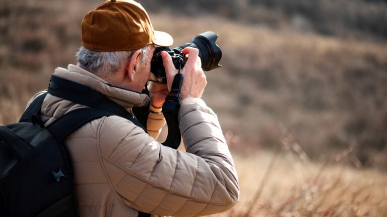


Follow these eight tips for stunning colors in your photos
Apr 2, 2021
Dunja Đuđić
Dunja Djudjic is a multi-talented artist based in Novi Sad, Serbia. With 15 years of experience as a photographer, she specializes in capturing the beauty of nature, travel, concerts, and fine art. In addition to her photography, Dunja also expresses her creativity through writing, embroidery, and jewelry making.
Share:

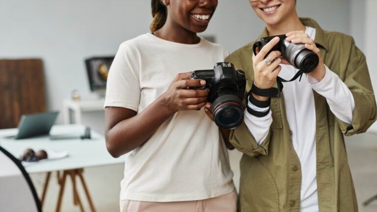
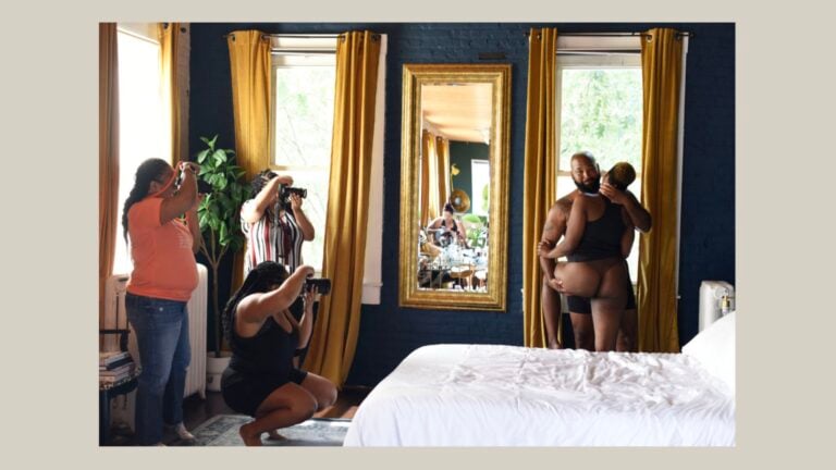
Whether it emphasizes the subject or is a subject itself, color is a powerful ally in creating a striking image. In this video, Jamie Windsor gives you eight tips that will help you master the use of color in your photos. He supports each of them with a set of wonderful examples, so take a look, take notes, and enjoy.
1.Make color a major subject
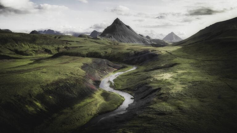
Before we start shooting, we need to decide why we use color and how we want to use it. It can be a great way to emphasize your subject, convey a message, even construct your own style. It can also become a subject of your image on its own – you can make an entire image be about color.
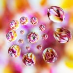
2. Be abstract
Light, reflections, color casts, shapes – these are all the things to pay attention to when you want to shoot abstract. Try not to view the world around you as people or objects. Don’t think about the objects’ functions, but rather think in terms of shapes, areas of color, and their aesthetic value.
3. Be surreal
Whether you use infrared film or digital editing software, you can manipulate the colors in your shots. Most of us do make color edits, but you can take that very far and create surreal and striking work with unexpected colors and effects. You can also shoot through objects like gels, prisms, and experiment with the colors it will give you.
4. Be selective (color theory)
When using colors in your image, it’s equally important which colors you leave out. Learning color theory will improve your use of color a lot, but it can be a little intimidating if you’re new to it.
However, Jamie suggests that you start by learning the two most common color harmonies: analogous and complementary colors. You will find plenty more color theory tutorials and fun videos here.
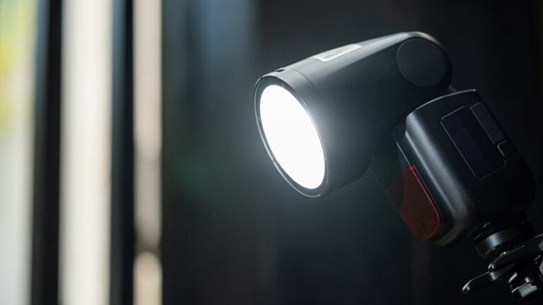
5. Use colored lighting
Colored light adds a kick of color to your photos taken at night. You can use color gels for your speedlight, or simple desk lamps with colored light bulbs, or even your computer or TV screen. When you’re outdoors, you can play with the light coming from neon signs or glowing adverts. Adding color to your lights is a great way to tell the story in your images using color.
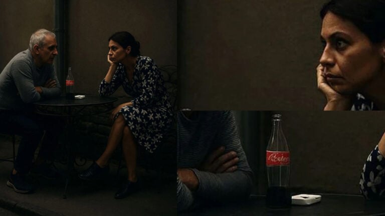
6. Understand that color perception is relative
Keep in mind that our brains perceive color differently and in relation to the colors around them. It’s important to look at the context and the photo as a whole. Jamie gives a great example of correct skin tones. When you add a bright orange tone to them, it immediately stands out and you’d never say it was a correct skin tone. However, it was taken from the movie Amalie Poulain, and due to very saturated green and orange tones in the scene, the skin looks just fine in the context.
7. Know your software
Jamie advises that it’s better to have a general idea of what you want to achieve with editing, rather than play around with settings until you get something you like. And for the first thing to work, you need to know your software. You need to know what you should do to get a certain look.
In the video, Jamie also gives a short overview of how to tweak colors in Lightroom and achieve the look you want. He also explains how the HSL and Calibration sliders work, so take a look for a quick tutorial.
8. Edit in the right conditions
When you’re editing color in your images (or anything else, if you ask me), don’t have bright sunlight shining into your screen or into your eyes. Make sure to have the right conditions, and also calibrate your monitor. Don’t forget to take regular breaks from editing so you can see your work with a fresh pair of eyes and decide what you can improve.
[Important COLOR TIPS for BETTER PHOTOS via ISO 1200]

Dunja Đuđić
Dunja Djudjic is a multi-talented artist based in Novi Sad, Serbia. With 15 years of experience as a photographer, she specializes in capturing the beauty of nature, travel, concerts, and fine art. In addition to her photography, Dunja also expresses her creativity through writing, embroidery, and jewelry making.


Join the Discussion
DIYP Comment Policy
Be nice, be on-topic, no personal information or flames.