


Understanding Clarity vs Texture vs Dehaze: When to Use Each
Jan 11, 2026
Darlene Lleno
Darlene Lleno brings a unique perspective to DIY Photography as someone who grew up surrounded by camera gear but chose words over lenses. With five years of writing experience, she specializes in photography content that’s both technically informed and genuinely passionate. Growing up with a photographer twin brother meant camera talk was everyday conversation in her household. While he mastered capturing moments, Darlene discovered she preferred being the subject and the storyteller behind the scenes. As a travel enthusiast and mother of two, she understands the importance of preserving life’s precious moments. When not exploring new destinations or writing for DIY Photography, you’ll find her reading or tending to her garden. Her approach to photography writing is refreshingly authentic, she may not be behind the camera, but she knows exactly what it takes to help others capture the shots that matter most.
Share:
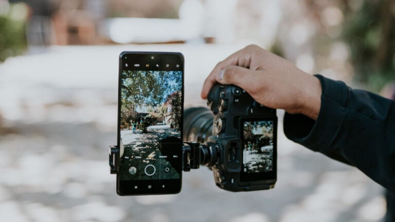
Clarity vs texture vs dehaze are three different editing tools in Lightroom. Each one works on your photos in its own way. Many photographers grab these sliders without really knowing what they do. They move them around and hope for the best.
Each slider affects specific parts of your image. Knowing the difference changes how you edit photos. These tools live in your Lightroom workspace, ready to fix flat images or hazy shots. But pick the wrong one and you’ll get crunchy textures or fake-looking colors.
Learning when to use each tool takes your editing from okay to great. You’ll stop guessing and start getting consistent results every time.
What Clarity Does to Your Photos
Clarity works on the midtones in your image. It boosts local contrast in those middle gray areas. This makes edges look sharper and more defined.
The slider finds spots where light and dark tones meet. Then it makes the difference between them stronger. Photographers call this effect microcontrast. It adds depth without touching your bright whites or deep blacks.
Bump up clarity and eyes become clearer. Clouds gain more separation. Mountain ranges look more solid. The effect adds punch to flat photos.
You can also go negative with clarity. This softens those midtone transitions. Portrait photographers love this for dreamy, soft images. Try negative clarity around -10 to -20 for smooth skin.
Problems happen when you push clarity too far:
- Halos appear around edges
- Textures become too harsh and crunchy
- Skin looks rough and unnatural
- Clouds turn into cotton balls
- Everything starts looking fake
Most photos work best with clarity between -20 and +25. Stay in this range and you’ll avoid the overdone HDR look.
How Texture Controls Surface Detail
Adobe added texture to Lightroom in 2019. It solved many problems that clarity created. Where clarity affects midtone contrast broadly, texture targets fine details only.
The algorithm looks for actual surface patterns. Things like fabric weave, tree bark, skin pores, or metal grain. It boosts or reduces these without creating halos. You can push texture harder than clarity before things look weird.
Positive texture brings out amazing detail. That brick wall shows every tiny crack. Canyon walls reveal layers you didn’t see before. Metal surfaces pop with dimension. Landscape photographers use this all the time for rock formations and forest detail.
Negative texture works great for portraits:
- Smooths skin while keeping it natural
- Reduces pores without the plastic look
- Keeps underlying detail structure intact
- Works best between -20 and -30
The big difference from clarity is simple. Texture doesn’t mess with your tones at all. It only affects detail frequency. Your overall contrast stays the same. No halos show up around edges.
Dehaze Cuts Through Fog and Haze
Dehaze does exactly what its name says. It removes fog, haze, pollution, and atmospheric moisture from your shots. But it does more than just that under the hood.
This tool increases contrast in darker tones. It slightly desaturates highlights while adding saturation to shadows. The algorithm finds areas affected by atmospheric scatter. Then it reverses that effect by darkening those parts and restoring color depth.
The slider shines for landscape photos on misty days. Mountains hidden in haze suddenly appear clear. City skylines in smog gain definition. Flat sunset skies develop rich color.
You can also use negative dehaze to add mood. Drop the slider left and you create atmospheric effects. Portraits gain a soft quality. Landscapes get that romantic morning mist feel. Some photographers use -10 to -15 dehaze instead of gradients.
Watch out for these dehaze problems:
- Colors become too vibrant when pushed high
- Skies turn nuclear blue above +40
- Shadows lose all detail and block up
- Everything looks overdone past +50
Keep dehaze between +5 and +25 for most photos. This range gives you results without going overboard.
Key Differences Between the Three Tools
Understanding clarity vs texture vs dehaze means knowing what each one targets. Clarity works on midtone contrast across your whole image. Texture targets fine detail without touching tonal relationships. Dehaze fixes atmospheric effects and their impact on contrast and color.
Think about what your photo needs. Does it look flat with poor separation? Use clarity. Are fine details missing or too strong? Reach for texture. Does haze kill your contrast and color? Dehaze fixes it.
These tools work together when you use them right. A landscape shot might need +15 dehaze for morning mist. Add +10 texture for rock detail. Finish with +5 clarity for extra punch. A portrait might want -20 texture, -10 clarity, and +5 dehaze for the eyes.
The order you use them matters. Start with dehaze if you see atmospheric problems. Then move to clarity for overall depth. Finish with texture for detail work. This workflow keeps you from over-processing your photos.
When to Use Each Tool for Different Photos
Different types of photography need different approaches. Here’s how to use these sliders for the best results.
Landscape Photography
Morning and evening shoots often need dehaze first. It cuts through atmospheric moisture quickly. Mountain ranges benefit from moderate clarity for separation. Rock formations pop with positive texture between +15 and +25.
The combination creates images with depth and detail. Just don’t go too far or things start looking processed.
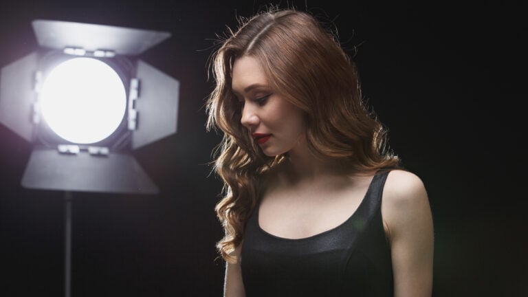
Portrait Photography
Most portraits need a gentler touch with these sliders. Skin looks best with negative texture between -15 and -30. This creates natural smoothing without the blur effect.
Clarity usually stays between -10 and +5 for portraits. The exact amount depends on your style. Dehaze might add +5 to +10 for eye detail. But too much makes skin look too saturated and weird.
Street and Documentary Work
Street photography often needs clarity for that gritty look. Texture at +10 to +20 brings out urban details. Think weathered walls and textured clothing.
Dehaze helps on overcast days or in cities with pollution. It cuts through that flat gray atmosphere fast.
Product Photography
Products vary by what you’re shooting. Smooth items like electronics need negative texture. This emphasizes sleek surfaces. Textured products like leather want positive texture to show craftsmanship.
Clarity adds definition to edges and forms. Dehaze rarely matters unless you’re shooting through glass.
Architecture Photography
Buildings love clarity for defined lines and strong structure. Texture at +15 to +25 reveals material details. Dehaze helps outdoor shots by cutting through urban haze.
The combination creates images with strong graphic impact. Just watch those editing mistakes that make buildings look fake.
Common Mistakes to Avoid
Most editing problems come from pushing sliders too far. Clarity above +40 looks artificial in most images. Texture beyond +50 creates unnatural crunchiness. Dehaze past +50 destroys shadows and oversaturates colors.
Here are the biggest mistakes photographers make:
- Applying adjustments globally instead of using masks
- Not zooming to 100% while adjusting
- Using sliders to fix bad exposure
- Ignoring how adjustments interact with each other
- Forgetting to check skin tones at full size
Modern Lightroom masking lets you apply these tools to specific areas. Boost clarity on mountains but not the sky. Add texture to foreground rocks but not distant haze. This selective approach looks way more natural.
Always check your adjustments at full resolution. Effects that look subtle at screen fit often appear harsh at actual pixels. This matters most for portraits where skin texture shows everything.
Remember these sliders fix specific problems only. They won’t rescue an underexposed shot or fix terrible lighting decisions. Get your photo right in camera first. Then use these tools to polish what you already have.
How the Algorithms Actually Work
Understanding the technical side helps you use these tools better. Clarity uses a contrast mask to find edges in midtones. The algorithm locates areas where brightness transitions from middle gray. Then it increases how fast that transition happens.
This creates sharper-looking edges without affecting actual detail. The effect covers larger areas than sharpening but smaller areas than contrast. That middle ground adds dimension without harsh artifacts.
Texture operates on higher detail frequencies than clarity. It identifies repeating patterns and fine structures at the pixel level. The tool applies a localized filter that boosts or reduces patterns. No halos appear because it works differently than clarity.
Adobe used machine learning to teach texture what actual surface detail looks like. The tool learned from millions of images. It can now tell the difference between real texture and noise.
Dehaze analyzes your entire tonal range for atmospheric scatter. It creates a depth map that estimates atmosphere between camera and subject. The algorithm then reverses the scatter effect. It darkens affected areas based on their estimated distance.
This depth-aware processing explains why dehaze hits sky harder than foreground. The tool recognizes that haze builds up with distance. So it applies stronger fixes to areas that appear further away.
Combining All Three Tools for Better Results
Creating separation in complex scenes uses all three strategically. Apply +20 dehaze globally to establish base contrast. Add +10 clarity to midtones for depth. Use +15 texture on the subject while masking it from the background.
This layered approach creates three-dimensional pop. Nothing looks overdone because you spread the effect across different adjustments.
The gentle punch technique works for subtle improvements:
- Use +5 clarity for base depth
- Add +10 texture for detail
- Apply +8 dehaze for color restoration
- Keep everything under processing threshold
These small adjustments add up to noticeable improvement. But they stay under the point where things look fake.
Selective masking takes your editing to pro level. Apply +30 texture to a mountain range. Use -15 texture in the sky above it. Add +15 clarity to your subject. Put -10 clarity on distracting backgrounds. This contrast guides the viewer’s eye naturally through your photo.
Color grading works differently with these adjustments active. Dehaze shifts color relationships first. So apply it before fine-tuning white balance. Clarity affects how colors separate. Adjust it before touching saturation. Texture doesn’t affect color much so you can apply it anytime.
Building These Tools Into Your Workflow
Smart workflow order prevents fighting your own adjustments. Start with basic exposure and white balance. Apply dehaze next if you see atmospheric issues. It affects both contrast and color so deal with it early.
Move to clarity for midtone depth and overall dimension. Finish with texture for fine detail work. This sequence works because each adjustment builds on the previous one.
Fixing dehaze first establishes your base contrast and color. Clarity then adds dimension to that corrected base. Texture refines final details without messing up the broader work you’ve done.
Using presets with these sliders needs caution. A preset made for desert landscapes might include +30 dehaze. That same amount looks terrible on foggy forest scenes. Always adjust these sliders manually for your specific image.
Mobile editing apps include these tools now. But they work less effectively than desktop versions. The algorithms simplify for phone processors. Results vary more between mobile and desktop Lightroom. Make final adjustments on desktop if these sliders matter for your photo.
Batch editing tips:
- Use consistency for similar shooting conditions
- Review images individually for effect-heavy sliders
- Apply moderate global adjustments first
- Fine-tune individual photos after batch processing
Making Your Choice: Clarity vs Texture vs Dehaze
Understanding clarity vs texture vs dehaze removes guesswork from editing. Stop randomly adjusting all three and hoping. Instead, diagnose what your image actually needs.
Flat midtones need clarity. Missing detail needs texture. Atmospheric haze needs dehaze. Most images need subtle adjustments between -20 and +20. The difference between amateur and pro work comes down to restraint.
Your editing style develops through trying these tools. Some photographers love aggressive texture for gritty realism. Others prefer subtle clarity for gentle depth. Find what works for your vision and apply it consistently.
These sliders are creative tools with no single right answer. They help you express your vision once you nail the fundamentals. Get your capture right in camera. Then use clarity, texture, and dehaze to polish your already solid images.
Practice on different types of photos. See how each slider affects various subjects. Build your understanding through hands-on experience. Soon you’ll reach for the right tool automatically every time.

Darlene Lleno
Darlene Lleno brings a unique perspective to DIY Photography as someone who grew up surrounded by camera gear but chose words over lenses. With five years of writing experience, she specializes in photography content that’s both technically informed and genuinely passionate. Growing up with a photographer twin brother meant camera talk was everyday conversation in her household. While he mastered capturing moments, Darlene discovered she preferred being the subject and the storyteller behind the scenes. As a travel enthusiast and mother of two, she understands the importance of preserving life’s precious moments. When not exploring new destinations or writing for DIY Photography, you’ll find her reading or tending to her garden. Her approach to photography writing is refreshingly authentic, she may not be behind the camera, but she knows exactly what it takes to help others capture the shots that matter most.


Join the Discussion
DIYP Comment Policy
Be nice, be on-topic, no personal information or flames.
One response to “Understanding Clarity vs Texture vs Dehaze: When to Use Each”
Excellent article, thank you!