

















How to Create Cinematic Color Grades Without Making Skin Look Orange
Jan 11, 2026
Darlene Lleno
Darlene Lleno brings a unique perspective to DIY Photography as someone who grew up surrounded by camera gear but chose words over lenses. With five years of writing experience, she specializes in photography content that’s both technically informed and genuinely passionate. Growing up with a photographer twin brother meant camera talk was everyday conversation in her household. While he mastered capturing moments, Darlene discovered she preferred being the subject and the storyteller behind the scenes. As a travel enthusiast and mother of two, she understands the importance of preserving life’s precious moments. When not exploring new destinations or writing for DIY Photography, you’ll find her reading or tending to her garden. Her approach to photography writing is refreshingly authentic, she may not be behind the camera, but she knows exactly what it takes to help others capture the shots that matter most.
Share:
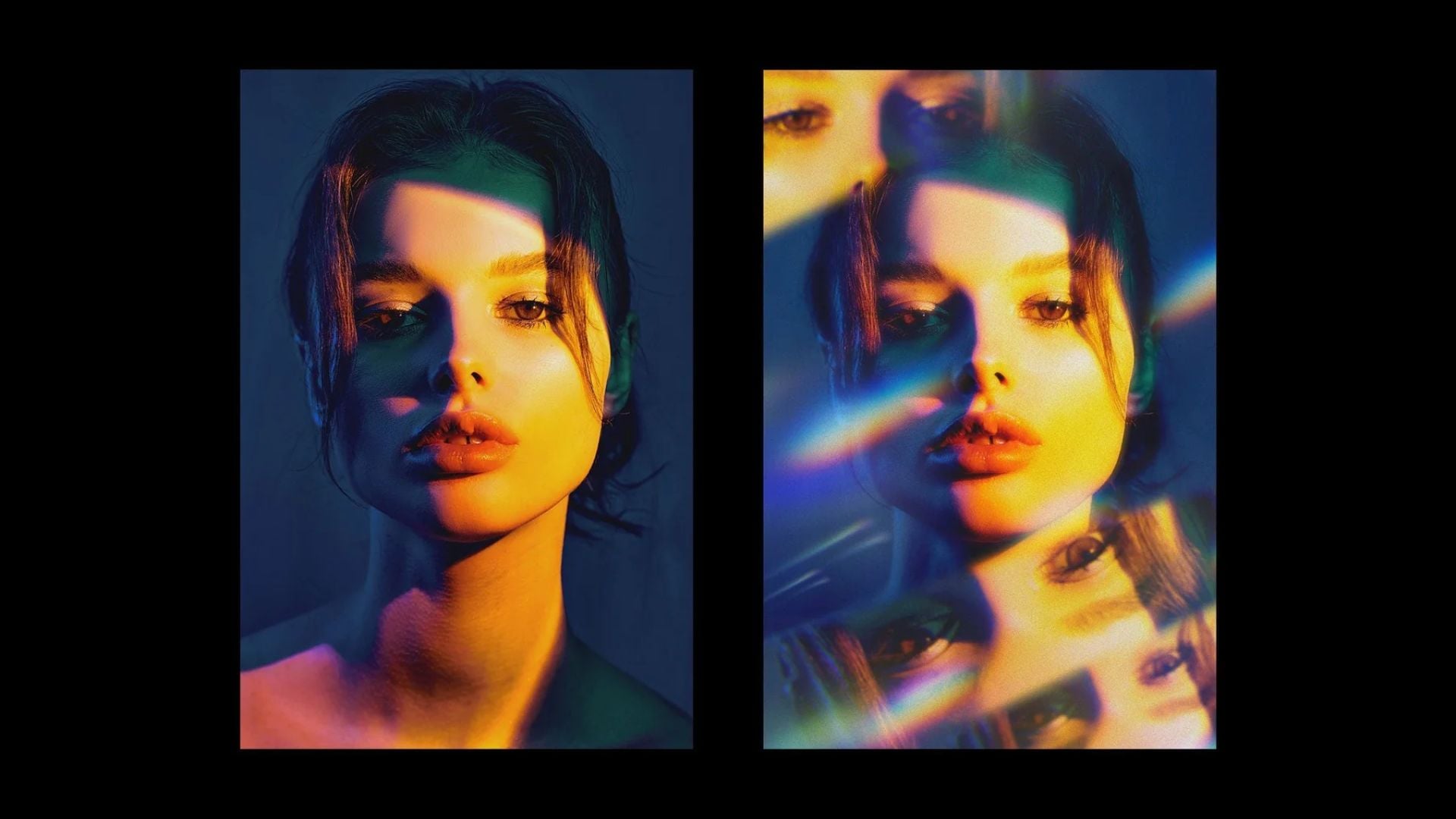
Cinematic color grading skin tones trips up more photographers than you’d think. You want that warm film look but end up with subjects who look like they bathed in orange juice. Getting this balance right separates beginner edits from pro-level work. The good news is keeping skin natural while pushing creative colors is totally doable.
Most photographers get excited about cinematic looks and slam those orange sliders hard. Then they step back and see their portrait subject looks sunburned. The problem isn’t the cinematic style itself. The issue is how color changes hit skin differently than other parts of your image.
Why Your Grades Keep Turning Skin Orange
The classic cinematic look relies on warm tones in the midtones and shadows. Film stocks historically gave images warmer characteristics. Modern digital grading mimics this look. When you add warmth across your entire image, skin picks up those orange tones faster than anything else.
Skin naturally contains red and yellow pigments. When you add more warmth through color grading, those existing tones get amplified. Human eyes are incredibly sensitive to skin tone variations. We notice even tiny color shifts in faces before we spot changes anywhere else.
Another common mistake happens when you slap on LUTs without adjusting them. Look-up tables can jumpstart your cinematic color grading skin tones. But they’re starting points, not final solutions. A LUT created for landscape footage won’t work the same way on portraits.
Temperature shifts play a major role too. Pushing your white balance slider toward warm creates that golden hour feel. But skin already has so many warm undertones that extra heat makes things go sideways fast. This becomes especially bad with certain skin tones that have more natural redness.
How to Protect Skin While Grading
The secret to cinematic color grading skin tones without orange disaster is selective adjustment. You need to grade different parts of your image separately. Modern editing software makes this easy through HSL controls, color masks, and local adjustments.
Start by identifying exactly which colors your subject’s skin occupies. In most programs you can sample skin tones directly. Skin typically falls in the orange and yellow ranges. This varies by ethnicity and lighting. Once you know where skin lives, you can protect those specific hues while changing everything else.

Work Smart with HSL Controls
HSL sliders give you targeted control over individual colors. Here’s how to use them for better skin tones:
- Pull back orange and yellow saturation to calm down warm skin tones
- Boost warmth in reds, greens, and blues to affect backgrounds
- Adjust hue slightly to shift skin away from pure orange
- Use luminance controls to brighten or darken specific color ranges
This approach lets you create warmth in backgrounds and clothing without affecting faces. Your cinematic look stays intact while skin remains believable.
Master Color Wheels for Better Results
Color wheels in Lightroom offer another powerful method. Instead of adjusting temperature everywhere, add warmth to shadows and highlights independently. Leave midtones relatively neutral. Most skin lives in the midtone range. This creates depth and mood without messing up complexions.
According to Adobe’s color grading documentation, separating tonal adjustments gives you the most control over final results. Professional colorists use this technique constantly.
Using Masks for Precise Control
Masking takes your cinematic color grading skin tones work to the next level. You literally paint protection over faces and skin areas. Most modern software includes AI-powered subject selection that makes masking super fast.
In Photoshop and Lightroom, subject selection tools recognize people automatically. You can create a mask around your subject in seconds. Then invert that mask to apply your cinematic grade only to the background. Skin stays natural while everything else gets the full creative treatment.
Feathering your masks prevents harsh edges between graded areas. Set your feather radius high enough that transitions feel seamless. Nobody should see where your mask begins and ends. The goal is a cohesive image where nothing looks artificially separated.
Luminosity masks work great for protecting skin too. These masks select pixels based on brightness rather than color. Since skin often sits in midtone values, you can create a luminosity mask that targets highlights and shadows. Apply your warm grade through this mask and skin automatically stays neutral.
Getting Orange and Teal Right
Orange and teal is the quintessential cinematic color palette. Movies use it constantly because warm and cool tones create visual interest. The problem is this look specifically targets orange tones. Those overlap perfectly with skin color ranges.
The key is pushing complementary colors in different parts of your frame. Instead of making everything orange and teal, designate where each color lives. Skin and important foreground elements get subtle warmth. Backgrounds, skies, and negative space receive the teal treatment.
Build Your Grade Step by Step
Start with color correction before creative grading. Get your white balance right first. Neutralize any color casts. If your starting point is already warm or cool, adding cinematic grades will push things too far.
Work the teal side harder than orange for portrait work. Skies, water, and backgrounds can handle aggressive teal shifts. Meanwhile, keep orange adjustments minimal on skin areas. You’ll get the look without making subjects appear sick.
Consider shooting with grading in mind. Using cooler lighting on backgrounds while keeping warmer light on subjects makes post easier. You’re building color separation in-camera rather than manufacturing it entirely in editing.

Temperature Control Techniques That Work
Managing temperature separately across tonal ranges prevents orange skin entirely. Most editing software lets you adjust color temperature for shadows, midtones, and highlights independently. This gives you surgical precision over where warmth appears.
For cinematic color grading skin tones, try adding coolness to highlights and warmth to shadows. This creates a cross-processing effect that feels filmic. Skin tones stay closer to neutral while your overall image gains cinematic character.
Split toning is another temperature control method worth learning. Add warm tones to shadows and cool tones to highlights. This creates color contrast without affecting midtone skin. The separation between warm and cool creates visual interest while protecting skin.
White balance adjustments should happen before exposure tweaks. Getting temperature right first means your other adjustments work from a solid foundation. If you adjust exposure while colors are off, you’ll fight those mistakes throughout editing.
Working with Different Skin Tones
Different ethnicities present unique challenges for cinematic color grading skin tones. What works on fair skin might look completely wrong on darker complexions. Understanding these variations helps you adapt your approach.
Lighter skin shows color shifts more obviously. Even minor orange casts become immediately visible on pale complexions. With fair-skinned subjects, pull back warm tones more than you think necessary. What looks natural on your monitor might still read as slightly orange to viewers.
Medium skin tones offer the most flexibility for cinematic grades. These complexions can handle more warmth before looking fake. You can push orange and teal effects harder while maintaining realistic skin. Just watch for muddiness in midtones. This can make skin look dull even if color is technically correct.
Darker skin requires special attention to avoid ash or gray tones. When adding teal to shadows for that cinematic look, darker complexions can lose their warmth. Keep warmth present in darker skin areas even while cooling the rest of your image.
Mixed skin tones in the same frame present the ultimate challenge. Group portraits need grades that work across all subjects. Stick to subtle adjustments and use targeted masks if certain people need different treatment.
Why Monitor Calibration Matters
Your screen lies to you about color. Without proper calibration, you’re grading blind. What looks perfect on your display might look wildly different on phones and tablets. Professional colorists obsess over calibration for good reason.
Invest in a hardware calibration tool if you’re serious about color work. These devices measure your monitor’s actual output. They create a custom profile that corrects color, brightness, and contrast. You’ll finally see what your images really look like.
Ambient lighting affects how you perceive color on screen. Grade in a room with neutral gray walls and controlled lighting. Bright windows or colored walls throw off your color judgment. Professional editing bays are dark for this exact reason.
Check your work on multiple devices before calling it finished. Pull up your graded image on your phone, tablet, and a secondary monitor. If skin looks orange anywhere, it needs adjustment.
Using Reference Images as Your Guide
Creating consistent cinematic color grading skin tones becomes easier when you reference examples you love. Build a collection of movie stills and commercial work that captures the look you want. These references show exactly how professionals handle skin within cinematic color palettes.
Pay attention to how reference images balance warm and cool tones. Notice where warmth lives in the frame versus where cooler colors dominate. Study skin specifically to see how much warmth remains in faces. This analysis informs your own grading decisions.
Match your grade to references using side-by-side comparison. Many editing programs let you load reference images directly in your workspace. Grade while looking at your reference to match color relationships. This approach produces more consistent results.
Different cinematic styles require different skin tone approaches. The warm nostalgic look of 70s films handles skin differently than cool desaturated modern thrillers. Choose references that match your intended mood.
Software-Specific Approaches
Each editing platform handles cinematic color grading skin tones slightly differently. Understanding your software’s strengths helps you work more efficiently.
Lightroom for Quick Results
Lightroom excels at non-destructive grading through powerful HSL panels. The color wheels let you adjust shadows, midtones, and highlights separately. This is perfect for protecting skin while grading backgrounds. Local adjustments with masks give you surgical precision when needed.
Photoshop for Maximum Control
Photoshop offers unmatched control through layers and adjustment layers. You can grade different elements completely independently using layer masks. The selective color adjustment specifically targets color ranges without affecting others. Camera Raw inside Photoshop combines Lightroom-style adjustments with powerful masking.
DaVinci Resolve for Professional Work
DaVinci Resolve is the professional choice for serious color work. Its node-based grading system lets you build complex looks. Power windows work incredibly well for isolating subjects. The qualification tools can select skin automatically based on color ranges.
Capture One for Portrait Specialists
Capture One provides excellent color grading tools alongside strong tethering capabilities. Its color editor works similarly to HSL adjustments but with more precision. Many professional portrait photographers prefer Capture One specifically for its skin tone handling.
Testing and Iteration Process
Great cinematic color grading skin tones rarely happens in one pass. Professional colorists iterate constantly. Building this testing phase into your workflow prevents you from overdoing things.
Grade in stages rather than trying to achieve your final look immediately. Start with basic color correction to neutralize casts and get proper exposure. Then add your cinematic look gradually. Check skin after each adjustment. This methodical approach makes it easier to identify which change pushed skin into orange territory.
Take breaks during long grading sessions. Your eyes adapt to color shifts over time. This makes it harder to judge whether skin looks natural. Step away for 10 minutes, then return with fresh eyes. Problems that became invisible suddenly become obvious again.
Get feedback from others before finalizing your grade. What looks natural to you might read as orange to someone else. Ask photographer friends whether skin tones look realistic. Fresh perspectives catch issues you’ve become blind to during editing.
Practical Exercise to Build Skills
Try this exercise to develop your cinematic color grading skin tones abilities. Take a portrait with a plain background and work through a systematic grading process.
Here’s your step-by-step workflow:
- Correct any color casts and set proper exposure first
- Your starting point should be technically neutral
- Add your cinematic look to the background only
- Mask your subject and apply warmth or coolness to everything except skin
- Refine the mask edges and check for color spill onto skin
- Apply subtle color adjustments to skin if needed
Keep final skin adjustments minimal. The goal is cohesion, not matching skin to your background palette. According to Cambridge in Colour’s guide on color management, working in stages produces the most predictable and controllable results.

Maintaining Natural Dimension
Skin texture lives in highlights and shadows. When you aggressively grade these tonal ranges, you risk flattening skin. Maintaining separation between highlights and shadows keeps skin looking three-dimensional.
Avoid crushing shadows too hard in skin areas. Some photographers push blacks for that moody cinematic look. But this destroys shadow detail in skin that creates depth. Keep enough detail in darker areas so faces maintain their structure.
Protect highlight detail similarly. Blown highlights on skin look especially bad because you lose all texture. Cinematic looks often include bright airy highlights. But these should exist in backgrounds rather than on faces. Keep skin highlights controlled and textured.
Contrast adjustments affect how warm or cool your skin appears. Adding contrast can make existing warm tones feel more intense. This pushes skin closer to orange without actually changing color. If you need strong contrast for your cinematic look, use luminosity adjustments instead.
Creating Mood Without Destroying Skin
Cinematic color grading skin tones ultimately serves your image’s mood and story. The technical execution matters. But never lose sight of why you’re applying these grades in the first place.
Warm grades feel nostalgic, romantic, and comfortable. They work beautifully for golden hour portraits and family sessions. Keep warmth subtle on skin while pushing it harder in environmental elements. Your viewer gets the emotional impact without noticing technical problems.
Cool grades create tension, modernity, and drama. These work for edgy fashion and moody storytelling. The challenge is maintaining warmth in skin while surrounding it with cool tones. This contrast actually makes skin stand out more.
Desaturated looks with selective color retention offer another cinematic approach. Pull overall saturation down while keeping some warmth in skin. This creates that bleach-bypass look popular in action movies. Maintaining skin saturation while desaturating everything else produces striking images.
Green and magenta shifts get less attention than orange and teal. But they create unique cinematic moods. Adding slight magenta to highlights and green to shadows produces an interesting cross-processing effect. This works surprisingly well for fashion and editorial work.
Your Next Steps with Cinematic Color Grades
Remember that cinematic color grading skin tones is just one part of creating professional images. Lighting, composition, and subject direction all contribute to that polished film-inspired look. No amount of post-processing can save poorly executed photography.
Shoot with your final grade in mind. Understanding how you’ll process images changes your decisions during the photo session. Choose lighting that supports the mood you want. Place subjects where backgrounds work with your planned color palette.
Keep learning from cinema itself. Watch movies with attention to color. Notice how different genres approach color grading. Study how skin tones are handled across various lighting scenarios. This visual education informs your photography in ways technical tutorials can’t match.
Your style evolves through experimentation and practice. What works today might feel dated in a year. Keep pushing your grading skills forward while maintaining fundamentals that keep skin natural. The balance between creative expression and technical correctness defines professional work.
Cinematic color grading skin tones challenges photographers at every skill level. The appeal of bold movie-inspired colors tempts us to push too far. Success lies in understanding color relationships and using targeted adjustments. Always check that skin remains believable. Master these techniques and you’ll create images that capture cinematic mood without sacrificing natural skin tones.
See more from DIYPhotography.net on Google
Add DIYPhotography.net as a trusted source. This makes
our stories more likely to appear in your Google Search results.
 Add as a preferred source on Google

Darlene Lleno
Darlene Lleno brings a unique perspective to DIY Photography as someone who grew up surrounded by camera gear but chose words over lenses. With five years of writing experience, she specializes in photography content that’s both technically informed and genuinely passionate. Growing up with a photographer twin brother meant camera talk was everyday conversation in her household. While he mastered capturing moments, Darlene discovered she preferred being the subject and the storyteller behind the scenes. As a travel enthusiast and mother of two, she understands the importance of preserving life’s precious moments. When not exploring new destinations or writing for DIY Photography, you’ll find her reading or tending to her garden. Her approach to photography writing is refreshingly authentic, she may not be behind the camera, but she knows exactly what it takes to help others capture the shots that matter most.
Related Posts
 How to create quick and easy cinematic colour grades in Photoshop in 2 minutes
 How to reverse engineer colour grades in Photoshop and reproduce them with curves
 The Infinite Looks Photoshop plugin gives you a million different grades for your images
 Infinite Skin is a new retouching plugin for Photoshop designed specifically for skin
Join the Discussion
DIYP Comment Policy
Be nice, be on-topic, no personal information or flames.