


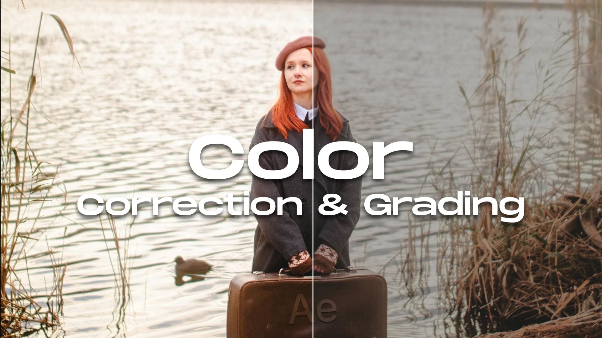
Color Grading vs Color Correction: Understanding the Difference and When to Use Each
Oct 30, 2025
Darlene Lleno
Darlene Lleno brings a unique perspective to DIY Photography as someone who grew up surrounded by camera gear but chose words over lenses. With five years of writing experience, she specializes in photography content that’s both technically informed and genuinely passionate. Growing up with a photographer twin brother meant camera talk was everyday conversation in her household. While he mastered capturing moments, Darlene discovered she preferred being the subject and the storyteller behind the scenes. As a travel enthusiast and mother of two, she understands the importance of preserving life’s precious moments. When not exploring new destinations or writing for DIY Photography, you’ll find her reading or tending to her garden. Her approach to photography writing is refreshingly authentic, she may not be behind the camera, but she knows exactly what it takes to help others capture the shots that matter most.
Share:

Color grading vs color correction trips up a lot of photographers and videographers. Both work with color, but they do completely different jobs in your editing workflow. One fixes problems. The other adds style.
Most people make the same mistake. They jump straight into making images look cinematic without fixing basic issues first. This creates way more work down the line. Fix the technical stuff first, then add your creative touch. Get this right and your work jumps from okay to outstanding.

What Color Correction Means
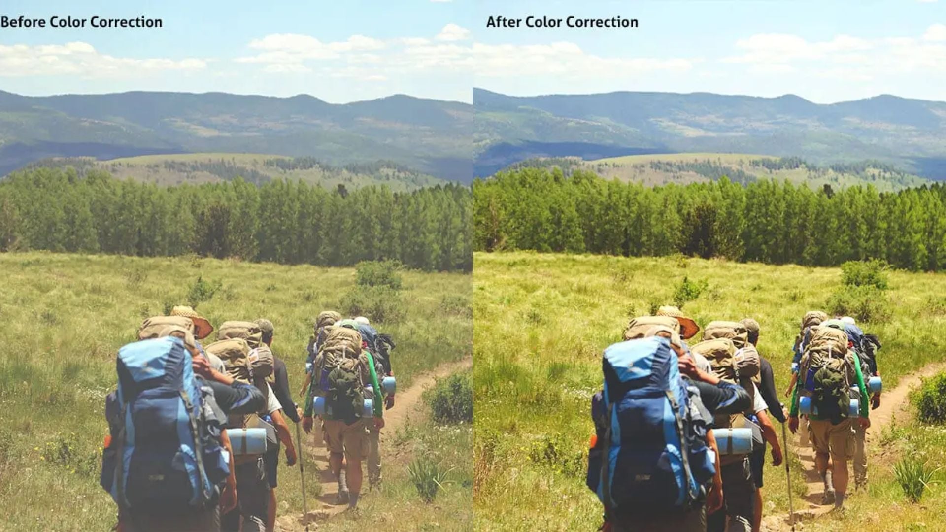
Color correction fixes technical problems in your shots. You’re bringing everything back to neutral and accurate. Your goal is to make the image look natural, like what you’d see with your own eyes.
Camera sensors all interpret light differently. Sometimes your white balance goes off because of mixed lighting. Other times you get blown highlights or crushed shadows. Color correction tackles these basic problems before you do anything creative.
The Technical Foundation of Color Correction
Your camera captures raw data that needs fixing. Think of correction as damage control for shooting mistakes. Maybe you forgot to set custom white balance in warm indoor lighting. Or maybe auto exposure went wild because of a bright window.
Professional colorists always start with correction. They fix white balance so whites look actually white. They adjust exposure so skin tones sit in the right range. They match shots from different cameras so everything looks consistent.
Getting your exposure right during shooting makes correction easier. Good exposure gives you room to adjust without adding noise. Shoot smart and you’ll spend less time fixing problems later.

Common Color Correction Tasks
Correction follows a pretty standard path. You start with white balance and set a proper neutral point. Then you fix overall brightness and contrast to get normal-looking levels.
Shadow and highlight recovery comes next. Modern cameras grab tons of dynamic range. You just need to pull that detail out. How you meter your shots affects how much work you’ll have here.
Matching different shots matters too. If you filmed with different cameras or at different times, those clips need to match. Get this baseline consistency right and everything else gets easier.
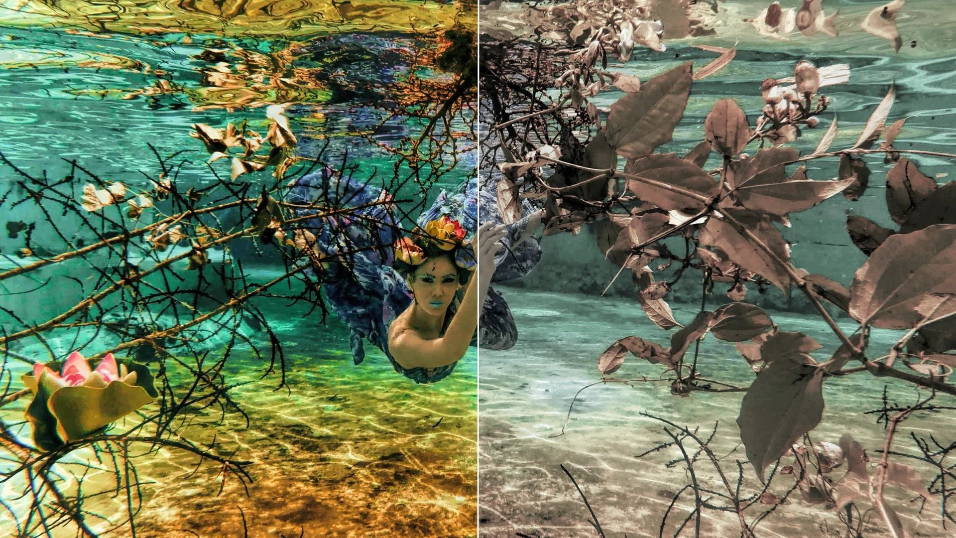
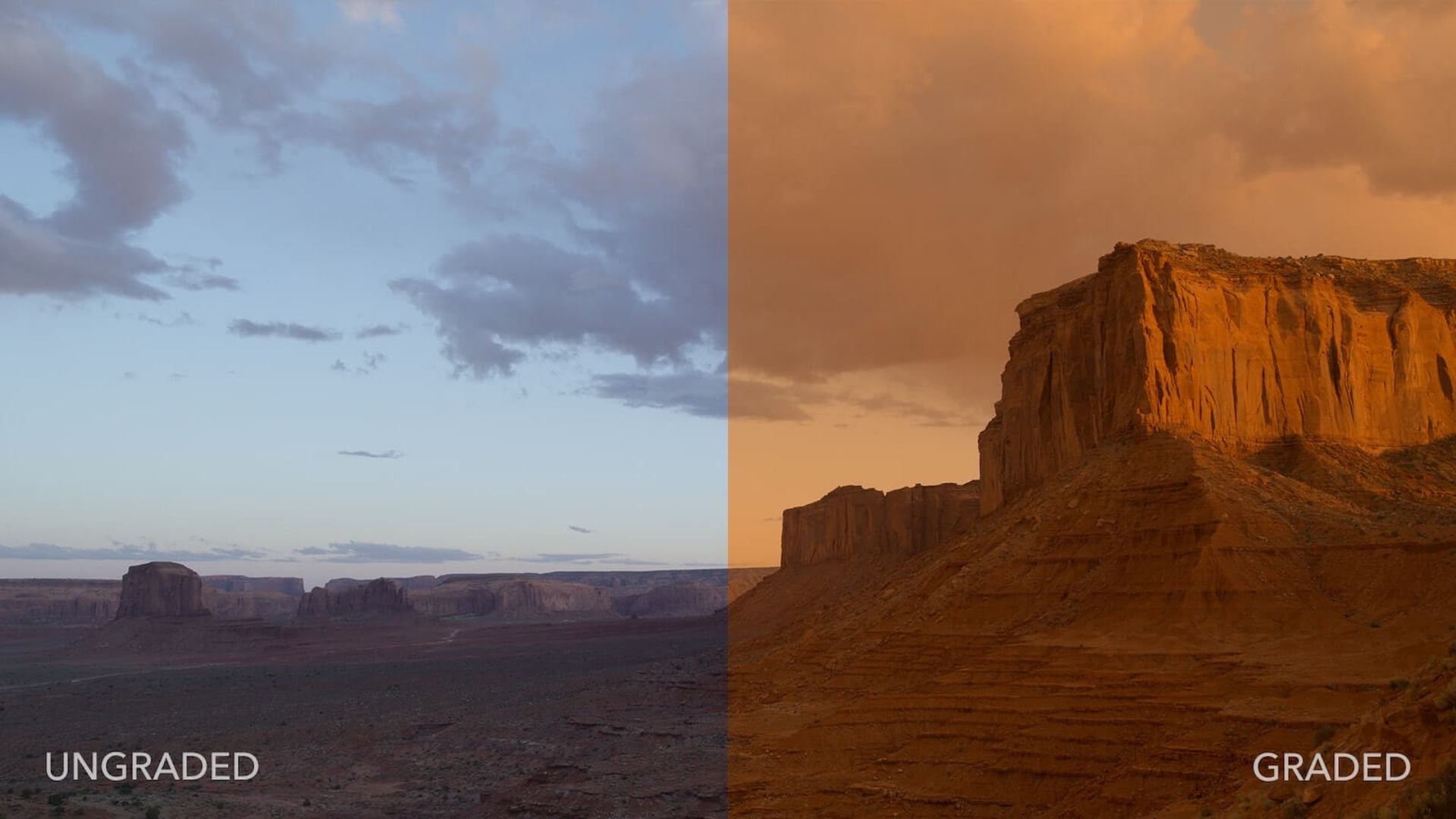
Color Grading Brings Creative Vision to Life
Color grading vs color correction shows the clearest split here. Grading adds mood and style to properly corrected footage. You’re making creative choices that tell your story. This turns technically correct images into something with real emotional punch.
Filmmakers use specific color palettes to create feelings. Orange and teal dominate action movies. Desaturated looks feel serious and dramatic. High contrast with crushed blacks builds tension. Each choice says something without using words.
The Art of Creating a Look
Professional colorists spend years training their eyes. They get color theory and how different hues work together. They know which colors pop forward and which sink back. This knowledge helps them guide attention and create depth.
Portrait work really benefits from smart grading. Warm skin tones feel inviting and natural. Cooler backgrounds separate your subject from everything else. These small shifts make images feel polished and intentional.
Popular looks often use secondary corrections. You adjust specific colors or areas independently. You might desaturate everything except one accent color. Or add warmth to highlights while cooling shadows. These split-toning tricks add serious polish.
Building a Consistent Style
Many photographers develop signature looks through grading. This consistency becomes their brand. Clients spot their work instantly because of specific color treatments.
Creating LUTs lets you apply the same grade across projects. You build a library of looks for different moods. Wedding photographers might save romantic, soft grades. Documentary shooters prefer realistic grades with subtle tweaks.
Your grading workflow should allow experiments. Try different approaches and see what clicks. Some images need gentle adjustments. Others demand bold, stylized treatments.
Tips for Correct Workflow Order
You always do color correction before color grading. This order matters way more than most beginners think. Trying to grade uncorrected footage creates endless headaches and weird results.
Think about building a house on a crooked foundation. Nothing sits straight and problems multiply as you build higher. Same deal here. Start with a solid corrected base and creative grading becomes much simpler.
Why Correction Must Come First
Uncorrected footage has problems that mess with grading. If your white balance is off, adding creative grades makes it worse. You think you’re creating a cool blue mood but you’re just emphasizing an existing color cast.
Exposure problems get amplified during grading. Trying to create dramatic lighting on badly exposed images produces muddy results. You lose shadow detail or blow highlights beyond saving.
Professional workflows keep these stages completely separate. Correction brings everything to neutral first. Only then do colorists apply creative grades. This separation keeps projects organized and results consistent.
Building Your Personal Workflow
Start by correcting your worst clips. This shows you what’s possible and where your limits are. Some footage might be too damaged for your intended look. Better to know early than after hours of wasted work.
Many editors use adjustment layers to separate correction from grading. Correction sits on the bottom layer affecting raw footage. Grading layers stack on top applying creative looks to corrected material. You can modify either stage without touching the other.
Reference images help maintain consistency. Pull stills from professionally graded films or photos you love. Keep these visible while working so you can compare progress.
Tools and Software for Each Process
Different tools handle correction versus grading work better. Some apps do both well while others specialize. Knowing your software’s strengths helps you work faster.
Professional colorists often use DaVinci Resolve for both tasks. This software packs powerful correction tools alongside sophisticated grading features. Adobe Premiere Pro and Final Cut Pro work well too. For stills, Lightroom handles correction while Photoshop adds grading flexibility.
Essential Correction Tools
Scopes become your best friend during correction. Waveform monitors show exposure distribution across your frame. Vectorscopes display color information making color casts obvious. Histograms reveal clipping in highlights or shadows.
White balance tools work the same across most software. You select a neutral reference point in your image. The software shifts all colors to make that point truly neutral. This one adjustment often fixes multiple color problems instantly.
Curves give precise control over tonal ranges. You adjust shadows, midtones, and highlights separately. This flexibility helps recover detail and establish proper contrast.
Creative Grading Features
Color wheels give intuitive control over different tones. Adjust lift (shadows), gamma (midtones), and gain (highlights) independently. This three-way corrector forms the foundation of most grading work.
Secondary color correction tools let you isolate specific colors or areas. You might select all blues in a scene and shift them toward teal. Or create a mask around your subject and grade them separately.
Film emulation LUTs provide starting points for specific looks. These mimic classic film stock color response. Apply one as a base then adjust to taste. This speeds up your process while keeping a professional look.
Common Mistakes to Avoid
Both beginners and experienced editors fall into similar traps with color work. Spotting these problems helps you dodge them in your projects.
Over-correction creates flat, lifeless images. You can fix things too aggressively. Sometimes a slight imperfection adds character. Not every image needs perfect neutrality. Real scenes contain color variation that feels natural.
Correction Mistakes That Ruin Your Grade
Pushing corrections too far kills image quality. Extreme adjustments introduce noise, especially in shadows. They can also create color banding where smooth gradients should exist. Work gently with multiple small adjustments instead of one massive correction.
Ignoring your scopes means you’re just guessing. What looks good on your monitor might fail elsewhere. Calibrated scopes provide objective feedback. Monitor calibration helps but scopes remain essential for accurate work.
Matching shots by eye alone rarely works perfectly. Use reference frames and technical measurements. Your perception shifts during long sessions. What looked matched an hour ago might not be when you come back fresh.
Grading Errors That Scream Amateur
Heavy-handed grading dominates amateur work. Maxing out saturation doesn’t create cinematic looks. Neither does crushing blacks until you lose all shadow detail. Subtlety separates professional color work from beginner attempts.
Copying trendy looks without understanding them creates dated work. That orange and teal look works for some projects but not others. Choose grades that support your specific story. Don’t force a style that doesn’t fit.
Inconsistent grading across a project feels jarring. Your audience shouldn’t notice color shifts between scenes unless you want them to. Build a system for staying consistent. Save your settings. Use reference stills. Check your entire timeline before finishing.
Practical Examples for Different Scenarios
Different content types need different approaches to color grading vs color correction. Understanding these variations helps you make better choices for specific projects.
Wedding photography typically needs lots of correction. You’re shooting in varied lighting all day. Indoor ceremonies, outdoor vows, reception halls with colored lights. Each situation throws unique challenges at you. Correct these first to establish consistency then apply romantic, flattering grades.
Narrative Film Work
Scripted content gives you more control over shooting conditions. You can plan lighting and exposure for specific looks. Correction work focuses on matching multiple takes and camera angles. Your grading builds emotional tone for each scene.
Different scenes in the same film might get very different grades. A flashback could have desaturated, slightly shifted colors. Present-day scenes might feel warmer and more vibrant. These choices guide your audience through story structure.
Good lighting during production makes both correction and grading easier. Well-lit footage provides clean information to work with. You can push your grade further without breaking the image.
Documentary and Event Coverage
Uncontrolled environments demand strong correction skills. You can’t ask the sun to stop moving. You can’t tell fluorescent lights to play nice with tungsten practicals. Shoot as carefully as possible but accept that correction will play a major role.
Grading for documentary work typically stays subtle. You want to keep a sense of reality and authenticity. Heavy stylization can make content feel manipulated or dishonest. Small adjustments to create consistency and polish serve you better than dramatic looks.
Sports and event videography benefits from bold, saturated grades. These pump up the energy and excitement. Team colors get emphasized. Action feels more dynamic with increased contrast and punchy colors.
Advanced Techniques Worth Learning
Once you master basic correction and grading, several advanced techniques can level up your work. These methods take more time and practice but deliver professional results.
Skin tone isolation lets you perfect complexion while leaving other colors alone. You create a mask that follows your subject then adjust only those tones. This prevents green foliage behind them from turning orange when you warm their skin.
Split Toning for Depth
Adding different colors to highlights and shadows creates sophisticated depth. Warm highlights and cool shadows feel natural and pleasing. This mimics how film stock responds to light. The contrast between color temperatures adds visual interest without feeling fake.
You can get more creative with split toning too. Complementary color schemes create vibrant energy. Analogous schemes feel harmonious and cohesive. Understanding basic color theory helps you make intentional choices rather than random experiments.
HDR techniques inform your correction approach. Even if you’re not creating HDR images, understanding how to balance extreme dynamic ranges improves correction skills. You learn to recover detail without creating unnatural results.
Selective Grading for Maximum Impact
Professional colorists grade different elements separately. The sky might get one treatment while the foreground gets another. This layered approach creates more control and better results than applying one grade to everything.
Power windows and tracking tools let you follow subjects through moving shots. Your grade stays with your actor as they walk across the frame. This precision separates amateur work from professional finishing.
Mastering Both Skills Takes Time
Color grading vs color correction represents two separate but connected processes. Correction fixes technical problems and sets a neutral baseline. Grading adds creative style and emotional impact. You need both skills for professional results. You must apply them in the right order.
Master correction first. Learn to read scopes, fix white balance, and match shots accurately. Build this foundation until it becomes automatic. Then explore creative grading with confidence knowing your corrections support whatever look you choose.Your unique style develops through practice and experiments. Study professional work you admire. Analyze their color choices and try recreating them. Over time you’ll develop an eye for what works. You’ll find preferences for specific treatments. These combined skills transform good photography and videography into exceptional visual storytelling.

Darlene Lleno
Darlene Lleno brings a unique perspective to DIY Photography as someone who grew up surrounded by camera gear but chose words over lenses. With five years of writing experience, she specializes in photography content that’s both technically informed and genuinely passionate. Growing up with a photographer twin brother meant camera talk was everyday conversation in her household. While he mastered capturing moments, Darlene discovered she preferred being the subject and the storyteller behind the scenes. As a travel enthusiast and mother of two, she understands the importance of preserving life’s precious moments. When not exploring new destinations or writing for DIY Photography, you’ll find her reading or tending to her garden. Her approach to photography writing is refreshingly authentic, she may not be behind the camera, but she knows exactly what it takes to help others capture the shots that matter most.


Join the Discussion
DIYP Comment Policy
Be nice, be on-topic, no personal information or flames.