


Photo Editing Mistakes That Make Your Photos Look Fake
Nov 9, 2025
Anzalna Siddiqui
A psychology major in her third year of Bachelor’s, Anzalna Siddiqui has endless curiosity for the human mind and a deep love for storytelling – both through words and visuals. Though she hasn’t taken up photography as a profession, her Instagram is where her passion finds its home. In addition to this, she’s a travel enthusiast who never travels without her camera because every place has a story waiting to be captured.
Share:
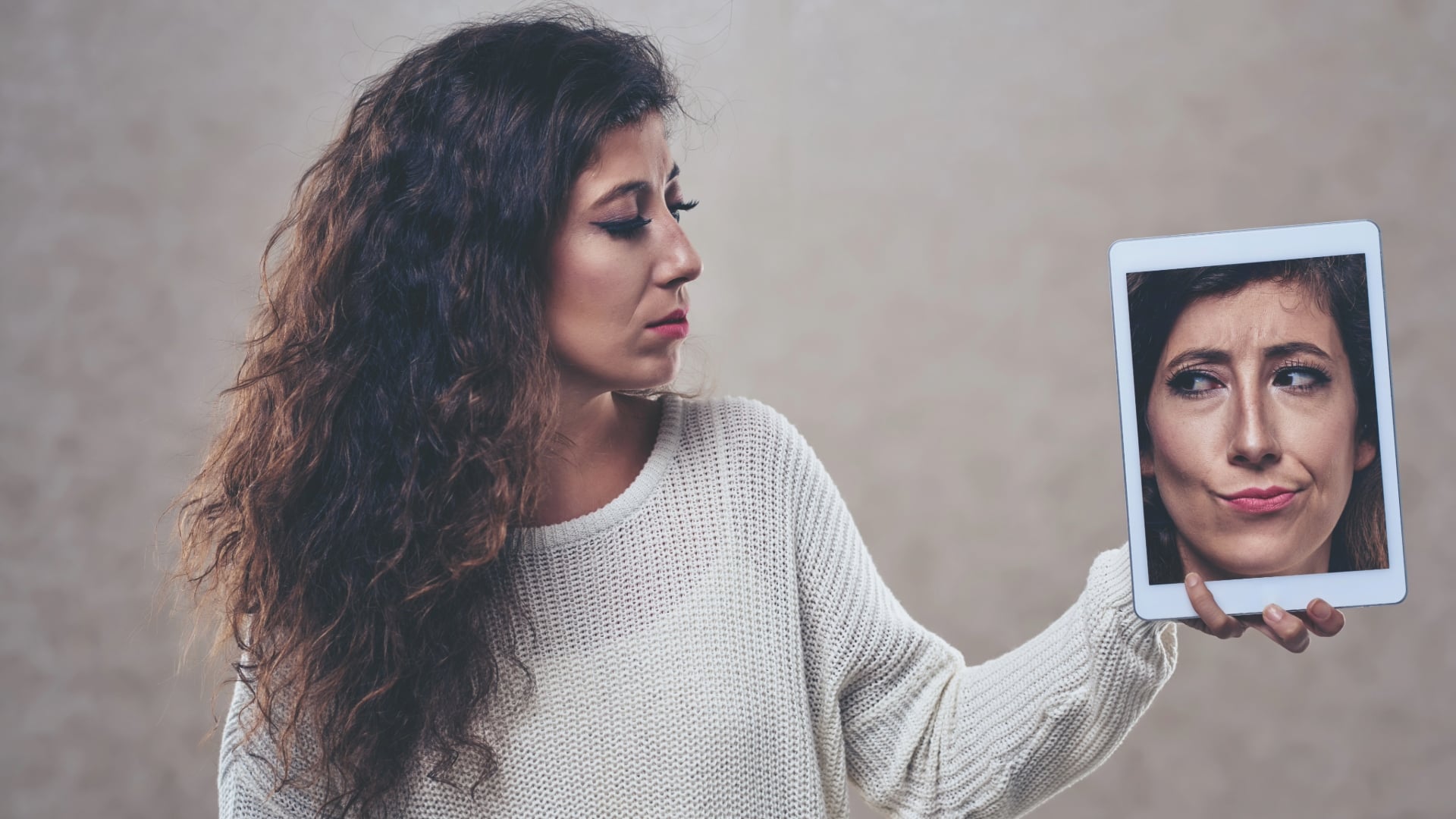
There’s usually that one image in our collection that screams “edited” and feels fake. It’s disappointing when you aim for a natural look that reflects the true essence of the moment.
I really enjoy diving deep into editing to enhance my photos, so I was intrigued when Kosta Bratsos revealed the top five photo editing mistakes that can make images appear overdone and unrealistic. You may be familiar with some technical terms, but he points out that many photographers struggle with a few basic concepts related to their raw files. By addressing these five issues, you can make your edits more subtle, impactful, and genuinely authentic.
Mistake 1: Stop Your Photos Looking Fake—Check Your Camera Profile First
This is one of those simple ideas that’s right in front of us, and I honestly can’t believe I didn’t discover it sooner. Kosta points out that a common photo editing mistake is starting with the wrong camera profile.
When you bring a raw file into editing programs like Lightroom, the software has to interpret the data before you make any adjustments. The default profile, called Adobe Color, is how Adobe thinks your raw image should appear. It serves as a general starting point, but it doesn’t accurately reflect what your camera actually captured or what you saw on the screen while shooting.
Kosta illustrates this well with a side-by-side comparison, showing how the Adobe Color profile can appear flat and less attractive. The colors seem less realistic, and the contrast doesn’t look right.
The Simple Fix You Need to Make Right Now:
He suggests that a quick way to improve your photos is by switching to the Camera Standard profile. This change makes your images look much closer to how they were initially captured, enhancing both contrast and color right away, so you won’t need to edit as much initially. The Camera Standard profile is made to follow the color and contrast settings that your camera maker intended.
Fewer edits usually result in a look that appears more natural. This minor adjustment, located at the top of your profile panel, provides a better starting point for color and tone. It seems like Adobe Color is often the reason you end up over-editing your images.
Mistake 2: Why You’re Fighting Your Raw File (and Losing) to Get a Natural Photo
Sometimes, your desire for perfection can hinder the creation of a good photo. Kosta points out a common issue: battling your raw file instead of embracing it. I know this from experience. Early on, I tried to make every detail visible by brightening shadows and recovering highlights, hoping to bring everything to mid-tones.
However, consider how light behaves in the real world. You notice bright spots and dark areas. Shadows are vital. Kosta emphasizes that they add depth and emotion to your photo.
When you excessively lighten shadows across an entire image, the result becomes “muddy and lifeless,” looking overly processed. Sure, you can see everything, but the magic is lost. The key issue is trying to make your photo brighter than the actual scene. If the setting was dark and moody, allow it to remain that way to keep the intended atmosphere.
How to Stop Fighting and Start Working:
He proposes a more gentle method for adjusting your basic tone settings:
- Exposure: This controls the overall brightness of your image.
- Highlights & Whites: Use these sliders to restore details in bright areas. However, he advises against moving them below minus 50. Moving beyond that can lead to a loss of depth in the image.
- Shadows & Blacks: Limit your adjustments in this area. Kosta suggests keeping any changes to shadows and blacks at no more than +10, or even avoiding adjustments altogether.
Pro Tip for Dark Spots:
To bring back details effectively, focus on specific areas. If there’s a dark spot that needs brightening, avoid using the overall Shadows slider. Instead, Kosta recommends applying a soft mask and increasing the exposure just for that area. This way, you illuminate only the chosen shadow while keeping the other dramatic shadows unchanged. By working with the light you have, you’ll achieve more realistic results.
[Related Reading: What Are the Best Free Photo Editors for Beginners in 2025?]
Mistake 3: Fix the Foundation: Don’t Touch HSL Until White Balance is Set
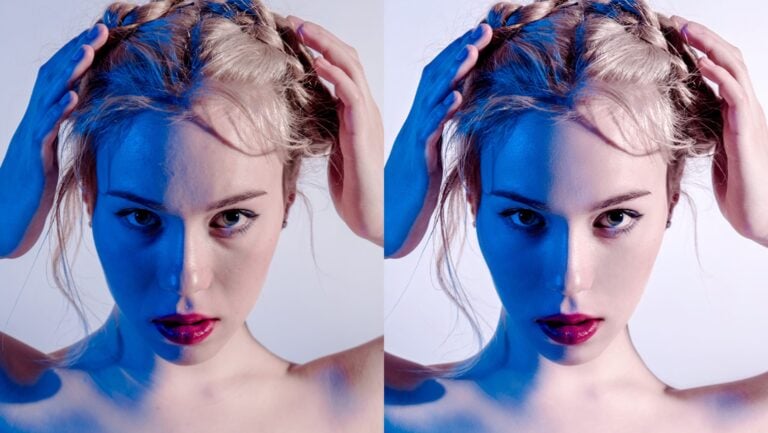
The third photo editing mistake he highlights is related to color. You might be eager to use the HSL sliders (Hue, Saturation, Luminance) or experiment with color grading to adjust the overall color of your photo.
Kosta emphasizes that the White Balance and Tint sliders are essential for establishing the color foundation of your image. They help you achieve the most accurate and natural starting point for your color tones. The HSL and Color Grading tools should only be used after you’ve set the white balance, as they are described as more of a stylistic addition.
He demonstrates that if you leave your white balance set to Auto and try to add warmth using the HSL sliders or adding lots of orange and red in color grading, the colors end up looking “forced and unnatural.” In contrast, the same photo adjusted with White Balance first appears much more natural and balanced.
Get More Precise with Your Color:
Once you’ve adjusted the White Balance, Kosta recommends using the Point Color tool for tweaking specific colors. He believes it’s much more accurate and robust than the usual HSL sliders. I totally agree. Point Color feels simpler to me because it targets exact color points instead of wider color ranges, which can unintentionally impact different areas of your image.
A Simple Trick to Make Color Pop Naturally:
If you want a specific color to stand out, Kosta suggests increasing its brightness (Luminance) first, rather than jumping right to making it more intense (Saturation). Brightening the color usually makes it look more natural, which is something I’ve found helpful.
Mistake 4: The Truth About Clarity—Use Negative Clarity for a Natural, Film-Like Vibe
I understand that you enjoy making your photos really stand out and look clear. We all do. This often involves significantly boosting the Clarity slider. However, Kosta points out that a common photo editing mistake is to raise Clarity and similar effects too high.
He warns against this because going overboard with Clarity, Texture, and Dehaze can make edges too sharp and textures too pronounced. This results in a harsh, overly sharpened look that clearly shows the photo was edited.
The New Look is Soft and Subtle:
Kosta mentions that many photographers are now opting for negative clarity settings. He suggests reducing the clarity to about minus 10 to minus 20, or even more if you’re using a very sharp lens, to achieve a softer, more “filmic” look that feels more natural. This helps to avoid the “sterile, perfect look” that many want to escape from in digital photography.
He also recommends making any adjustments for effects like Dehaze, Texture, and Vignettes gently. When considering making a change, it’s best to take a step back. He believes that the main difference between a pro’s edit and an amateur’s is the level of restraint used. He says that using fewer sliders will yield results that appear more natural.
Mistake 5: Follow the Light with Masking to Keep Your Photo Natural
You’ve put in a lot of effort on your camera setup, including the profile, tone, colors, and effects. Now it’s time to start masking. But here’s a photo editing mistake that Kosta points out: it can ruin all the work you’ve done.
The mistake is trying to make everything equally bright with your masks. This means adjusting the brightness of the shadows, foreground, and background so that every detail is visible. However, Kosta emphasizes that light doesn’t behave like that.
When you move everything to a mid-tone level, you lose all the mood, depth, and drama from the photo. It ends up looking flat and uninteresting.
How to Mask Like a Pro:
The best method is simple. Use the existing light as your guide. He explains that masks should only be used to highlight areas where there is already light, not to add new light. When brightening a dark spot, do it just a little to keep the main shadows intact, maintaining depth and atmosphere.
This idea lies at the heart of Kosta’s philosophy: you should aim to maximize the natural light and color present. If you attempt to create something artificial, such as fake light or colors, it will likely appear unrealistic.
You can’t fix poor lighting in editing; you can only enhance what’s already good.
The Core Mindset: Enhance, Don’t Fix
All five of these photo editing mistakes stem from the same fundamental mindset issue: you’re focused on fixing your photos instead of enhancing their existing qualities.
Before adjusting any settings, Kosta suggests you ask yourself: “What does this photo need to highlight what’s already there?” Instead of asking, “What can I change to improve it?”
By accepting what’s already in the raw image, you’ll find that you’ll need to edit less, which is the best way to achieve natural, realistic, and striking photos. Work with your light, not against it, and you’ll create the stunning images you’ve always wanted.
[Why Your Photo Editing Looks Fake (And How to Keep it Natural) I Kosta Brastos; Image credits: Envato]

Anzalna Siddiqui
A psychology major in her third year of Bachelor’s, Anzalna Siddiqui has endless curiosity for the human mind and a deep love for storytelling – both through words and visuals. Though she hasn’t taken up photography as a profession, her Instagram is where her passion finds its home. In addition to this, she’s a travel enthusiast who never travels without her camera because every place has a story waiting to be captured.


Join the Discussion
DIYP Comment Policy
Be nice, be on-topic, no personal information or flames.