


Follow these six principles to improve your color photography
Jun 29, 2021
Dunja Đuđić Kalinin
Dunja Djudjic is a multi-talented artist based in Novi Sad, Serbia. With 15 years of experience as a photographer, she specializes in capturing the beauty of nature, travel, concerts, and fine art. In addition to her photography, Dunja also expresses her creativity through writing, embroidery, and jewelry making.
Share:

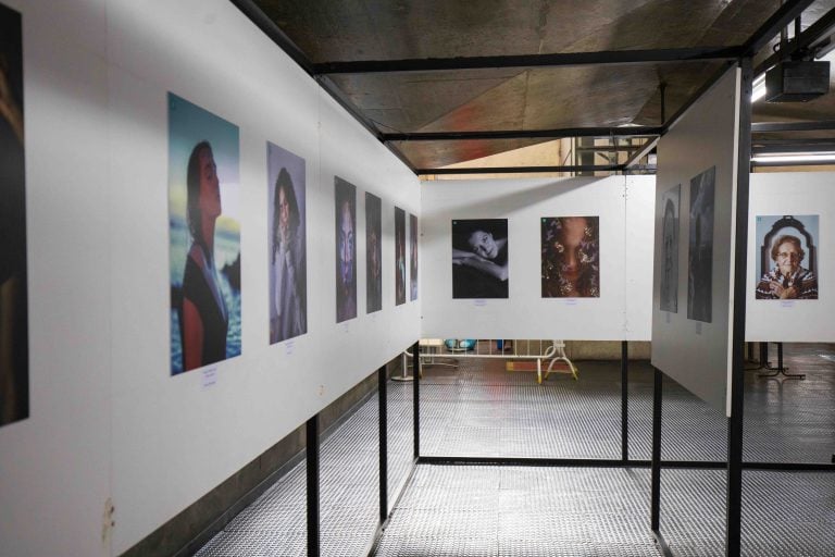
Understanding colors is one of the key concepts in photography. Personally, I’ve always found it interesting to learn about colors, and it has helped me immensely in each of my creative endeavors. In this video, Kebs Cayabyab gives you six principles to follow while taking photos. Master them, and your colors will always be spot-on.
1.Less is more: put simply, fewer colors are easier to manage. If you only have one or two main colors in the image, it will be easier to use them to make your subject stand out. The more colors there are, the more they fight for attention, making your image look messy.
2. Understand color weight: another concept to understand and have in mind is the visual weight of colors. Some colors tend to be more visually “heavy” than others, and it’s important to know how to combine them. For example, warm colors are usually considered “heavier” than cool colors. Combining elements of different colors and sizes will make your image balanced and help you draw the viewer’s eye to the subject.
You can see some great examples in Kebs’ video, and here is an interesting article on the topic.
3. Master neutrals: other than main colors, your image has to have some neutrals as well. These are the areas where the viewer’s eyes can “rest.” Neutral colors are black, white, and all the grays in between; but also muted colors and shades of brown.
4. Harmonize: another thing to learn is color harmonies. It can be overwhelming at first, but it’s actually very interesting and needless to say – very useful if you’re a photographer. You can harmonize the colors in the scene by setting it according to one of the harmonies. However, it’s more difficult to do it in genres like street or documentary photography where you can’t fully control the scene. In this case, you can balance the images out in post.
Kebs mentions two ways of harmonizing colors in post. The first one is to desaturate them a bit so they don’t “smother” each other. Alternatively, you can convert the photo to black and white, but keep in mind that it won’t always work and the photo may still look messy. Another way is to color grade your photo by adding a “harmonizing” color that will make everything the same tone.
5. Break the rules if you know them: most experienced photographers encourage breaking the rules. But to break them, you must first know what you’re breaking. In other words – learn the rules, and then make your own, but be mindful of your audience and your intent. This brings us to the last point.
6. Be intentional: as I mentioned, rules are meant to be broken. At least occasionally. However, don’t break them just because you’re such a rebel. Be intentional about it, do it tastefully, and be aware of what you want to achieve by following or not following a certain rule.
Of course, there’s plenty more to learn when it comes to colors, both for shooting and editing. But these are some guidelines to keep you on the right track and help you nail those colors in your shots. Check out this article for some more inspiration, and feel free to share your tips, tricks, and photos, too!
A Photographer’s Guide to Color (Master Colors Part 1) via FStoppers

Dunja Đuđić Kalinin
Dunja Djudjic is a multi-talented artist based in Novi Sad, Serbia. With 15 years of experience as a photographer, she specializes in capturing the beauty of nature, travel, concerts, and fine art. In addition to her photography, Dunja also expresses her creativity through writing, embroidery, and jewelry making.


Join the Discussion
DIYP Comment Policy
Be nice, be on-topic, no personal information or flames.