


Understanding Digtal Colors And How They Impact Emotion
Jan 28, 2016
Andrew Price

We love it when our readers get in touch with us to share their stories. This article was contributed to DIYP by a member of our community. If you would like to contribute an article, please contact us here.
Share:
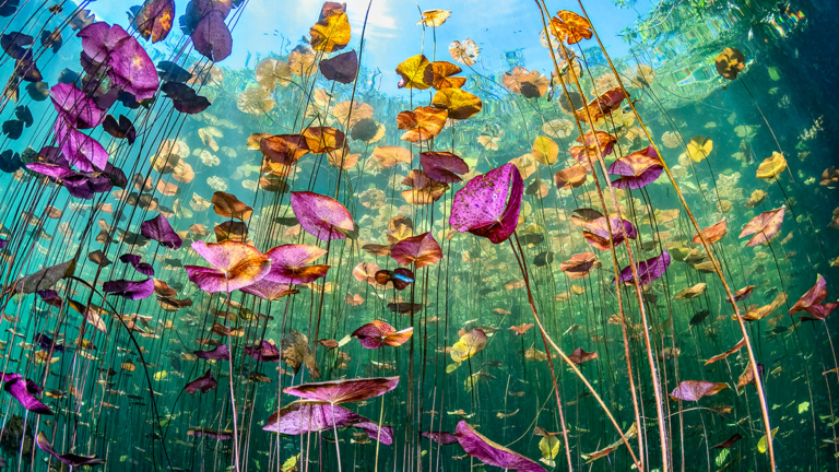
When used correctly, color can change the mood of the image, or impact the story. It can also draw the viewers eyes to a focal element. In the image below, digital colors are used effectively to focus your attention on the tube. And the controlled color palette also helps keep the image calm.

Color is used effectively in this image to keep the mood playful and light:

Saturation and Value
A lot of people think Colors are all about harmonious relationships. But Saturation and Value are equally as important, if not more so. Without a clear understand of what saturation and value is, and why it’s important, no color scheme will ever help you. Saturation is about intensity, and Value about Brightness/Darkness.
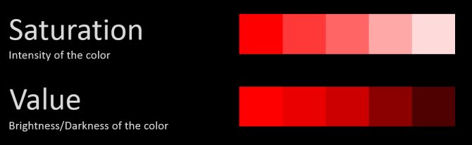


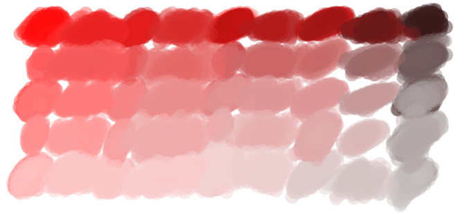
At 20% saturation, red turns into a fleshy pink.
And at 20% value, red becomes a dark muddy brown. In fact just using the color red as a starting point, you can create these shades simply by changing the saturation and value:
“Yeah, but why is this important?” Because Saturation and Value can make or break your image. The biggest problem I see with CG renders is oversaturation:

By forcing strong saturated colors on the viewer, you give them no where for their eyes to rest. Just like you never go full retard, you should never go full saturation. Here’s a much better level:

Not to say that saturation is bad though. In fact it can be excellent when used in moderation:

The striking red mountains catch your eye immediately. Doing so makes it the focal element of the entire image. In this image, a single note of saturation helps to guide your eyes through the scene:

And in this image, saturation is used to make Jesus look powerful amongst a group desaturated onlookers.


Saturation can even alter your mood. At the start of Pixar’s UP, the colors are vibrant and alive to signify their joyous life. But when tragedy strikes, the colors are immediately desaturated.
This simple touch of desaturation makes the viewer feel the pain and loneliness of the characters. It’s used extensively in hollywood and first-person shooters. For cartoons, saturated bright colors can play to the artists advantage, as it immediately tells the viewer that this is fake:

So as you can see, learning how to use Saturation and Value effectively can vastly help tell your story. With that out of the way, we can finally get into…
Color Harmonies (aka Color Schemes)
Everyone knows that some colors look better together than others, but it can get confusing if you try to remember which ones. Here are 6 of the most effective Color Harmonies…
1. Monochromatic

This one is the easiest to remember, because it’s just one color. Due to the absence of other colors, the viewer is left to focus on the differing values and saturation. Making it great for single subject shots or dramatic atmospheric scenes.
Examples:


Check out more monochromatic examples here.
2. Analogous

Analogous harmonies use colors that are adjacent to each other on the color wheel. It’s frequently seen in nature, making it great for creating a calm, comfortable and peaceful mood.
Examples:


3. Triadic

This one is probably one of the hardest to pull off well. It’s three colors that are equally distant to each other. It’s hard to do, because if used in equal amounts it can create ugly chaos. It’s best used for cartoon style scenes since the colors can look almost childish.


4. Complimentary
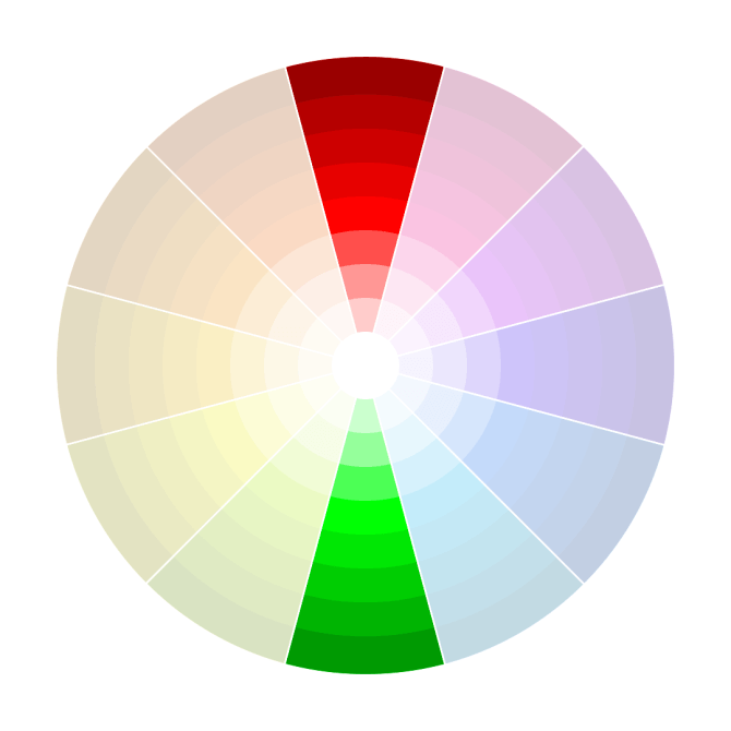
This one is definitely the most popular: colors on opposing sides of the wheel. They just naturally go well together. A common misconception is to use equal amounts of each, but this will more than likely create ugliness. You want to choose one color as the predominant one (usually the cooler color) and use the other to create splashes of interest. Use lots of browns and greys for a better effect. Examples:


Complementary colors accentuate each other. Meaning that a dull green against a red background, will suddenly look more saturated. So be careful of the saturation.
5. Split Complimentary

Similar to the complimentary harmony, this involves taking one opposite color and splitting it. This is useful for extending your palette (when two colors aren’t enough), or to create a more joyous mood. Examples:


6. Double complimentary

Just like the complimentary harmony, only double. Two pairs of complimentary colors (doesn’t matter where on the wheel). You have to be careful with this one as using equal amounts of all four will create chaos. It looks best when the foreground is one pair, and the background is another. Mixing the pairs can get tricky. Examples:

^Notice the complimentary pair of colors in the foreground, and another in the back?


Resources
- SmashingMagazine
- Kuler
- Colrd
- Designspiration.net
- ShutterStock Spectrum
- colourlovers.com
- design-seeds.com
Hope you found this useful! Now get out there and make some colorful art :)
Summary
- Go easy on the saturation… use it to help tell your story or guide the viewers to what’s important.
- Pick the color harmony that best suits what you want to achieve (calmness, playfulness, suspense).
- Study the classics, coz they knew what they were doing. ArtRenewal.org
- Experiment! The best way to get better is to just dive in. Don’t get stressed if you fail miserably the first few times.
About The Author
Andrew Price is a Blend master from Brisbane, Australia. Today, Andrew runs Blender Guru, a free Blender tutorial site. Anrew also runs the architecture academy course.
We love it when our readers get in touch with us to share their stories. This article was contributed to DIYP by a member of our community. If you would like to contribute an article, please contact us here.


Join the Discussion
DIYP Comment Policy
Be nice, be on-topic, no personal information or flames.
9 responses to “Understanding Digtal Colors And How They Impact Emotion”
awesome article (clap clap) :)
Great article!
Very, Very Very nice Artigle!
I love this article! And so needed as we grow accustomed to Instagram and photo filters! Our emotions are changing!
Good reminder. Really informative.But…
“Just like you never go full retard, you should never go full saturation.”
I’m pretty sure you’re not allowed to say that word anymore (in an article, at least).
It’s meant to be a joke. If you haven’t seen Tropic Thunder, I highly recommend it.
If you don’t plan on watching it, here you go: https://www.youtube.com/watch?v=X6WHBO_Qc-Q
Yes, I’ve watched it but it’s a comedy. The article is educational and, therefore, serious. So in this context, “retard” is really unnecessary.
This is humiliating. Every image and piece of information was taken from the Blender Guru. All you did was copy and paste in images and words, replacing some of the text from a work that was published 2 years ago. If this isn’t illegal it’s at least childish, at least give the author his credit..
The link for the original post:
https://www.blenderguru.com/tutorials/understanding-colors