


Use this Hollywood colour designer trick to elevate the emotion in your photographs
Apr 12, 2022
Alex Baker
Alex Baker is a portrait and lifestyle driven photographer based in Valencia, Spain. She works on a range of projects from commercial to fine art and has had work featured in publications such as The Daily Mail, Conde Nast Traveller and El Mundo, and has exhibited work across Europe
Share:
The use of colour in most movies is not random. It’s actually all thought through and planned far in advance of shooting, in order to amplify and help convey the emotion and story. This excellent video walks you through the complicated theory of colour and how it’s used in the film industry.
One popular way to simplify how colour is designed is to use the 60/30/10 rule, as this video from Wolfcrow describes. It’s different from colour grading which is colour adjustment applied in post-production.
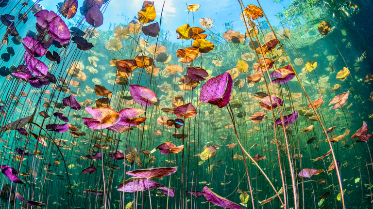
This rule isn’t just used in film and photography, however. It’s common in architectural and interior design too. So how does this rule work? Well, 60% of the frame will be one dominant colour. 30% will then be a secondary or complementary colour, and the final 10% will be an accent colour.
The dominating colour is important because it sets the overall mood of the scene. Is it a high key scene? Low key? Set at night? Outdoors in bright daylight? There’s really no right or wrong answer here.

The complementary colour’s purpose is to support the dominant colour. This also provides more depth and realism to a scene. You can also go with a contrasting colour, hence the popularity of the teal and orange colour scheme so prevalent in recent years.

The highlight or accent colour is exactly what it sounds like. It’s a pop of colour, for example, red will automatically draw the eye, even if it’s just taking up a tiny amount of space in the image. It’s become a slight cliche but that’s because it works. Highlight colours are often not found in the natural world in order to lend more weight to them and the objects that they are pointing to. In the following still from the film Amelie, blue is clearly the accent colour.

I find colour theory absolutely fascinating and there are a lot of great books written about it and the psychology of colour as well. Anecdotal evidence exists that painting the waiting room of a therapist’s office or the away team’s changing room blue will have a calming or subduing effect.
I think as still photographers we often overlook this powerful tool that is relatively inexpensive to use. A prop added in the right colour can make a world of difference to the mood of the image. Sure, it can be changed fairly easily in post, but in my opinion, it’s always more fun to get it right in camera.

Alex Baker
Alex Baker is a portrait and lifestyle driven photographer based in Valencia, Spain. She works on a range of projects from commercial to fine art and has had work featured in publications such as The Daily Mail, Conde Nast Traveller and El Mundo, and has exhibited work across Europe


Join the Discussion
DIYP Comment Policy
Be nice, be on-topic, no personal information or flames.