Sochi 2014 Olympic Winter Games – Women’s Hockey Photo Inspiration
Feb 8, 2014
Share:
A few weeks ago I had the opportunity to photograph fitness model Kristen Cavarzan.
Kristen is an excellent hockey player, and with the start of the Sochi 2014 Winter Olympics, we decided to do a women’s hockey inspired photo shoot.

Concept for Women’s Hockey Photos
Up here in Canada, we take our hockey pretty seriously. The women on the Canadian Woman’s Hockey Team who are over at the Sochi 2014 Olympic Winter Games right now are perpetually one of the top woman’s hockey teams in the world.
That is to say, Canadian women’s hockey players are pretty badass – and if we were going to use them for inspiration for this shoot – it couldn’t be all prissy and pink.

The overall concept for the shoot was to take that Barbie doll, prom queen, demure and soft ideal of femininity that we are used to seeing everywhere, and slowly transform her into an idealized image of a serious, tough, aggressive, athletic, female hockey player.

I really wanted to capture the transformation that is common for all female athletes who are expected to live up to the ideals of modern feminine beauty in the everyday world, but when they step on the ice (field, court, pitch etc.), they are valued for almost the exact opposite traits.
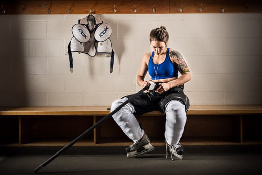
Studio Lighting for Woman’s Hockey Photos
Similar to the concept for the shoot, I wanted the lighting to be edgy and dramatic.
I used four studio strobes. There is a large softbox to the right side of the model, a strip light to the left and an overhead hair light in a small softbox just behind the model. These three lights are all to the side or slightly behind the model, forming a continuous rim light. In the front, there is a large octa softbox to fill in the shadows.

In this photo, you can just see the edges of the three rim lights.
With the exception of the fill light, the power of all the lights are set to be relatively equal by using a light meter.
The fill light is set about two to three stops under the rim lights to just add a little bit of detail to what would otherwise be deep shadow areas.
However, using an actual hockey arena change room posed somewhat of problem.
Posing Kristen on the bench, where she would normally be sitting while preparing for a hockey game meant that I could only position the rim lights to either side of her, instead of slightly behind her, where I would prefer them.


You can see the significant difference just a slight change in the position of the lighting makes in the above two photos.
In the first photo, Kristen is sitting on the change room bench with the two large studio strobes to either side of her.
In the second photo, Kristen is standing about a foot out from the bench, which positions the rim lights just slightly behind her. You can see how much more dramatic and edgy the lighting looks in the second photo.
Post Production
The photos in this post were completely edited in Adobe Lightroom, except for some logo removals, which required more advanced tools in Photoshop.
In Lightroom, my usual workflow is to correct lens distortion, tweak the exposure, make sure the white balance looks good, increase the contrast and make sure the blacks are black, adjust the highlights and add a little bit of contrast, clarity and vibrance.
I also used the gradient tool to darken the edges of each photo.
Finally, because I was going for a dramatic, edgy look, I used the adjustment brush with the clarity set to 100% and brushed over the model and gear. This is not a technique that I would normally use, but I think sports photos with punchy lighting really look good with this treatment.
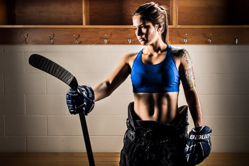
Blue Strobe Gels
For a woman’s hockey photo shoot, I wanted to use a real hockey arena dressing room to give the photographs a realistic context. However, as you can see, a hockey arena change room isn’t exactly the coolest backdrop in the world.
To change things up a bit, I tried shooting some of the photos with blue gels on the studio strobes.
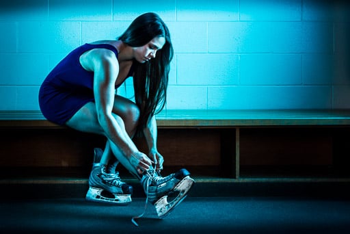
The idea was that the blue light from the gelled strobes would accentuate the model’s blue dress and give the photographs a calm, cool, serious feeling.
Plus I thought that it would just look cool (literally and figuratively).
For the blue gels, I used three layers of blue cellophane wrapping paper taped over the fronts of the softboxes.
You can get cellophane wrapping paper at craft stores such as Michaels.
Comments or Questions About the Concept or Lighting Setup?
Leave a comment below!
About The
Author
JP Danko is a commercial photographer based in Toronto, Canada. JP can change a lens mid-rappel, swap a memory card while treading water, or use a camel as a light stand.
To see more of his work please visit his studio website blurMEDIAphotography, or follow him on Twitter, 500px, Google Plus or YouTube.
JP’s photography is available for licensing at Stocksy United.
JP Danko
JP Danko is a commercial photographer based in Toronto, Canada. JP can change a lens mid-rappel, swap a memory card while treading water, or use a camel as a light stand.










Join the Discussion
DIYP Comment Policy
Be nice, be on-topic, no personal information or flames.