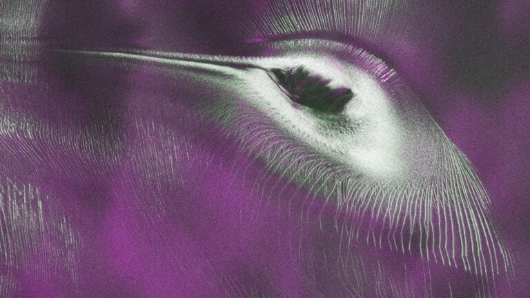


Simplify Photoshop color matching with this simple Eye Dropper trick
Nov 26, 2024
Dunja Đuđić Kalinin
Dunja Djudjic is a multi-talented artist based in Novi Sad, Serbia. With 15 years of experience as a photographer, she specializes in capturing the beauty of nature, travel, concerts, and fine art. In addition to her photography, Dunja also expresses her creativity through writing, embroidery, and jewelry making.
Share:
When you create composite photos in Photoshop, color matching is one of the key techniques to master to make everything look seamless. In his recent video, Rikard Rodin shares a clever Photoshop trick using the black and white eyedropper tools. This method simplifies the often tedious process of color matching, yet it gives you a great result! Let’s dive right in, you’ll master it in no time.
To get started, open your subject and background files in Photoshop. Rickard demonstrates with a portrait and a mountain landscape, and you can try it with his images. Once you open the files, add two curves adjustment layers: one for color adjustments and another for tonal adjustments.
Color adjustment
Start by adding the first curves layer, which you’ll use to align the subject’s colors with the background. This is your “Color Adjustment” layer, and clip it to your subject layer. Clipping ensures the adjustments only affect the subject, leaving the rest of the composition unchanged.
Next, it’s time to put the black and white eyedroppers to work. Hold down the Option/Alt key and click the “Auto” button in the Curves panel. This opens the Auto Color Correction Options dialog. Select “Find Dark and Light Colors” to access the eyedropper tools. For shadows, use the eyedropper to sample a dark area from the background, such as a deep blue tone in the mountain image. Do the same for midtones, choosing a neutral color from the background, and for highlights, select a light, bright color. This instantly adjusts the subject’s tonal range to better match the background. For finer control, set the clipping values to zero, ensuring the sampled colors are used as-is without further adjustments.
Tonal adjustment
With the color alignment in place, it’s time to refine the tonal balance. Add a second Curves adjustment layer beneath the first one, and this will be your “Tone Adjustment” layer. Because it’s below a clipped layer, Photoshop will automatically clip it to the subject. Use this layer to adjust the black and white points manually. Pull the shadows and highlights in until the subject’s tonal range aligns naturally with the background. This final tweak ensures a cohesive look, blending the subject into the scene without looking over-processed. There’s no universal recipe here – experiment with curves like Rikard does in the video and see what looks best.
This approach avoids the complexity of working directly with color channels and lets you achieve professional results with minimal effort. What’s more, it’s a great way to build a foundational understanding of color relationships. With practice, you’ll develop the confidence to eyeball colors and tones, making your editing faster and more intuitive.
I loved this tutorial because it’s so simple, yet so effective I don’t normally create composites, but I’ll test this out just for fun, because it seems almost effortless! Have you tried it yet? How does it work for you?
[How to Use Eye Droppers for Color Matching in Photoshop via ISO1200]

Dunja Đuđić Kalinin
Dunja Djudjic is a multi-talented artist based in Novi Sad, Serbia. With 15 years of experience as a photographer, she specializes in capturing the beauty of nature, travel, concerts, and fine art. In addition to her photography, Dunja also expresses her creativity through writing, embroidery, and jewelry making.
Related Posts
 This tip will save you hours of color matching in photoshop
 This simple Smart Object trick solves “Blend If” transparency issues in Photoshop
 Here is a simple Photoshop zoom trick you probably didn’t know
 This Trick Will Make You See A Black And White Photo In Color And Explain How Color Perception Works
Join the Discussion
DIYP Comment Policy
Be nice, be on-topic, no personal information or flames.