


How to create quick and easy cinematic colour grades in Photoshop in 2 minutes
Mar 26, 2018
John Aldred
John Aldred is a photographer with over 25 years of experience in the portrait and commercial worlds. He is based in Scotland and has been an early adopter – and occasional beta tester – of almost every digital imaging technology in that time. As well as his creative visual work, John uses 3D printing, electronics and programming to create his own photography and filmmaking tools and consults for a number of brands across the industry.
Share:

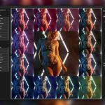
There are a million ways to create cinematic looking colour grades, but this has to be the quickest I’ve seen. All it requires is a single colour adjustment layer set to exclusion blend mode. In this two minute video from Phlearn, we see just how quick and easy it is to do.
As I said, it really is quick and simple.
- Make a solid colour adjustment layer
- Set the layer blending mode to “Exclusion”
- Adjust opacity to taste
Aaron suggests using a cooler colour for the colour adjustment layer. Then when you change the layer blending mode to Exclusion, it will add that colour to the shadows and subtract it from the highlights, providing a complementary colour scheme. It’s a bit overpowering when you first switch the adjustment layer, so just adjust the layer opacity until you get something you’re happy with.

You will want to start off with an image that’s correct in its original colours. So, you’ll want to make sure your white balance is good, or it’s not going to look great. And if you make presets for the ones you like, they’ll all need that consistent “correct” starting point.
This effect can also work on video, too. I easily managed to replicate it in Premiere Pro CS6 using a simple Solid Composite effect on an adjustment layer over my footage, then dialled back the opacity until I got something I was happy with. You might also need to add a curves adjustment to bring back some of the contrast.
So, that’s it, a quick and easy way to grade and tone your image with complementary colours.

John Aldred
John Aldred is a photographer with over 25 years of experience in the portrait and commercial worlds. He is based in Scotland and has been an early adopter – and occasional beta tester – of almost every digital imaging technology in that time. As well as his creative visual work, John uses 3D printing, electronics and programming to create his own photography and filmmaking tools and consults for a number of brands across the industry.
Related Posts
 How to reverse engineer colour grades in Photoshop and reproduce them with curves
 The Infinite Looks Photoshop plugin gives you a million different grades for your images
 Photoshop quick tip: how to brighten portraits and preserve skin tones in two minutes
 Quick Tip: Use Photoshop Quick Mask To Paint Your Selections
Join the Discussion
DIYP Comment Policy
Be nice, be on-topic, no personal information or flames.
5 responses to “How to create quick and easy cinematic colour grades in Photoshop in 2 minutes”
That’s a simple, yet handy trick. I think it’ll improve some of my concert photos!
An action to apply an adjustment layer … really … ?
A image with “bars” … ?
Most of his tutorials are quite good, but honestly, this is a bit ridiculous.
How about someone wipe your ass after the dump … ?
Want some vinegar with that salt?
So you’re above the average learning level of Phlearn’s audience. Phooey for you. The action has several options built into it for those who either don’t have time to fiddle around with colour grading or have to process a bunch of images. The bars are simply a convenience one can choose to use.
“Want some vinegar with that salt?”
Why? Would that break up your pink world?
I find it hilarious with what excuses people come up to defend laziness.
“The action has several options built into it for those who either don’t
have time to fiddle around with colour grading or have to process a
bunch of images.”
Sorry, but “those, who don’t have time”, why do they bother to manipulate an image in the first place? And if “they have a bunch of images” … well, then this color layer is produced one time and then applied to all the others … can’t see any time issues here either.
And those bars make no sense at all. Apart from the fact that it looks silly anyway, in the time in which one searches the image, loads into Photoshop, place and scale … I’ve already finished it on ten other pictures with two black shapes.
Sorry … learning how to be lazy (and therefore staying dumb) is not the way. Aaron can do this much better.
I wrote about this in 2016 hahahaha – https://www.diyphotography.net/powerful-10-second-toning-tip-youve-never-heard/