


Take your photo’s colours to the next level with split toning
Jan 31, 2018
John Aldred
John Aldred is a photographer with over 25 years of experience in the portrait and commercial worlds. He is based in Scotland and has been an early adopter – and occasional beta tester – of almost every digital imaging technology in that time. As well as his creative visual work, John uses 3D printing, electronics and programming to create his own photography and filmmaking tools and consults for a number of brands across the industry.
Share:

I have kind of a love-hate relationship with split toning. I love the work I see others doing with it, but for me, it never really gives me what I want. I guess I need more practice. But Evan Ranft (formerly, Evan 5ps) has a handy little tutorial for dealing with split toning in Adobe Lightroom. The technique should work exactly the same way in Adobe Camera Raw, too.
Evan says the main advantage of split toning for him is that it allows him to give his images a great look without having to dive deep into colour channel adjustments. They also help to give a consistent and uniform feel between multiple images, even when the originals are vastly different. And they can be applied fairly quickly, too.
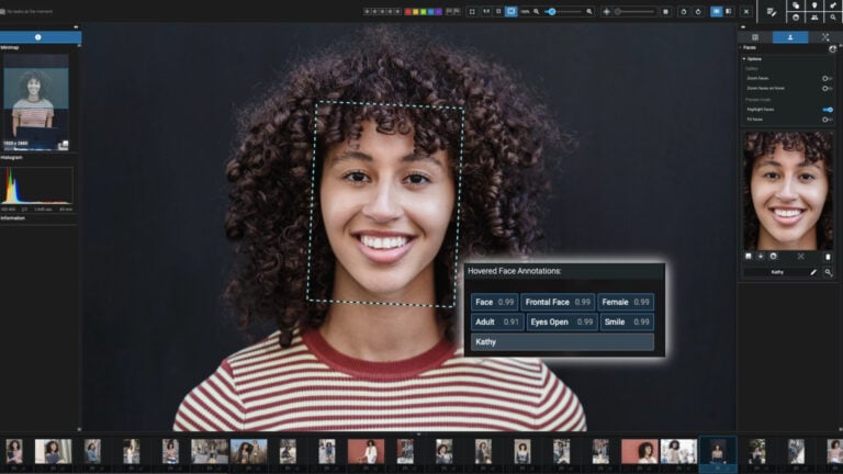
The split toning panel is fairly simple, consisting of just five sliders. The top two control the hue and saturation of the highlights, the bottom two control the hue and saturation of the shadows, and the slider in the middle alters the balance of the two.

You’ll note in the screenshot above that there are two grey boxes next to the “Highlights” and “Shadows” labels. Clicking on those will bring up a dialogue that lets you visually click and drag around to alter the colour and see the change in real-time on your image. Evan begins by setting the colour for his highlights. He picks a blueish colour, with a medium saturation.

He then goes onto tone the shadows, favouring a hue on the opposite side of the colour wheel to that which he used for his highlights. These opposite colours often work very well to compliment each other.

Finally, he adjusts the balance slider. Moving the slider to the left increases the strength of the shadow colour throughout the image. Moving it to the right does the same for the highlights.
So, it’s just a case of finding a balance that works for you. It ultimately boils down to personal taste. You might even find that once you’ve set your balance you want to make further tweaks to the highlight and shadow colours slightly, too. Ultimately resulting in a look that pleases you.


From here, once you’ve got split tone settings you’re happy with, you can simply copy and paste the setting to other images, or you can make a preset.
I still can’t get Lightroom or ACR’s split toning to work for me. I prefer to do it in Photoshop with a curves adjustment. But, maybe I just need more practice.

John Aldred
John Aldred is a photographer with over 25 years of experience in the portrait and commercial worlds. He is based in Scotland and has been an early adopter – and occasional beta tester – of almost every digital imaging technology in that time. As well as his creative visual work, John uses 3D printing, electronics and programming to create his own photography and filmmaking tools and consults for a number of brands across the industry.
Related Posts
 Adobe brings a major features to Lightroom CC including tone curve and split toning
 Lightroom for iOS 2.1 adds live filters, point curves and split toning
 Adobe unveils Lightroom 2.0 for Android, complete with RAW shooting/editing, Dehaze and Split Toning
 The most powerful 10 second toning tip you’ve never heard of!
Join the Discussion
DIYP Comment Policy
Be nice, be on-topic, no personal information or flames.
2 responses to “Take your photo’s colours to the next level with split toning”
I tried my hands with split toning few times with event photographs that I have shot. I think its indeed a good tool but you need a sound practice to get the desired result.
Regards,
Kartick
hmm i usually try split-toning with B&W images. I’ve tried to study relationships between colors on the color circle with this technique.