


How to get the “illustrative” look in your portraits
Feb 22, 2017
Robert Cornelius

We love it when our readers get in touch with us to share their stories. This article was contributed to DIYP by a member of our community. If you would like to contribute an article, please contact us here.
Share:

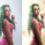
I can’t tell you how many times I get comments like “Wow this is so cool; it almost looks like a painting!” Not that I’m complaining about that whatsoever; I take it as a compliment. It’s one of my goals when creating a work of art – to make something that isn’t quite a photo, but isn’t quite a painting. “Yes, but how do you make it look like that!?” Well, since you asked I guess I could explain some of the process. Obviously a LOT goes into making my images look the way they do. Fancy studio lighting and a hefty amount of digital painting play large roles, but one technique that really pushes my work towards that sort of hyper-real-digital-illustration-y-type-look is the use of the “Shadows/Highlights” adjustment.

Essentially what you’re doing with the Shadows/Highlights adjustment is lightening the dark areas and darkening the light areas. It’s kind of heading in the direction of a fake HDR look and can very easily be taken a bit too far (in my opinion), but when used tastefully can give your images a little extra punch of detail. It’s obviously not a technique to be used on every photo. Sometimes you want very dark dramatic shadows and blown out highlights, but quite often for my work it’s just the thing I need to elevate an image past the look of a typical snapshot. Something about having more details in the shadows and highlights of a picture starts to give it that realer-than-life-illustration sort of look.

I don’t even remember when I first discovered it, but apparently one day the Photoshop Gods were smiling down upon me and cast a glorious ray of light onto the Shadows/Highlights adjustment. The very first time you open it, it will look quite unassuming – just a small pop-up window with a couple of sliders. HOWEVER, if you click the box in the bottom left corner that says “Show More Options,” then we can really get down to business. Note that once you check this magical box it will stay checked from then on. It’s the best.

When Shadows/Highlights launches it will default to lightening your shadows up 35%. I’m not sure who made this decision, but I pretty much never leave it like this. It tends to be a bit too drastic of a push for my tastes. So, the first thing I do is bring them back down a little bit by sliding the first slider to the left. Note that there is no perfect formula of numbers to use. It’s going to be different for every image, and even for every layer within an edit. Oh, also note (man you’re making lots of notes today) that I like to duplicate the layer I’m going to be applying the adjustment to, then take the Shadows/Highlights alterations slightly further than I really want, and then turn the opacity of that layer down. Unfortunately, there is no Shadows/Highlights adjustment layer option, so this way I can turn the effect up or down throughout the rest of my editing process. It’s a slightly more non-destructive editing work-around.

So let’s break it down, shall we? (Yes, we shall.) The top three sliders adjust your shadows. The first one, “Amount,” is going to affect the intensity of the adjustment, aka how light the shadows get. The next slider, “Tone,” adjusts the range of tonal values that will be affected by the top slider. Meaning the higher the “Tone” number, the more of the image that will be affected by the “Amount” slider. As you raise the “Tone” slider, it will start to consider lighter and lighter parts of the image to be shadows and lighten them as well. If you slide it to the left it’s going to only affect the darker pixels. The third slider, “Radius,” changes the distance of transition between the areas being affected and the areas not being affected. You might notice a little halo of lighter pixels around a darker area if you push the shadows/highlights too far – that’s the transition this slider can feather out or tighten up. You basically just have to mess around with all of these sliders, taking it too far and bringing it back towards the other direction to see what you like best for that particular image.

Below the shadow adjustments are three more sliders that will affect your highlights. These are exactly the same as the three above them, except rather than lightening your darker pixels they will be darkening the lighter parts of your image. Again, you just have to mess around and see what you like. Below the three highlight sliders you’ll find the “Color” slider. This is basically just saturating or desaturating a little bit. When you alter the shadows and highlights of an image you can affect the colors slightly, and the image may need a bit more or less saturation to compensate.

The last tweak you can make is to the “Midtone” slider. After you’ve adjusted your highlights and shadows you’ll potentially have brought all of the pixels in your image much closer to a midtone value. This will flatten out the appearance of the picture, meaning you’ll have lost most of the contrast. This handy slider lets you pump some contrast back into the midtones. I basically ALWAYS want to increase the midtone contrast at least a little bit. (Remember that I’m going to take this whole effect a little too far and then turn that duplicated layer’s opacity down a tad.) And at the very bottom, last but not least … no wait, definitely least … are two things that I never touch. The “Black Clip” and “White Clip” help to minimize the loss of detail in the shadows and highlights, but I don’t fully understand how they work and have never changed them. This seems to be working for me thus far so why fix what isn’t broken?

I use the Shadows/Highlights adjustment on pretty much 100% of my images, even if only very slightly. I tend to apply it to the subject and the background separately, and then again at the very end of my edit. I’ll duplicate and merge all my layers and apply it ever so slightly to the entire image. Obviously just slapping these adjustments onto your work won’t magically give it that fully rendered illustrative look, but it will certainly start you in the right direction. The digital painting portion of my editing (which tends to be my favorite part), is where I imagine most of the magic really happens. Below you can see all the painting I did on this image (I put it on a solid grey layer so you could see it better. You’re welcome.)

So if you’ve never tried the Shadows/Highlights adjustment, well, you know … try it! You won’t be sorry… unless you overdo it and your picture looks like butt … so like, don’t do that. For a little bit more in-depth explanation of what went into this edit, take a gander at the speed edit below.
The background, smoke, lens flares, and particle textures are from the RAWexchange Store if you’d like to snag them for yourself!
About the Author
Robert Cornelius is a conceptual photographer and Photoshop artists from Lebanon, PA. You can read more of his writing on his blog and say hi on his Facebook and Instagram pages, and support his Patreon here. This article was also published here and shared with permission.
We love it when our readers get in touch with us to share their stories. This article was contributed to DIYP by a member of our community. If you would like to contribute an article, please contact us here.


Join the Discussion
DIYP Comment Policy
Be nice, be on-topic, no personal information or flames.
5 responses to “How to get the “illustrative” look in your portraits”
watch a few tutorials by calvin hollywood.
Mollie Rouse this kind of reminded me of your project maybe it’ll help? ?
Uh . So maybe reading the author wrong but is he saying good lighting is still just a snapshot and the only way to get a good photo is fake it in PS ?
Didn’t teach me a thing.
Cool picture – no question. Awesome editing – no question. Still I find it absolutely brutal and it bothers me a lot how he shoots with certain lighting, gets rid of the highlights completely and creates new ones in PS. The reason why it “looks like an illustration” is because there’s not much of the original photo left! It is an illustration!