


How I blended photography and CGI to create a desert door composite
Jul 17, 2016
Joseph Parry
Joseph Parry is a Commercial and Editorial photographer based in the UK that provides cinematic photography and ounces of humour. Follow him on Instagram for stories and kick ass imagery.
Share:

Good morning guys! JP here again with another image breakdown. I’ve been friends with Mario for quite some time now and his recent work just blew me away, so I wanted to get in touch with him and get a step through of his some of his latest work.
Today he’ll be sharing how he blended CGI into his composition to make an album cover for the artist Carlos Contra. Take it away Mario! *points to Mario*.
How did the idea come about?
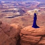
Carlos told me that his idea was he walking trough a desert, so I told him that would be awesome if we had a door in the middle shining in the night, he agreed.
We started with a shooting of him walking so I could compose that later in Photoshop, we took several pictures until we got the perfect walk frozen. The light setup was easy, one 90×60 softbox in front of him simulating the door light and another one behind to give more drama and texture to his back and jacket.

So where did you go to create this desert? Was it an on location shot?
So here comes the tricky part, I was looking for desert pictures that could fit with our needs, but there wasn’t any desert pictures in the perspective we wanted and without copyright, so I choose to create the whole desert with CGI within 3DSMax, my fav 3d software.

Then I tried to build the door within Photoshop with just 2D layers, but I wasn’t achieving the look I wanted so I had to build the door in CGI as well.

So I’m assuming the orange and blue colour scheme was intentional here?
Once I had all the elements with their respective lighting, I started to compose the image. For the door I used 3 layers for the Colour Correction so that way it could fit with the cold mood of the scene. Here is an image of how every layer affects the door and some final touches like the lighting, the yellow/orange light complements the cold tones of the whole scene so that’s why is stands out so much.

Were the stars a stock image or?
For the stars I used a procedural texture made by noise and contrast to give some variety in the size as stars, and for the Milky Way I used an awesome picture that my brother Alex Sahagún took on one of his journeys, he’s an amazing photographer and Adobe certified instructor.
Nice!!! Thanks so much for talking us through this, it;s insane what you can achieve with such a simple setup (though in this case some hefty 3D knowledge it seems! Have you got any other pointers you think are important for compositing in general?
Sure!:
– Perspective: This is so important because it can make something appear bigger or smaller, or just could not match with the whole scene and angle of the camera you want to achieve.
– Contrast: As a tip, the closer the elements to the camera the more contrast you’ll have, so remember to match the contrast depending on the distance you have your elements. There are existing particles in the air that create something called “haze” or “fog” that lower the contrast of the farthest elements.
– Colour/Tone: Colour is very important because it will fake and make the blending of the elements closer to the same mood. You can do this part of the process on the top of the composition with different adjustment layers as gradient maps, solid colour as soft light, etc. This will help you a lot to merge elements also.
– Light source: If your light source of every element are different, the brain will tell you that something is wrong with the composition it won’t appear as real as possible. Photoshop is amazing because with adjustment layers you can easily create shadows or highlights, so you can choose where you want the light source of every element is coming, I think this is one of my favorite parts about compositing.
– Haze/fog: Creating haze or fog using layers blended in “Normal” mode or “Screen” mode on the top of the composition also helps to blend a lot your elements, this makes the shadows of every element being affected by this effect and looks more believable to eye so the brain likes it, you just have to experiment with different opacity.
Here you can see an animation GIF I made for the process I went trough, as you can see to give depth to the composition I put some “haze” to separate the background and the foreground elements, that helps a lot for the depth part and lower the contrast of elements as I mentioned before.

Wow. Thank you so much Mario! Any last words?
I think that’s it, have fun with compositing and be patient, but more importantly, OBSERVE, observe how real life works and try to understand everything about light, go slow and experiment a lot. Do not expect someone to solve your problems, experiment to find a way to solve it if you don’t find one, believe in your intuition and have fun trough the process.
Compositing can be stressful but it is also the most fun thing in the world withing Photoshop, you can create EVERYTHING you can, it is the perfect tool for materialising dreams and everything inside the mind.
You can check out more of Mario’s work on his website.
Filed Under:
Tagged With:

Joseph Parry
Joseph Parry is a Commercial and Editorial photographer based in the UK that provides cinematic photography and ounces of humour. Follow him on Instagram for stories and kick ass imagery.
Related Posts
 This filmmaker used a salad bowl to create a “door spy hole” effect
 Create Amazing Rainy Composite Images With This Great Photoshop Video Tutorial
 We took four models into the desert to create dramatic portraits in the landscape
 Group shots don’t have to be boring, create an epic composite like this wedding photographer
Join the Discussion
DIYP Comment Policy
Be nice, be on-topic, no personal information or flames.
7 responses to “How I blended photography and CGI to create a desert door composite”
Awesome!
I don’t know why, but the perspective of the door doesn’t look right in the scene. :/
Also, the guy looks like he is going to the left of the door, not at the doors.
How did you matched the perspective? Did you use Perspective Match tool?
Other than that – cool project. I myself am currently planing to create something similar.
Here is a pic from my latest cg/photo experiment: https://uploads.disquscdn.com/images/a7ea2280bf594fc260427481d1897449070e22ecdb0766c62b7dc03e74f096b8.jpg
The perspective is wrong. The door and the man are two different scale.
The lights are totally wrong. The light comes from the crack are going both way. It looks like the wood is on fire. The man’s shadow says the strongest light in the scene is the light coming from the door, but the door casts a shadow from whatever light source. Not the Milky Way, that (well obviously too dim) would cast a shadow towards the viewer. (Both man and door) Also, in front of the door, the sand’s texture is indicating that the light comes from the top right corner, not the bottom of the door. Also there are issues with the colour of the light.
Sorry, I know I’m too negative but if you want to write an article about something you should be good at it.
> if you want to write an article about something you should be good at it.
Strongly disagree with that statement.
Sometimes the point of an article is to show there is more than one way to do something. It’s a means to inspire people to think outside of their current box and to try something different.
Also, who defines what is good here? Aesthetics and preferences are purely subjective. Just because you don’t like something does not mean it’s bad, it merely means you do not like it. If your preferences are based on technical perfection, it does not mean everyone sees the technical flaws that you do.
You raise some very valid points that I’m sure Mario can read over and use to further his knowledge next time he creates. Thanks for sharing!
Maybe you pointed some valid issues there… but I don’t agree with you saying: “if you want to write an article about something you should be good at it.”… I think this is inspiring and shows me a different way to do things, so, yes, It can be improved, but it is also very helpful. I think is a great tut and a good image!
This can be really fun to experiement in creatively!