


Trump Trolled By Time – A Photographic Deconstruction of the Man of the Year 2016 Cover
Share:

The perceived devil horns grabbed the headlines, but the real story behind the deep symbolism embedded within Time Magazine’s 2016 person of the year cover featuring Donald Trump is much more interesting.
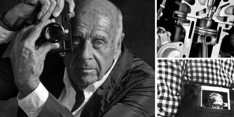
Nadav Kander is a brilliant photographer and the impression of Donald Trump that you get from his photograph is unmistakable – following in a long tradition of using photography to influence perception – like Arnold Newman’s evil brooding image of Nazi industrialist Alfred Krupp, to Platon’s cold, inhuman portrayal of Vladimir Putin.
Kander’s treatment of Trump is subtle enough that supporters probably don’t see past a tough looking businessman, but the deliberate nuance to this image is delicious – so lets take a moment talk about this image of Donald Trump from a photography perspective.
Photography Tells A Deliberate Story
First of all we need to understand that Time Magazine’s 2016 person of the year cover was meticulously planned. There is nothing in this image that was not deliberate – Kander’s image of Trump is crafted to tell the viewer a specific story.
If you’re not quite sure of the deliberacy behind this image of Trump, take a look at Kander’s portraits of Barack Obama – you get a very different impression of the kind of man Obama is versus Trump (your impression of that reality of course depends on your personal world view).
Even Kander’s portraits of members of Trump’s inner circle: Steve Bannon, Kellyanne Conway, Mike Pence and Reince Priebus don’t receive the same treatment as Trump – their stories are nowhere near as explicit as the story Kander and Time are telling about Donald Trump.
Here is the official story from Time about this portrait of Trump (with a few little sneak peaks at the setup):
The Obvious Positive Story
The obvious story at the surface of this image is that of a successful, powerful, tough businessman – and Trump certainly embodies that narrative.
Trump’s expression appears confident and shrewd, like a person concentrating on an important task.
The viewer’s interpretation is dependent on the viewer’s world view – in other words, if you are a Trump supporter, or Trump himself, you’re probably going to look at this image, interpret the obvious story and come away with a positive impression of Trump the businessman.
The Subliminal Negative Story
Of course, the real story that this image is trying to tell is the opposite of the obvious.
I think George Takei totally nails the the negative subliminal cues present in this image (in under 140 characters too in his Tweet “Trump trolled by Time”):
Devil horns, monster shadow, unretouched bald spot, delapidated chair, literally resting on laurels…Trump trolled by Time. h/t N. Freedman pic.twitter.com/4tRAHvJ3ul
— George Takei (@GeorgeTakei) December 8, 2016
But lets deconstruct the image further, from a photographer’s perspective.
In the pose chosen, Trump is looking back at the viewer, a superior who is far ahead – and therefore better than the viewer – and in the process of turning away from you.
Trump’s pose is especially interesting given that Trump is an elite billionaire, but he won the presidency by campaigning as a populist – the regular guy middle class Americans can relate to. However, Trump’s pose in this image is designed to convey the feeling of an elite with a palpable disdain for his inferiors.
Given the subliminal cues provided by Trump’s pose, his expression becomes a lot more ominous. Instead of seeing a confident business man, the viewer sees a man who is looking right at them with a neutral expression and a hint of a smirk – his intentions are not clear and his gaze is unnerving.
Next we have the prop – a tattered old gilded chair.
The symbolism that the chair conveys is such a powerful part of this image. At first glance (if you even notice the chair) you get the impression of wealth and grandeur. But with a closer look, the viewer realizes that the gold isn’t real and the chair is just tired, old, damaged and clearly past its prime – visual impressions that are transferred to Trump himself, and perhaps America in general (especially poignant since one of Trump’s biggest claims is that he’s not a phony – that chair says otherwise).
Then there is the lighting. Half of Trump’s face and body are visible to the viewer, while the other half is hidden in shadow. He is depicted as a man divided with a literal dark side. It is hard to mistake the symbolism there. An even more powerful subliminal trigger is the dark, sinister shadow brooding in the background. The blue gel on the fill light and blue in the background pallet finish the image off with a cold unfriendly tone – similar to Platon’s portrayal of Vladimir Putin.
Finally, if there was any doubt about intentions of the true story Kander and Time are telling about Donald Trump there is the caption “President of the Divided States of America”.
This single statement ties all of the positive and negative visual subliminal cues together into a neat concise story.
Do You See A Positive or Negative Portrayal of Donald Trump?
One thing that I love about photography is the ability to convey a complicated narrative with a single image – and that narrative can be extremely powerful.
In an interview with Getty, Arnold Newman said the following about his iconic image of Alfred Krupp:
I deliberately put a knife in Krupp’s back, visually. He was a friend of Hitler’s and Hitler let him use prisoners as slave labor. If the prisoners fell, he just unchained them and they went directly into the crematoriums in Auschwitz. Krupp’s people realized I was Jewish, and they were worried that I might not be kind to him. I was trying to figure a way to show who he really was without being obvious. I lit from both sides and I said, “Would you lean forward.” And my hair stood up on end. The light from the sides made him look like the devil.
Time will tell how Nadav Kander‘s image of Donald Trump will be judged, but there is no question that it is a powerful image telling an interesting story. I think the fact that even the most ardent Trump supporters see a conspiracy with devil horns speaks to the effectiveness of the narrative this image conveys (if he was portrayed in warm tones as kind and jovial we’d be talking about rabbit ears).
I also have to admit that I love the fact that photographers have consistently been able to portray some of the world’s most powerful people in a very unflattering way (if not brutally honest), without their subjects or their subject’s handlers realizing it at the time.
But, what do you see in this photograph?
Do you see Donald Trump the powerful, confident businessman?
Or do you see Donald Trump the shadowy, untrustworthy demagogue?
What do you think the photographer’s intention was with this image?
Leave a comment below and let us know!
(And please, this is a photography blog so lets keep the discussion about photography).
Image credits:
Arnold Newman – Alfred Krupp
Nadav Kander – Donald Trump
Platon – Vladimir Putin

JP Danko
JP Danko is a commercial photographer based in Toronto, Canada. JP can change a lens mid-rappel, swap a memory card while treading water, or use a camel as a light stand.
Related Posts
 Man Asks Photoshoppers to Place the Eiffel Tower Under His Finger; Gets Trolled Big Time
 I won something in this years British Army Photographic competition 2016
 How my profile photo got severly trolled by my photographer friends
 Granny dressed in bubblewrap and clothes pegs trolled London Fashion Week photographers
Join the Discussion
DIYP Comment Policy
Be nice, be on-topic, no personal information or flames.
24 responses to “Trump Trolled By Time – A Photographic Deconstruction of the Man of the Year 2016 Cover”
Reminds me a lot of Gregory Heisler’s portraits of Giuliani and Gingrich, also for TIME.
Kudos to the photographer and Time magazine. The photo immediately had given me the creeps. As a photographer of everything but portraits, I knew there were things that I might have missed but I knew it was not a flattering photo. I noticed the M positioned above his head, the backward stare, the frayed edges on the chair. My thoughts about the chair was that it seemed very much out of place in photo of him because he would most likely never to seen sitting in a chair in ill repair. I saw the design but did not think of laurels but of a fleur-de-lis pattern but not what made that pattern. It wouldn’t be what he would have in his home or office. The caption – perfection. His campaign of lies and hate mongering divided this country and it will get worse during his tenure in the oval office. He will never be my president. The people elected a different president but the electoral college stole it from her. Reporters will need to be just as vigilante in reporting on this presidency and his congress. (Capitalization of some words deliberately ignored because he does not demonstrate or deserve that respect.)
Dummy…the president in the US has never been elected via the popular vote.
Not everyone can make a portrait that subject to various interpretations, and Nadav Kander really did a great job!
I like your observation that “if he was portrayed in warm tones as kind and jovial we’d be talking about rabbit ears”. Although, personally, I could never see anything positive about this man even if he had rabbit ears, glitter and riding on a unicorn.
Yes I think that this photographer has achieved what he set out to achieve, especially when taken in context with the Obama portrait.
It’s a bit childish though.
This is the left rolls. Always childish, never professional.
I’d argue that expression through art is far more professional and intelligent than drawing swastikas and “Trump” on people’s personal property.
Deliberate was the exact word I used to describe this cover. Time often goes for a dark, almost satirical vibe, but what I think is most notable about this image is the chair. It’s distracting. He’s half hidden, as if they were trying to make him appear less important, less powerful, weak.
i cant beleive DIY Photography is playing politics. The election is over and still more politics. Get over it
I don’t think this is playing politics beyond the decision to analyse this specific portrait, but politics are very much in the public mind just now and photography has always commented on them. The analysis was anyway fascinating and I shall look at portraits of celebreties with new eyes in future.
Not nearly as bad as the hack job Annie Liebovitz did on Bush and his admistration.
Call it what it is, “Person of the Year” that egotistical ass doesn’t like that Time no longer calls it “Man of the Year” I guess it’s less dignified. Ass #therealdonaldtrump
We all lose. You Trump lovers will find out soon enough.
The devil horns are easy to see, but I appreciate the analysis of the elements of the photo.
I know we live in a post-truth world now, but I have to point out the reality of a particular impression doesn’t vary with your world view. Its accuracy may change with time and with someone’s actions. Opinions and perceptions are what change from person to person.
By the way, you keep saying queue when you mean cue.
Thank you! I was trying to avoid saying that the reality is Obama is a better man than Trump, but I can’t stand this post truth bs that reality is based on perception either – so…updated. Also thanks for the catch with queue vs cue – I was pretty proud that I figured out how to spell queue ;)
I can understand. Two thumbs up anyway!
Way to show yourself as unbiased news source. :D
From this novice’s point of view, the image of Trump only reinforces the ‘I’m better than you’, pompous attitude the, er, man, exhibits. IMHO, men like him are a dime a dozen, yet, only worth about half as much. And, I am not referring to a person’s wealth, either.
What do you make of the shadow? It does not look “right” to me. Does the place of the shadow in this image correspond with the direction of the light as it strikes Trump’s face? Or is the shadow an interpolation?
Great observation – I was going to talk about the shadow but thought that was getting a little to technical. You’re right, the shadow isn’t from the key light – I think it must be from the blue gelled fill light – but then it doesn’t make sense that the background is brighter than his dark side. In the video we see a few peeks at the setup, so I’m pretty sure it was done in camera, but I’m not sure exactly how.
I guess it comes from the blue fill?!?- or made to look that way…(supposedly to enhance the coldness of the backgr.)
Now- placing human skin tone on a cold backgr. should warm the subject by contrast…Not sure that was the intention!
I also noticed the devilish reflection of the blue filtered light in the left eye- and I think that is actually at least enhanced if not inserted in retouching.
I find the expression defying- to say at least (but that came probably naturally- and was not dismissed…). I’m sure Kander would not fall short of directing the subject’s expression, even in the case of POTUS…(if he wanted to).
Anyway, great “dissection”! I enjoyed the article.
Do you really like the linked-to photo of President Obama? I can’t get past the overprocessing… the wildly-unnatural background glow, as if Lightroom’s “Dehaze” and “Clarity” were both pushed to the max. He’s a handsome man who’s confident in front of the camera, so I’m sure it’s not hard to take a good photo of him… if you just lay off the processing. Perhaps it’s just a matter of taste.
And clearly the photographer had never see Peter Hurley’s popular video about extending the chin a bit to tighten the jaw line and de-accentuate neck flab. It’s not a horrible photo, but definitely not a “Shazam!” (to borrow Peter Hurley’s phrasing) capture.
(All that being said, I’m sure it’s still better than I could do. )
As a linked in headshot no – Perter Hurley’s mandate as a portrait photographer (working for the subject) is much different than Kander’s as a story teller (working for himself or a 3rd party art director). I think Kander’s portraits of Obama are very dignified and give you an impression of a cerebral, focused man – which I assume is what he was going for. As for the processing, I think part of it is the medium format look where you can achieve a much wider dynamic range in camera – which online tends to look like + 50 dehaze, +100 shadows, +100 clarity – but yes I see your point, I’m not a big fan of over-processing either.
Oh, I didn’t mean to imply that Peter Hurley’s photographic *style* was what was missing in the President Obama portrait, sorry. Merely that even a “cerebral, focused man” looks better in photos without the appearance of chin flab.