


Take your images up a notch with colour grading done the right way
Jul 18, 2022
Alex Baker
Alex Baker is a portrait and lifestyle driven photographer based in Valencia, Spain. She works on a range of projects from commercial to fine art and has had work featured in publications such as The Daily Mail, Conde Nast Traveller and El Mundo, and has exhibited work across Europe
Share:
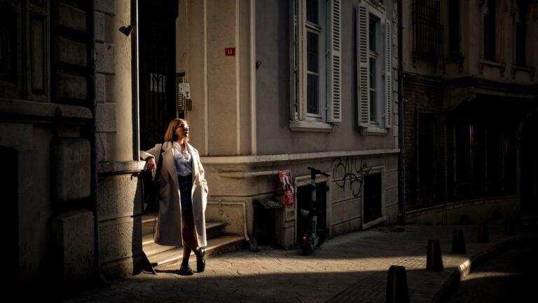
One of the parts of editing and post-processing I enjoy the most is colour grading. You can really add to the emotion and story depending on how you edit the colour palettes of an image.
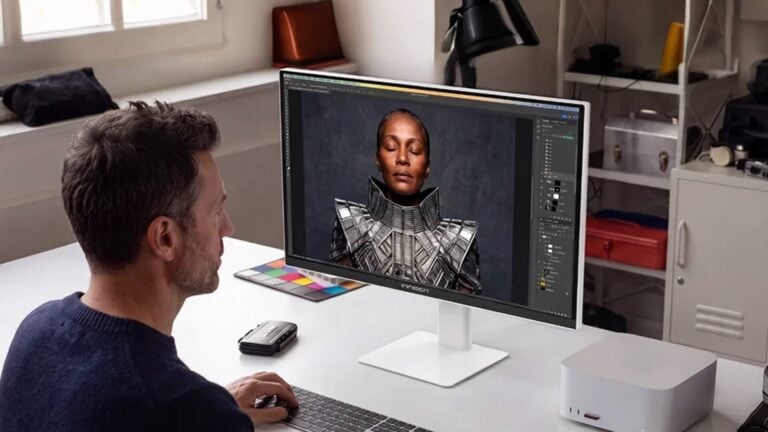
In this excellent video from Adorama, editorial and commercial photographer Emily Teague shows us how she goes about colour grading an image. Emily is using Capture One to edit her image, however, the same principles apply to whichever software you’re using.
First off Emily explains the difference between colour correction and colour grading. This is an important distinction as I think it’s easy to get confused by the two terms. They do in fact have a lot in common, but the goal is quite different.
Colour correction basically involves what it sounds like. It’s taking the colour or white balance of an image and making it look as realistic as possible. Because colour varies in temperature it’s quite common to need to adjust the colour temperature in post particularly if using mixed ambient and artificial lighting. Tweaking the white balance, exposure and contrast can all help to create an accurate and neutral natural-looking image. Once that’s done you can move on to colour grading.
Colour grading on the other hand is a much more subjective and creative process. This is where your colour choices reflect your stylistic approach to the image. You can use colour grading as a tool to enhance the mood of the photo and emphasise certain aspects of the story.
Emily has one very important point though. That is to not do so much to the image that you risk degrading the quality. It’s easy to get carried away. With anything post-processing, less is more. You’ll notice that when Emily toggles between the before and after the difference is quite subtle.
What really makes this video stand out is how Emily walks us through her thought process behind each of her choices. It’s not just a ‘how to’ but also a ‘why to’ which is far more useful in my opinion. She has a few really great insights as to why she is doing something or why she isn’t doing something. For example, how she is extra careful when colour grading the highlights because they tend to affect skin tones more, and she is careful to keep those looking somewhat natural.
Ultimately it’s a very fun creative process that helps you take your images to the next level.

Alex Baker
Alex Baker is a portrait and lifestyle driven photographer based in Valencia, Spain. She works on a range of projects from commercial to fine art and has had work featured in publications such as The Daily Mail, Conde Nast Traveller and El Mundo, and has exhibited work across Europe


Join the Discussion
DIYP Comment Policy
Be nice, be on-topic, no personal information or flames.