


Avoidable Photographic Errors
May 24, 2015
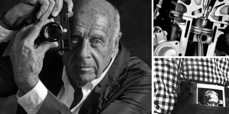
Ming Thein

We love it when our readers get in touch with us to share their stories. This article was contributed to DIYP by a member of our community. If you would like to contribute an article, please contact us here.
Share:

Rule number one: there are no rules. A ‘mistake’ may not necessarily be a mistake if it helps convey the message or story or feeling intended by the photographer. I can easily think of multiple examples that go against every scenario described below. That said, for the most part, I’ve found these ‘mistakes’ to hold true. And if you want to achieve something very specific, then you either won’t be reading this article in the first place, or you’ll know when to bend the rules. The general viewing public probably has some preformed opinions of what is right/good, but these are born out of as much ignorance as conditioning by companies trying to sell more software or lenses or something else. There are rational reasons why these opinions may not necessarily be right in the context of fulfilling creative intention.
More bokeh is better
Less depth of field means less context. Less context means less story, and a weaker image. Have shallow enough depth of field, and you can’t actually even clearly identify the subject: it’ll be like looking at something through a thick liquid. Unless this is your creative intention, it’s actually quite annoying to the audience to be able to see something but not really make it out clearly. Don’t get me wrong: there is a right amount of depth of field, where everything you want to be clear is in focus, and everything that you don’t is not to varying degrees of blur. It’s still important to be able to identify the non-important elements for context. Faster lenses have a function, too; and that’s usually when it comes to creating some separation at much longer distances, or collecting more light to keep your shutter speeds up in dim situations. Both of these situations of course require a lens that can actually perform well wide open or close to it and can be focused reliably; otherwise you’ll land up with a soft image anyway. Not all optical designs are equal, so you may well find that by f2.8, f1.4 and f1.8 maximum aperture lenses are pretty much identical; you might save yourself some money and weight in the process.
Tilting horizons is funky
The nature of our visual cortex is that it corrects for inclined horizons: this is to say, if your head is tilted slightly, you’ll never perceive the horizon as being slightly off – it’s either drastically tilted, or not at all. If it’s drastically tilted, we start to feel uncomfortable because the situations in which this happens in reality are generally the precursor to something very bad to which we need to react immediately. Part of the reason our brains can do this is because the visual field doesn’t drop off to zero abruptly at the edges; rather, it fades out. This means there are no obvious non-orthogonal edges to correct for where a skewed horizon meets the border of the frame. This does, however, exist in a photograph: our brains cannot correct for this, and it then becomes very obvious that the horizon is skewed because there is a visual cue we cannot ignore. This is especially obvious if the horizon is close to the bottom or top of the frame, or forms a clear line that intersects the right or left borders (e.g. a seascape as opposed to a cityscape without a distinct horizon). Hold the camera straight.

Filters and overprocessing can make an image interesting
If the first impression of a photograph is one of processing (color shifts, vignettes, artificial tilt shift effects, grain etc.) then the chances are the actual subject matter will never really stand out, simply because the presentation dominates. Chances are, if the processing is too strong and you had a dozen photographs processed and presented identically, nobody will remember the subjects at all. Is the photograph about the subject or the presentation? If the content is unimportant, why take the photograph at all? An interesting subject and/or composition should not require heavy processing to make it interesting to begin with. The role of processing is to support and enhance the presentation of an idea only.
Wide angle lenses are to ‘get more in’
Wide angle lenses are to emphasise foregrounds over backgrounds because the geometry resulting from a wide angle of view is such that a near foreground object will appear to dominate more over a distant one of the same size because it occupies a greater linear percentage of the frame when projected into two dimensions. If you simply back up to include more linear distance of background, then the foreground grows even more dominant relative to the background and the image appears even emptier; if anything the result is the opposite to the effect you’re aiming for. It would probably be better to stitch multiple frames from a telephoto.
There is no clear subject
Humans are pattern-recognisers; this works both ways: we see repetition and breaks in repetition. However, when we see repetition, we ignore individual elements that aren’t too different; a crowd of people still looks fairly homogenous even though each individual is different. No one person stands out unless they are very different; think somebody wearing a neon pink jumpsuit and hat in a group of grey suits, for instance. If there’s a second person in neon blue, then Mr. Pink will have competition – and so on. So for a subject to stand out, it has to break pattern with the background and visually dominate. I see a lot of images in which what stands out the most isn’t the intended subject – beware of tunnel vision in composition, too.
The subject has to be in the middle
Most camera’s AF points are clustered about and most effective in the centre of the frame; this is due to engineering more than anything else. It’s actually very rare that a composition works best with a dead-centre subject; you run the risk of having empty and wasted space on either side of the long axis of your frame. Where you put the subject should be dictated by the available context and your intended message or composition, not the technical limitations of your hardware.

Motor drive makes up for good timing
More fps isn’t necessarily better for capturing the decisive moment – achieving critical timing is actually easier in single-shot mode, because it’s easier to know exactly when the shutter will fire. Even if you have 10fps, you don’t really improve your chances of hitting the critical point in time for several reasons: the total exposed time isn’t really that much more in absolute terms, and moreover the 10x longer blackout time is going to have a much greater negative impact on the result simply because you cannot see what is going on. The reasons why more fps can help is if some subsequent unexpected action happens, then a fast camera will be ready to go again in less time than a slow one and probably also have a larger buffer; you’re still better off shooting singles, though. Remember: HC-B had to wind the camera manually between frames, with a 36 shot buffer and probably a good 30 seconds or more to rewind the film and load a fresh roll. No motor drives there, and it didn’t seem to affect the results much.
High key and low key still need some absolute blacks and absolute whites
This one is a little more subtle: color or monochrome, no matter how dark or light an image, you still need an area that’s close to black or white so that the audience can calibrate their expectation of the scene and know that it was meant to be interpreted as dark or light and not an exposure error. The majority of the spatial area of the scene can be predominantly dark or light. If you find yourself with nothing that appears absolute black or white after adjusting exposure to the desired level, then this is where dodging and burning come in handy*.
*Covered in Making Outstanding Images Ep.5: processing for style
The technical bits matter to the exclusion of the image
Perhaps the greatest fallacy of all: you can make a technically perfect image that is boring, but not a great one whose composition suffers from being low resolution. Yes, all things equal, better technical qualities of an image are better and give you more output options; however, they should not be the first consideration unless you know how to deploy those technical properties to the enhancement of the intended idea – e.g. a 60″ wide Forest print would not give the impression of transparency and being there if the source file was 2MP.
The camera doesn’t see what you see
I believe this is the biggest disconnect of all: our eyes don’t work the way a camera does. Not being consciously aware of the differences and subsequently either using them to advantage or compensating is where the translation between idea and finished image falls down. Some of these differences are structural, some of them are perceptual and brain-related.
Of course, avoidance of these pitfalls doesn’t guarantee an interesting photograph – we haven’t said anything at all about the four things or output or context. But they can certainly go a long way to helping translate and communicate an idea from creator to audience – and ultimately, that is the purpose of photography. MT
About the Author
Ming Thein is a commercial photographer based in Kuala Lumpur, Malaysia. He specializes in architecture, corporate documentary and fine art. He also conducts masterclasses around the world and has a comprehensive set of video workshops available here. You can follow his excellent blog here, his photography on Flickr and his musing on Facebook. This article was originally posted here.
We love it when our readers get in touch with us to share their stories. This article was contributed to DIYP by a member of our community. If you would like to contribute an article, please contact us here.


Join the Discussion
DIYP Comment Policy
Be nice, be on-topic, no personal information or flames.
7 responses to “Avoidable Photographic Errors”
Nice article but you’ve muddled up the headings. Most are worded as the misconceptions you then dispel: “More Bokeh is Better”. But one is as correct idea you then confirm: “The Camera Doesn’t See What You See”. And one is ambiguous: “High Key and Low Key Still Require Absolute Blacks and Absolute Whites”. It’s very confusing to change perspective in a list.
Also I believe you meant to write “Bad Timing” or “Poor Timing” rather than “Good Timing” on the motor drive one, since that’s the misconception.
The article begins with: “Rule number one: there are no rules.”. That’s why the article is interesting.
I agree with Mike. Good article but confusing headers for the reasons stated.
Throw in “Waterfalls Should Look Like Dry Ice” and you’ve got a nice list of popular goofs.
Motor drive makes up for good timing:
I was on the lake with friends, stopped at a party spot, and I noticed one guy that was doing backflips off the top of a boat. I signal/shot “do it again”, I switch my Canon A-1 Motor Drive MA to high speed for a 5 fps. I got the entire backflip in 6 frames. I don’t know how Eadweard Muybridge did his photography of motion in the 1870’s.
But I would be interested in learning how to capture the decisive moment of a golfer hitting a golf ball from a bunker and capturing the spray of sand with the golf ball in flight in a single shot.
HC-B probably has never photographed an air show that featured military precision teams, such as the US Navy Blue Angels, or the US Air Force Thunderbirds. I went to an air show that featured the Thunderbirds; my budget for that day was 6 rolls of 36 exposure film. I loaded a new roll of film prior to the start of the Thunderbirds performance; during their performance, I had to reload. I wanted to get the opposing pass, but since I didn’t use my motor drive, I missed the two jets passing by.
you can learn to anticipate timing with enough practise. Of course there are always situations where the motor drive would be the better choice, as with your golf shot example, but for instance, when you are shooting with a flash it might not be able to recycle as fast as your motor drive would take the photos, so in such cases, perfect timing is critical.
True, but with film, there’s no way of knowing if you’ve nailed the photo until the film is developed. With the golf shots, it’s just a bunch of ones and zeros. I could become an air show junkie and travel several hundred miles, but locally, air shows usually come back to the same venue every two years (if US sequestration doesn’t kill the military precision air team’s show schedule).