


Color Theory in Photography: Definitive Guide in Using Color Wheels to Create Stunning Images
Nov 10, 2025
Darlene Lleno
Darlene Lleno brings a unique perspective to DIY Photography as someone who grew up surrounded by camera gear but chose words over lenses. With five years of writing experience, she specializes in photography content that’s both technically informed and genuinely passionate. Growing up with a photographer twin brother meant camera talk was everyday conversation in her household. While he mastered capturing moments, Darlene discovered she preferred being the subject and the storyteller behind the scenes. As a travel enthusiast and mother of two, she understands the importance of preserving life’s precious moments. When not exploring new destinations or writing for DIY Photography, you’ll find her reading or tending to her garden. Her approach to photography writing is refreshingly authentic, she may not be behind the camera, but she knows exactly what it takes to help others capture the shots that matter most.
Share:

Color theory in photography transforms how you compose and edit your images. Understanding how colors interact helps you create harmonious or contrasting compositions intentionally. The color wheel serves as your roadmap for making smart color choices.
Most photographers ignore color relationships completely. They focus on exposure, composition, and sharpness while colors just happen randomly. Professional photographers plan their color palettes deliberately. They understand complementary colors, analogous schemes, and how temperature affects mood.
Learning color theory in photography gives you a new creative tool. You’ll spot color opportunities in the field before shooting. You’ll know which colors to boost or tone down in editing. Your images will feel more cohesive and intentional than ever before.
Read more: Color Theory in Photography: Definitive Guide in Using Color Wheels to Create Stunning Images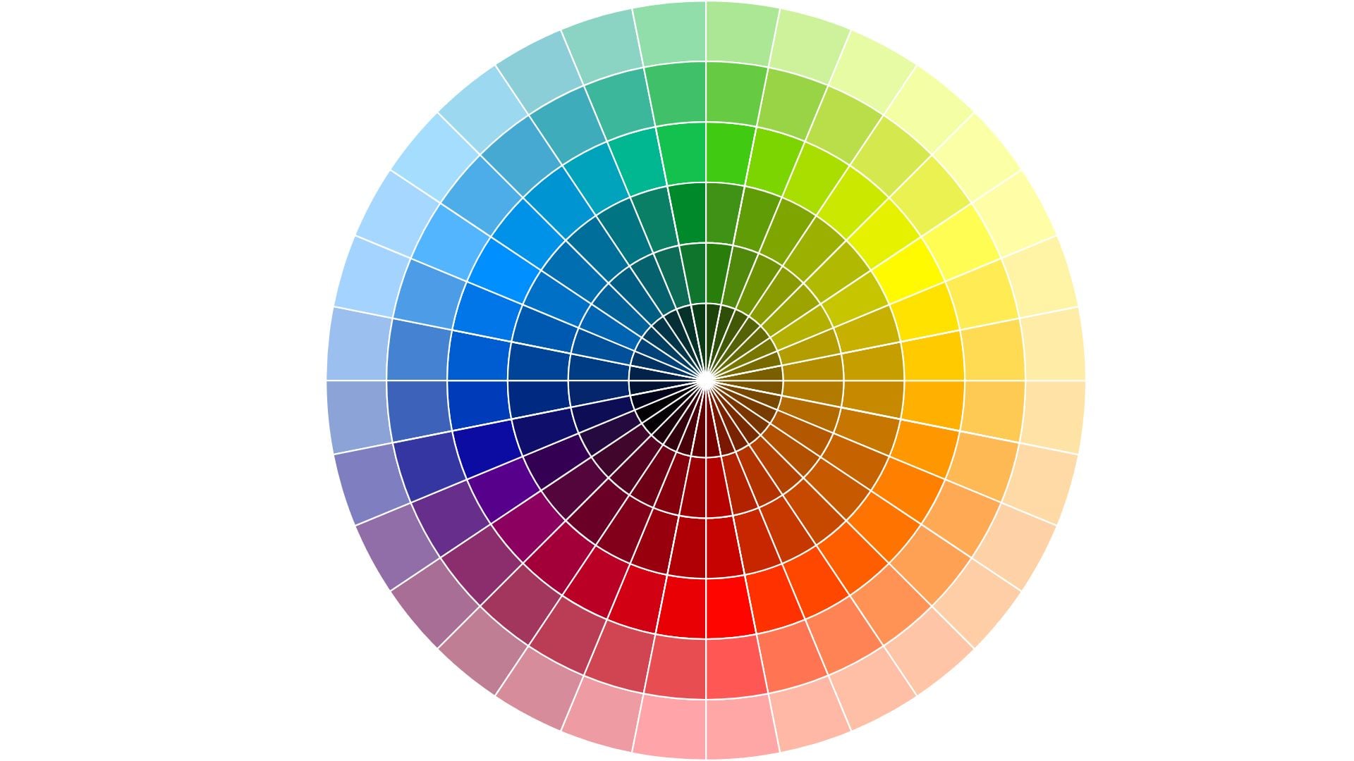
Understanding the Basic Color Wheel
The color wheel organizes colors in a circular format showing their relationships. Primary colors (red, yellow, blue) form the foundation of everything. Secondary colors (orange, green, purple) sit between primaries on the wheel. Tertiary colors fill the gaps creating a complete circle.
This simple diagram contains everything you need for smart color decisions. Colors opposite each other create maximum contrast naturally. Colors next to each other create harmony and flow. The wheel shows you these relationships at a glance.
Primary, Secondary, and Tertiary Colors
Primary colors can’t be created by mixing other colors together. Red, yellow, and blue stand alone as pure hues. Every other color comes from combining these three in different ways.
Secondary colors result from mixing two primaries equally. Red plus yellow creates orange. Yellow plus blue makes green. Blue plus red produces purple. These six colors form the basic wheel structure.
Tertiary colors add nuance between primary and secondary hues. Mix a primary with an adjacent secondary to get tertiary colors. Red-orange, yellow-orange, yellow-green, blue-green, blue-purple, and red-purple complete the wheel. These subtle variations give you more precise color control.
Warm vs Cool Colors
Colors naturally split into warm and cool categories. This temperature quality affects mood and emotion dramatically. Warm colors advance toward viewers in images. Cool colors recede into backgrounds naturally.
Warm colors include reds, oranges, and yellows. These feel energetic, exciting, or aggressive depending on context. Sunsets, autumn leaves, and fire all feature warm palettes. They create feelings of warmth, comfort, or passion.
Cool colors include blues, greens, and purples. These feel calm, serene, or sometimes cold and distant. Ocean scenes, winter landscapes, and shadows lean cool. They evoke tranquility, sadness, or professionalism depending on application.
Understanding color temperature helps you set mood intentionally. Warm-toned portraits feel inviting and friendly to viewers. Cool-toned images feel sophisticated or melancholy. Mix temperatures deliberately for specific emotional effects you want.

Complementary Color Schemes
Complementary colors sit directly opposite each other on the color wheel. Red complements green perfectly. Blue complements orange. Yellow complements purple naturally. These pairings create maximum visual contrast and energy.
Using complementary colors makes images pop with vibrance and tension. The contrast naturally draws attention to your subject. Your eye bounces between the opposing hues creating dynamic visual interest.
Finding Complementary Colors in Nature
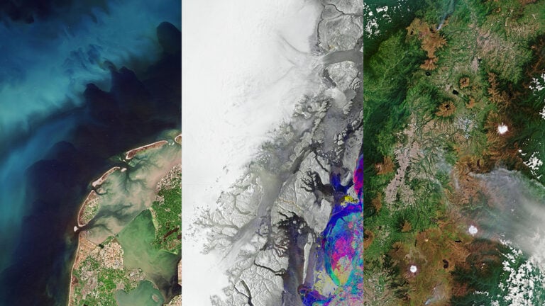
Nature provides countless complementary color combinations if you look. Orange autumn leaves against blue skies work perfectly. Red flowers in green foliage create natural contrast. Purple lavender fields under yellow sunlight follow color theory.
Train your eye to spot these relationships while shooting. A subject wearing orange pops against blue backgrounds instantly. Green eyes stand out with subtle red tones nearby. Yellow objects contrast beautifully with purple shadows naturally.
Sunrise and sunset naturally provide complementary schemes. The warm orange sun contrasts with cool blue shadows and sky. Golden hour becomes even more powerful when you recognize these relationships.
Using Complementary Colors in Composition
Place complementary colors strategically within your frame. Position your main subject in one color against its complement background. This separation creates instant visual hierarchy that guides eyes.
Complementary schemes work especially well for product photography situations. Shoot an orange product on blue seamless paper. Photograph green items against red backgrounds for pop. The contrast makes products stand out dramatically from their surroundings.
Control the balance between complementary colors carefully. Equal amounts create tension and vibration that can overwhelm viewers. Let one color dominate with the complement as accent only. This creates harmony within the contrast you’ve built.
Editing Complementary Schemes
Boost complementary colors during editing for more impact. Increase saturation selectively on both complementary hues only. This intensifies the contrast without affecting other colors in your image.
Use color grading to introduce complementary colors where they don’t exist naturally. Add orange tones to highlights and teal to shadows intentionally. This popular cinema look follows complementary color theory perfectly.
Balance complementary colors through selective adjustments in post. If one color overwhelms the other, reduce its saturation slightly. Or shift its hue just a bit. The goal is dynamic contrast, not chaotic clashing.
Analogous Color Schemes
Analogous colors sit next to each other on the color wheel. These harmonious combinations feel natural and pleasing to viewers. Red, orange, and yellow form an analogous scheme. Blue, blue-green, and green create another harmonious grouping.
Analogous schemes work better for calm, cohesive images. The colors blend smoothly without fighting for attention. This approach suits landscapes, nature photography, and serene portraits.
Creating Harmony with Adjacent Colors
Choose three to five adjacent colors from the wheel for your palette. Let one color dominate the composition completely. Use the others as supporting elements throughout. This creates unity while maintaining visual interest.
Autumn scenes naturally provide warm analogous palettes. Reds, oranges, and yellows blend harmoniously together. Ocean scenes offer cool analogous schemes with blues and greens flowing. These natural examples show why analogous colors feel so right.
Sunrise and sunset provide beautiful analogous opportunities. The progression from deep blue to purple to pink to orange follows the wheel. Capturing this gradient creates inherently pleasing images.
Analogous Colors for Different Moods
Warm analogous schemes (red through yellow) feel energetic and positive. These work well for joyful, active subjects. Summer gardens, happy portraits, and celebration photos benefit from warm palettes.
Cool analogous schemes (blue through green) feel peaceful and contemplative. Use these for tranquil scenes, water photography, or moody portraits. The harmony creates calm without visual conflict.
Green-based analogous schemes feel natural and organic. Yellow-green through blue-green works perfectly for nature photography. These earthy tones connect viewers to natural settings emotionally.
Maintaining Interest in Harmonious Schemes
Analogous schemes risk becoming boring without careful handling. Vary the saturation and brightness of your analogous colors. Some areas should be vibrant while others stay muted.
Add a small accent of the complementary color for pop. A predominantly blue-green scene becomes more interesting with tiny orange elements. This breaks the harmony just enough to create interest.
Use texture and pattern to maintain engagement with viewers. When colors are similar, other visual elements must work harder. Strong compositional elements keep analogous schemes from feeling flat.

Triadic Color Schemes
Triadic schemes use three colors equally spaced around the wheel. Red, yellow, and blue form the primary triad. Orange, green, and purple create the secondary triad. These combinations offer vibrant diversity while maintaining balance.
Triadic schemes provide more variety than analogous palettes do. They don’t have the intense contrast of complementary pairs. The three colors work together harmoniously while offering distinct visual separation.
Balancing Three Colors
Successful triadic schemes require careful balance between the three colors. Let one color dominate the frame completely. Use the second color as strong support throughout. The third appears as an accent only. This prevents chaotic, competing colors.
Primary triadic schemes feel bold and energetic. Think playground equipment, primary-colored products, or graphic designs. These work well for vibrant, eye-catching images with youthful energy.
Secondary triadic schemes feel more sophisticated overall. Orange, green, and purple offer richness without primary boldness. These suit autumn scenes, artistic portraits, and creative still life work.
Finding Triadic Opportunities
Look for triadic color combinations in urban environments around you. Buildings, signs, and vehicles often provide these relationships naturally. Street photography naturally captures triadic schemes in city settings.
Styled shoots let you control triadic palettes completely from start. Choose wardrobe, props, and backgrounds in your three colors. Fashion and editorial work often employs triadic schemes for maximum impact.
Sunset and blue hour provide natural triadic opportunities. Orange sun, blue sky, and green or purple landscapes create balanced triads. Time your shooting to capture these relationships at their peak.
Split-Complementary Color Schemes
Split-complementary schemes offer complementary contrast with less tension overall. Instead of direct opposites, you use one color plus two adjacent colors. Red with yellow-green and blue-green creates a split-complementary scheme.
This approach provides contrast and interest without the vibration. Pure complementary pairs can create visual vibration that’s uncomfortable. The result feels more sophisticated and easier on the eyes.
Why Split-Complementary Works
Split-complementary schemes give you options for variation in your palette. The two near-complement colors differ from each other slightly. This adds nuance while maintaining overall contrast with your base color.
The reduced tension makes split-complementary easier to balance successfully. You can use more equal amounts of each color. This flexibility helps in complex compositions with multiple elements.
Nature provides split-complementary combinations frequently if you observe. Red flowers with yellow-green and blue-green leaves work naturally. Orange sunset with blue and blue-purple sky creates balance. These near-complementary relationships feel natural and pleasing.
Applying Split-Complementary in Photography
Choose your main subject color first when planning. Identify its complement on the wheel opposite it. Then select the colors on either side of that complement. These three colors form your complete palette.
Use the two near-complement colors for background and supporting elements. This creates visual interest beyond simple subject-background relationships. The varied background colors add depth and complexity to compositions.
Control saturation levels to prevent chaos in your image. Keep one or two colors more saturated than others. Let others remain muted for balance. This hierarchy guides viewer attention through the color relationships.

Color Temperature and White Balance
Color temperature affects the overall mood and feel of your images. Warm images feel inviting, energetic, or nostalgic to viewers. Cool images feel modern, calm, or sometimes cold and distant.
White balance controls color temperature in your photos directly. Adjusting white balance shifts your entire image warmer or cooler. This simple adjustment dramatically changes emotional impact on viewers.
Using Temperature for Mood
Warm color temperature suits portraits, food photography, and cozy scenes. Push your white balance toward yellow and orange intentionally. This creates welcoming, comfortable feelings that draw viewers in.
Cool color temperature works for corporate work, technology shots, and serene landscapes. Push white balance toward blue for these subjects. This communicates professionalism, cleanliness, or tranquility depending on context.
Mixed color temperatures add complexity and interest to images. Warm subject lighting against cool ambient light creates dimension. This technique separates subjects from backgrounds effectively through color contrast.
White Balance as Creative Tool
Don’t always aim for neutral white balance in every shot. Intentional color casts serve creative purposes effectively. Slightly warm portraits feel more flattering and inviting. Slightly cool architectural shots feel more dramatic and modern.
Match white balance to your color scheme intentions deliberately. Shooting a warm analogous palette works better with warm balance. Cool color schemes benefit from cool white balance settings. Reinforce your color choices through temperature control.
Adjust white balance differently for different parts of your image. Use selective color adjustments to warm highlights and cool shadows. This adds depth and guides attention through temperature contrast.

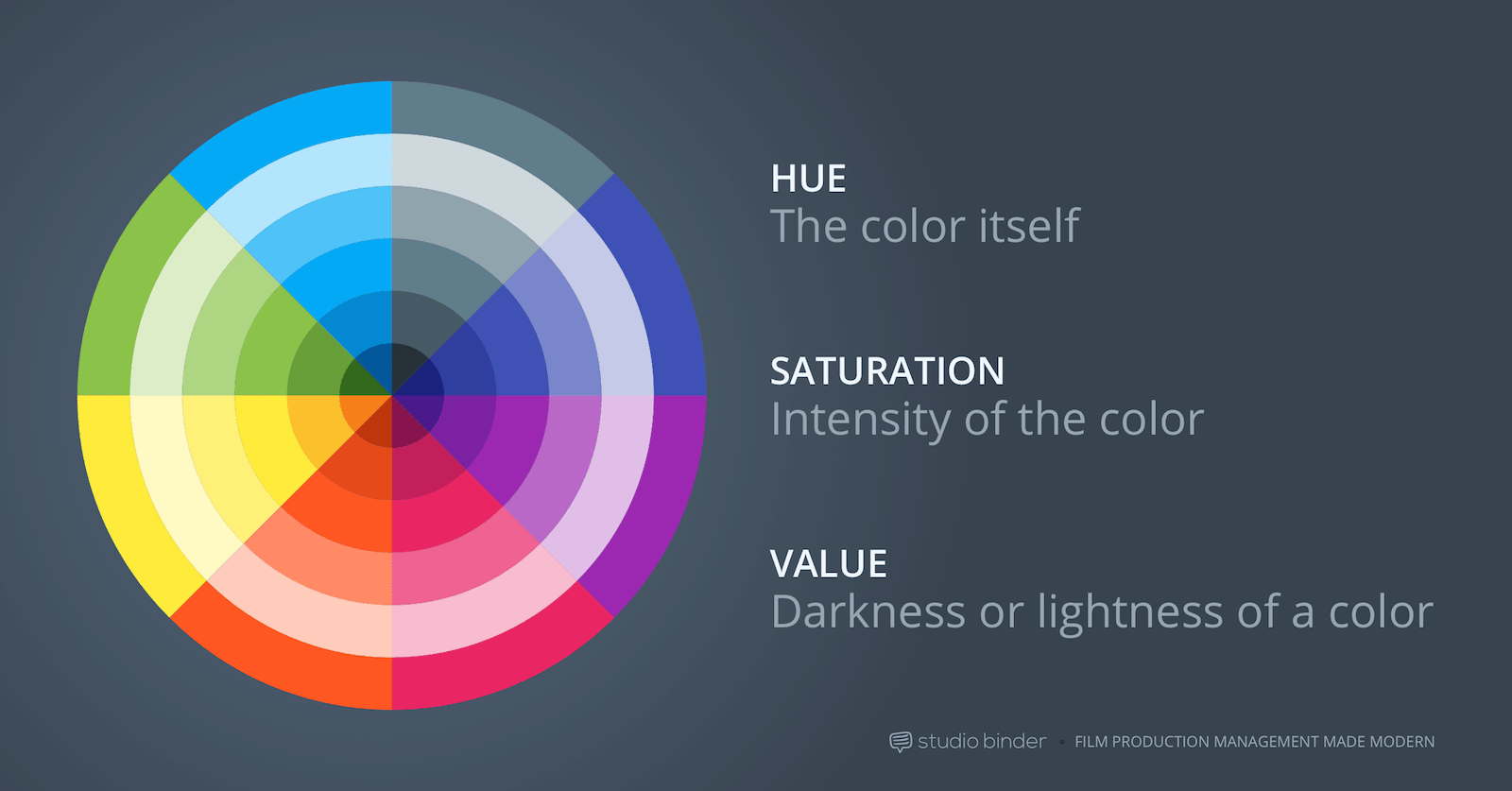
Saturation and Color Intensity
Saturation determines how intense or muted your colors appear. Highly saturated colors grab attention powerfully and immediately. Desaturated colors feel subtle and sophisticated. Both approaches work depending on your goals and subject.
Understanding saturation helps you control viewer attention deliberately. Saturated areas draw eyes first in any composition. Desaturated areas recede into supporting roles naturally. Use this to create visual hierarchy through color intensity.
When to Boost Saturation
Product photography often benefits from increased saturation levels. Vibrant colors make products look appealing and eye-catching. Food photography especially relies on saturated colors to trigger appetite.
Vibrant color schemes in nature photography celebrate natural beauty. Autumn leaves, spring flowers, and tropical scenes work well saturated. These subjects naturally feature intense colors worth emphasizing.
Children’s photography suits higher saturation typically. Bright, cheerful colors match the energy and joy of childhood. Family photos with kids often look better with boosted color.
When to Reduce Saturation
Portrait work often needs reduced saturation for flattering results. Overly saturated skin tones look unnatural and unflattering. Subtle colors let personality and expression take center stage.
Moody, artistic images benefit from desaturation significantly. Muted colors create sophisticated, emotional atmospheres. Black and white sits at the extreme end of this spectrum.
Busy scenes need saturation control to prevent chaos. Too many saturated colors compete for attention creating visual confusion. Selectively desaturate less important elements to create focus.
Selective Saturation Control
Boost saturation only on your main subject or key colors. Leave backgrounds and supporting elements less saturated intentionally. This creates natural separation and guides viewer attention.
Use HSL sliders to adjust individual color saturation precisely. Boost blues in a sky without affecting skin tones. Enhance greens in foliage without changing other hues. This precision prevents oversaturated chaos.
Balance saturation with luminosity for best results. Highly saturated colors need appropriate brightness levels. Too bright becomes garish and unpleasant. Too dark loses the color’s impact completely. Find the sweet spot through careful adjustment.

Practical Color Theory Applications
Color theory in photography works best when applied deliberately. Plan your color palette before shooting when possible. Scout locations for color opportunities in advance. Choose wardrobe and props strategically based on color relationships.
Study color relationships in images you admire from professionals. Identify the color schemes they use in their work. Understanding their choices helps you replicate successful approaches.
Pre-Visualization and Planning
Decide your color scheme during the planning phase. Will you shoot complementary, analogous, or triadic colors? This decision influences location choices, wardrobe selection, and prop styling.
Use color wheel apps on your phone while location scouting. Identify existing color relationships in potential shooting spots you find. Look for backgrounds that complement or harmonize with your subject’s coloring.
Create mood boards showing your intended color palette visually. Collect reference images featuring similar color schemes you want. This helps clients understand your vision and guides your execution.
Post-Processing Color Control
Color grading tools in Lightroom and Photoshop let you adjust relationships. Shift hues to create better harmony or stronger contrast. This fine-tuning perfects your color theory application after shooting.
Use split toning to introduce color relationships that didn’t exist naturally. Add warmth to highlights and coolness to shadows following theory. This cinema technique creates sophisticated, professional looks.
Create consistent color palettes across photo series for cohesion. Develop presets based on color theory principles you’ve learned. Apply these for cohesive galleries and bodies of work.

Building Your Color Theory Skills
Color theory in photography improves with practice and observation. Train your eye to see color relationships everywhere you go. Notice which combinations attract you and analyze why they work.
Study paintings by masters who understood color deeply. Impressionists and colorists offer lessons in color harmony and contrast. Their techniques translate directly to photography work.
Shoot the same subject in different color contexts for practice. Place it against various backgrounds and notice differences. See how color relationships change its impact on viewers. This hands-on practice teaches color theory better than theory alone.
Analyze your favorite photographs for color schemes they use. Identify whether they use complementary, analogous, triadic, or split-complementary approaches. Understanding successful color choices helps you make better photography decisions in your own work.

Darlene Lleno
Darlene Lleno brings a unique perspective to DIY Photography as someone who grew up surrounded by camera gear but chose words over lenses. With five years of writing experience, she specializes in photography content that’s both technically informed and genuinely passionate. Growing up with a photographer twin brother meant camera talk was everyday conversation in her household. While he mastered capturing moments, Darlene discovered she preferred being the subject and the storyteller behind the scenes. As a travel enthusiast and mother of two, she understands the importance of preserving life’s precious moments. When not exploring new destinations or writing for DIY Photography, you’ll find her reading or tending to her garden. Her approach to photography writing is refreshingly authentic, she may not be behind the camera, but she knows exactly what it takes to help others capture the shots that matter most.
Related Posts
 This in-depth colour theory guide helps create harmony and impact in your photography
 Watch: All you wanted to know about color theory and color grading
 This Color Wheels add on for Photoshop lets you color correct and grade photos as easily as video
 The Definitive Guide to Best Camera for Portrait Photography in 2025
Join the Discussion
DIYP Comment Policy
Be nice, be on-topic, no personal information or flames.