


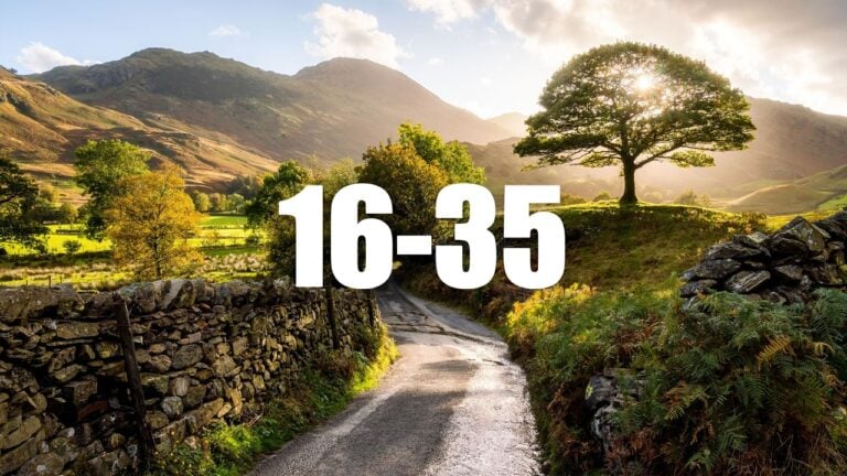


This in-depth colour theory guide helps create harmony and impact in your photography
Jan 26, 2017
John Aldred
John Aldred is a photographer with over 25 years of experience in the portrait and commercial worlds. He is based in Scotland and has been an early adopter – and occasional beta tester – of almost every digital imaging technology in that time. As well as his creative visual work, John uses 3D printing, electronics and programming to create his own photography and filmmaking tools and consults for a number of brands across the industry.
Share:

Colour can be one of the hardest things to master in photography. The real world doesn’t always provide the most pleasing colour for our images. Even within the same scene, different colours can clash and compete for attention. It’s a subject that many graphic designers study religiously to get perfect harmony in their work. But for photographers, it’s a subject that seems to skip by many.
It shouldn’t be, though. It’s one of the most important aspects of photography you can learn. Some of the principles might feel difficult to wrap your head around at first. But they’re usually fairly straightforward when explained simply. Landscape Photographer Dave Morrow goes very in-depth on colour theory in this 40 minute video. And by the end of it, you’ll understand the principles to take your work to the next level.
Dave begins the video by studying the works of Albert Bierstadt, whom he describes as his favourite landscape painter of all time. And it’s easy to see why. His work has an almost hyper-real quality about it. It’s almost too perfect. It’s the scenes we see in our heads when we think about what certain places should look like. The kind of mood they should exude. The kind of look many photographers strive for.
Like graphic designers, painters learn a lot about colour theory. Painters create everything from scratch, the entire scene. They may be referencing a photograph from time to time, but what to include, what to exclude, and what colour to make everything is entirely their decision. They can do with it as they please. For photographers, unless you’re into heavy manipulation of images, we’re often grounded somewhat in reality. But there’s a lot we can do with colour to enhance our work.
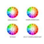
The first step is understanding how colour works in applications like Photoshop. Hue, Saturation and Value (brightness). Using the standard RGB colour wheel, Dave explains what it all means.

Dave then explores how these relate to the colours in Bierstadt’s paintings. He goes through various colour harmony theories using different paintings to explain how each works. Dave talks about five different types of colour harmonies.
- Direct / Complementary Color Harmony
- Analogous Color Harmony
- Triadic Color Harmony
- Split-Complementary Color Harmony
- Square Color Harmonies
In the second part of the video, Dave applies these principles to a raw file of one of his own images. First working in Adobe Camera Raw, and then bringing it into Photoshop to refine things further. As you can see, the differences are subtle, yet striking.


Although the changes seem quite minimal, the two images have a very different vibe. One is immediately more impactful than the other. Both are impressive, but the modified version just has a more pleasing look and mood. It feels more balanced.
Dave also has a PDF available which goes through these and other colour theory techniques that’s well worth a read, too. It’s definitely worth keeping handy on your tablet.
Unless you’re shooting black & white, colour is vitally important to photography. There is, of course, a lot more to colour theory than can be explained in a 40 minute video, though. But at least this’ll get you off to a good start. So, if you haven’t paid much attention to it before now, have a watch, and at least have a go at some of the things Dave talks about. You might surprise yourself.
[via FStoppers]

John Aldred
John Aldred is a photographer with over 25 years of experience in the portrait and commercial worlds. He is based in Scotland and has been an early adopter – and occasional beta tester – of almost every digital imaging technology in that time. As well as his creative visual work, John uses 3D printing, electronics and programming to create his own photography and filmmaking tools and consults for a number of brands across the industry.
Related Posts
 Color Theory in Photography: Definitive Guide in Using Color Wheels to Create Stunning Images
 Going beyond the basic “rules” – How to create balance and find harmony in your photography
 Depth of Field: the ultimate beginner’s guide to controlling depth of field using lens aperture in nature photography
 Polaroid Retinex is new round framed instant film to celebrate colour theory
Join the Discussion
DIYP Comment Policy
Be nice, be on-topic, no personal information or flames.
2 responses to “This in-depth colour theory guide helps create harmony and impact in your photography”
where are the photographer who can feel an image?. do we all need apps now and color theory?
do we have to fake and enhance everything in post?
photography has become a sad place for nerds and technocrats…
Color theory has nothing to do with faking.
The principles he explains in the video are applicable to any stage of a photograph. Knowing how to combine the colors means we can make more thorough decisions when it comes to create the photograph, either it’s in an urban environment, a landscape, a studio portrait situation and so on.
As far as the editing part goes, what it does is very minimal, in fact his final result is not overdone (which I personally appreciate). So, it’s actually all the opposite of those faked imaged you might be referring to. I’ve seen photos treated way more than this (to a point which I don’t consider them photographs anymore).
I guess your comment could have been appropriate, only this time you picked the wrong example imho as I personally consider this one of the very few cases where the author does a good job.
Just my 2 c.