


Vibrance vs Saturation in Photoshop: Are You Using Them Wrong?
Jul 18, 2025
Anzalna Siddiqui
A psychology major in her third year of Bachelor’s, Anzalna Siddiqui has endless curiosity for the human mind and a deep love for storytelling – both through words and visuals. Though she hasn’t taken up photography as a profession, her Instagram is where her passion finds its home. In addition to this, she’s a travel enthusiast who never travels without her camera because every place has a story waiting to be captured.
Share:

Oftentimes, the skin tones change to something less appealing after a quick edit in Photoshop. This is a common issue and frustrating when trying to enhance Vibrance vs Saturation in Photoshop. You want those vibrant colors, but your subject might look overly tanned or washed out.
Interestingly, we tend to adjust the most noticeable sliders, hoping for great results. But what if I told you that one particular color adjustment in Photoshop might secretly affect your portraits, especially those sensitive skin tones? It’s tricky, but you’ll improve your editing skills significantly once you figure it out.
In a recent video, the talented photographer and digital artist Aaron Nace of the PHLEARN explores the details of adjusting colors in Photoshop. He explains the key differences between Vibrance vs Saturation in Photoshop and when to use each. While both tools enhance color, they work in very different ways. Knowing how they function can improve your portrait editing.
The Great Color Conundrum: Vibrance vs. Saturation
When you open Photoshop and look at the color sliders, you’ll notice Vibrance and Saturation beside each other. It’s easy to think they work the same way. According to Aaron, both can enhance the colors in your photos. However, he points out that Vibrance is better for images with people because it helps maintain natural skin tones. On the other hand, Saturation is excellent for boosting all colors equally or making specific colors pop, especially in scenes without people, like beautiful landscapes or colorful still lives.
He strongly suggests using vibrance when there are people in your photo. But if you’re trying to make a scene colorful and there aren’t any people involved, Saturation is a good option.
To add a Vibrance adjustment layer, go to Layer > New Adjustment Layer > Vibrance. Personally, I find that adjustment layers are essential for my process because they allow me to edit without changing the original image. It’s like having a backup for your creative ideas.
Vibrance: Your Skin Tone’s Best Friend?
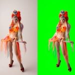
When you create a Vibrance adjustment layer, you’ll see both a Vibrance slider and a Saturation slider. Having two sliders for Saturation in different spots can be a bit confusing. Aaron shows something interesting. He moves the Vibrance slider to the right. What happens next? He notes that the image still looks natural. The greens in the background may get brighter, and the subject’s suit color could become richer, but here’s the key point: the subject’s face still looks good. It doesn’t turn into an orange or magenta mess, which often happens with other tools.
He describes Vibrance as a special tool that boosts the brightness of colors that aren’t very vibrant, while keeping the already bright colors (like skin tones) mostly the same. It’s like a clever way to enhance colors without going overboard. If you want to add a subtle, natural improvement to your whole image, especially when it includes people, Vibrance is a great option.
Saturation: The Skin Tone Villain (or Is It?)
Aaron demonstrates what happens when you create a new Vibrance adjustment layer (just for comparison) and push the Saturation slider to 100. While the plants in the background and the jacket get bright colors, he notes that the subject’s face becomes “too saturated.” You know that look, right? The one where a person seems like their skin color is so intense that it might just melt off. It’s not a good look.
He compares the two images side by side. The one edited with Vibrance appears much more natural and lifelike than the one that only used Saturation. I agree with his conclusion. If you want to enhance colors while still keeping skin tones looking good, Vibrance is the better choice. Using Saturation on a portrait can be too harsh, affecting everything equally and usually making the skin look worse.
Targeted Adjustments: The Power of Hue/Saturation
If you find that the global Saturation setting doesn’t work well for portraits, but you still want to adjust specific colors without changing everything else, the Hue/Saturation adjustment layer is the answer. This tool gives you precise control over color adjustments. Aaron explains that moving the main Saturation slider here is similar to using the Saturation slider in the Vibrance panel, which tends to give a broad and sometimes unappealing increase.
The true strength of this adjustment layer is its ability to focus on specific colors. You can pick a certain color range, like greens, and use the eyedropper tool to refine your choice. He shows how to target particular greens in the leaves and then change just the saturation or hue of those greens while leaving everything else as it is. This means you can make the leaves look brighter or alter their color without affecting your subject’s face.
He shows how to choose a teal color using the eyedropper tool on the subject’s suit, automatically matching that color. This allows you to change the hue and saturation of just the suit. For example, you could adjust the suit to blend in better with the green background or make it stand out more. As he points out, what’s great about this method is that it doesn’t affect the subject’s skin tone at all. This ability to selectively change colors is beneficial for making creative adjustments or subtle improvements without altering the subject’s natural appearance.
The Golden Combination: Vibrance and Hue/Saturation Working Together
Aaron discusses how the Hue/Saturation layer can change the background and clothing colors while leaving skin tones untouched. He outlines three methods he used: the overall Vibrance slider, which he highly recommends; adjusting saturation within the Vibrance layer, which he thinks is not ideal for portraits; and making targeted adjustments with the Hue/Saturation layer.
His main advice, which makes perfect sense, is to use these tools together. He suggests starting with the Vibrance layer for a natural overall color boost that enhances colors without affecting skin tones. Then, you can apply the Hue/Saturation layer to make specific color tweaks. This approach allows you to achieve a balanced enhancement that looks good on skin while giving you precise control over other colors in your image.
Final Thoughts
Mastering Photoshop’s tools is quite the adventure. Understanding the essential differences between Vibrance vs Saturation in Photoshop, along with how to use Hue/Saturation effectively, can change the way you work with color in your portrait photography.
So, pause for a moment when you’re working in Photoshop next time. Think about what you want to achieve rather than just sliding the Saturation bar. If your photo includes people, focus on using Vibrance. And if you need to adjust specific colors, keep in mind the control that the Hue/Saturation layer provides. You’ll be surprised at how much this improves your portraits, making skin tones look naturally radiant.
[Photoshop Basics: Vibrance vs Saturation Explained I Aaron Nace]

Anzalna Siddiqui
A psychology major in her third year of Bachelor’s, Anzalna Siddiqui has endless curiosity for the human mind and a deep love for storytelling – both through words and visuals. Though she hasn’t taken up photography as a profession, her Instagram is where her passion finds its home. In addition to this, she’s a travel enthusiast who never travels without her camera because every place has a story waiting to be captured.
Related Posts
 Yes, saturation and vibrance are different things and here’s how they both work
 Learn the difference between saturation and vibrance to create better photographs
 Master the difference between vibrance and saturation to supercharge your photos
 Saturation masks is an easy way to extract complex objects in Photoshop
Join the Discussion
DIYP Comment Policy
Be nice, be on-topic, no personal information or flames.