


Flat Lay Photography Tips: 15 Composition Rules That Make Products Look Expensive
Oct 27, 2025
Darlene Lleno
Darlene Lleno brings a unique perspective to DIY Photography as someone who grew up surrounded by camera gear but chose words over lenses. With five years of writing experience, she specializes in photography content that’s both technically informed and genuinely passionate. Growing up with a photographer twin brother meant camera talk was everyday conversation in her household. While he mastered capturing moments, Darlene discovered she preferred being the subject and the storyteller behind the scenes. As a travel enthusiast and mother of two, she understands the importance of preserving life’s precious moments. When not exploring new destinations or writing for DIY Photography, you’ll find her reading or tending to her garden. Her approach to photography writing is refreshingly authentic, she may not be behind the camera, but she knows exactly what it takes to help others capture the shots that matter most.
Share:
Flat lay photography tips can turn basic product shots into images that stop people mid-scroll. This overhead style has become a go-to for brands and photographers who want their products to look polished. The trick is knowing which composition rules actually work.
Good flat lays do more than just arrange stuff on a table. They tell stories through careful placement and thoughtful design choices. These skills matter whether you’re shooting for Instagram or an online store.
Understanding the Foundation of Strong Flat Lay Photography Tips
You have to nail the basics before moving to advanced techniques. The overhead view removes traditional depth from your photos. This completely changes how you think about balance and visual flow.
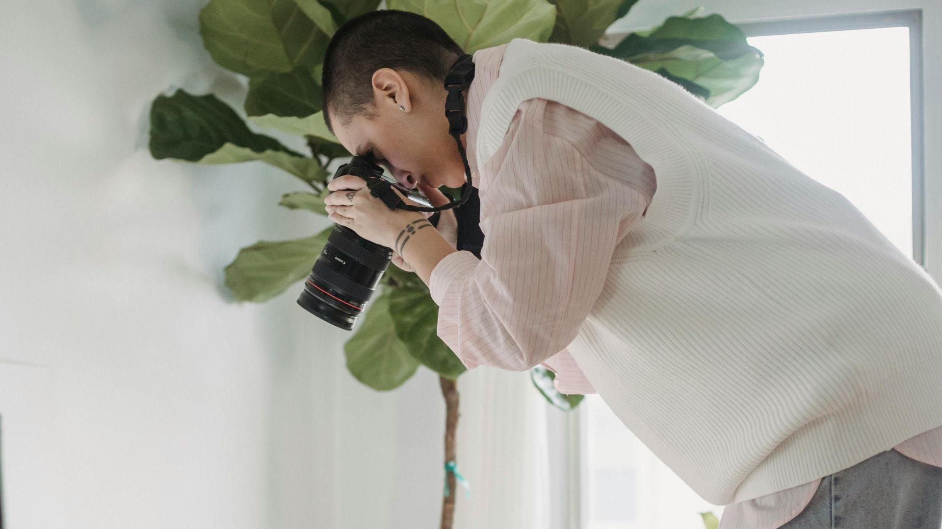
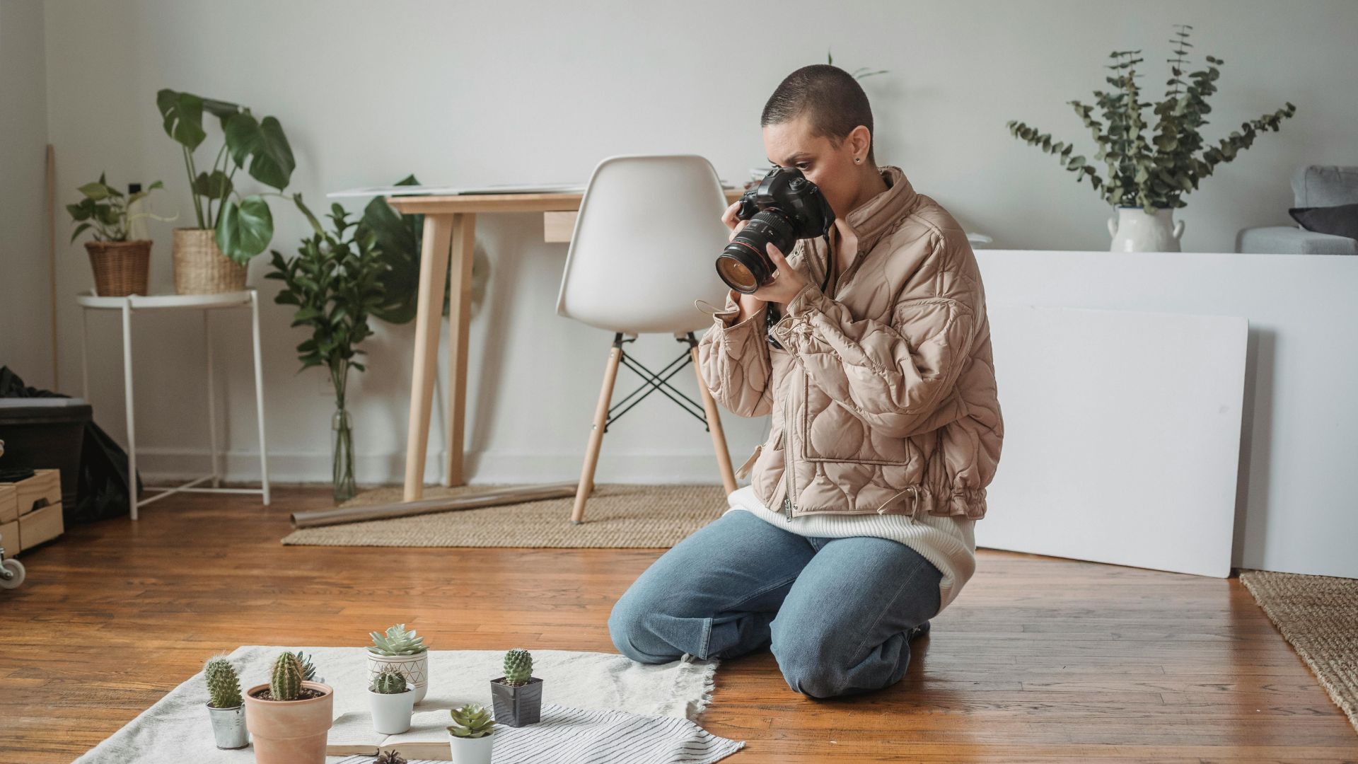
Your camera angle makes a huge difference here. Shoot from directly above your subject. Keep your camera parallel to the surface below. This creates that signature bird’s eye view everyone recognizes. Even a small tilt can mess up your symmetry.
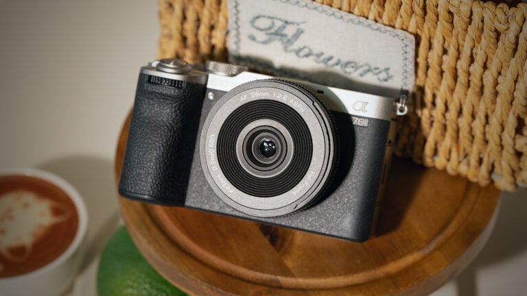
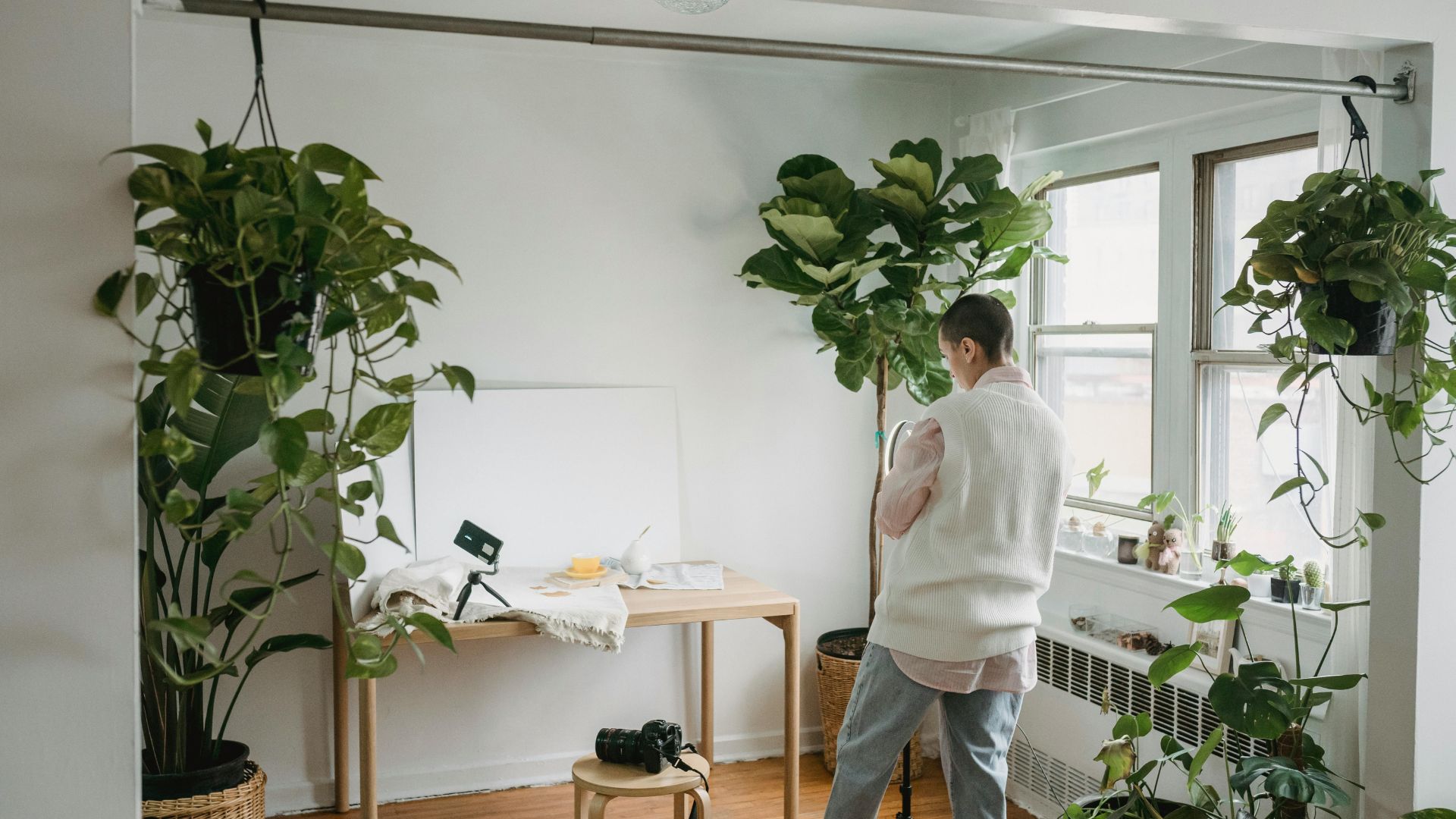
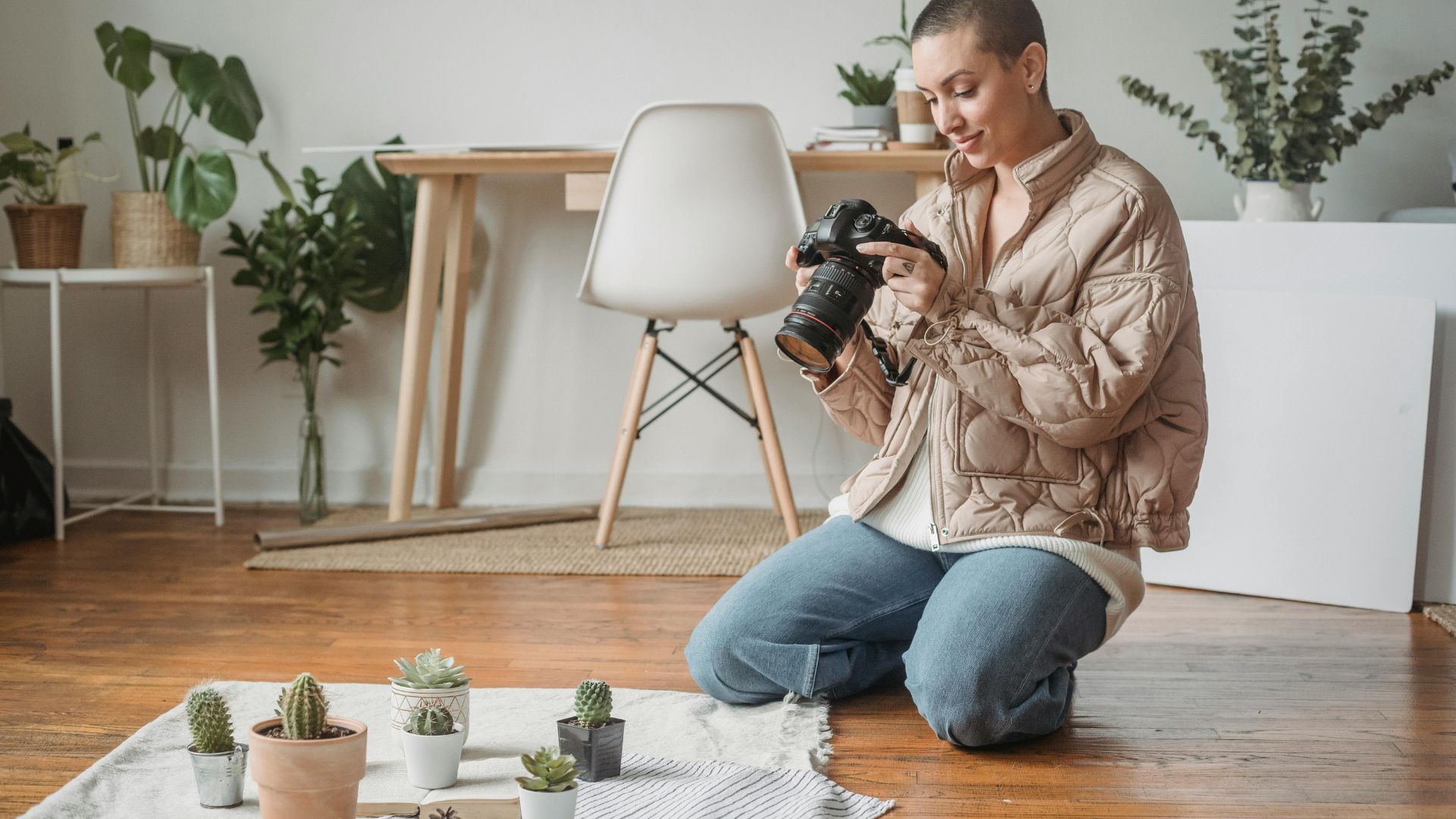
A solid tripod is your best friend for flat lay photography tips. You can’t hold your camera steady enough by hand for consistent results. Get a tripod that extends high enough for larger scenes. This gives you room to shoot bigger arrangements or work on raised surfaces like tables.
Get Your Lighting Right
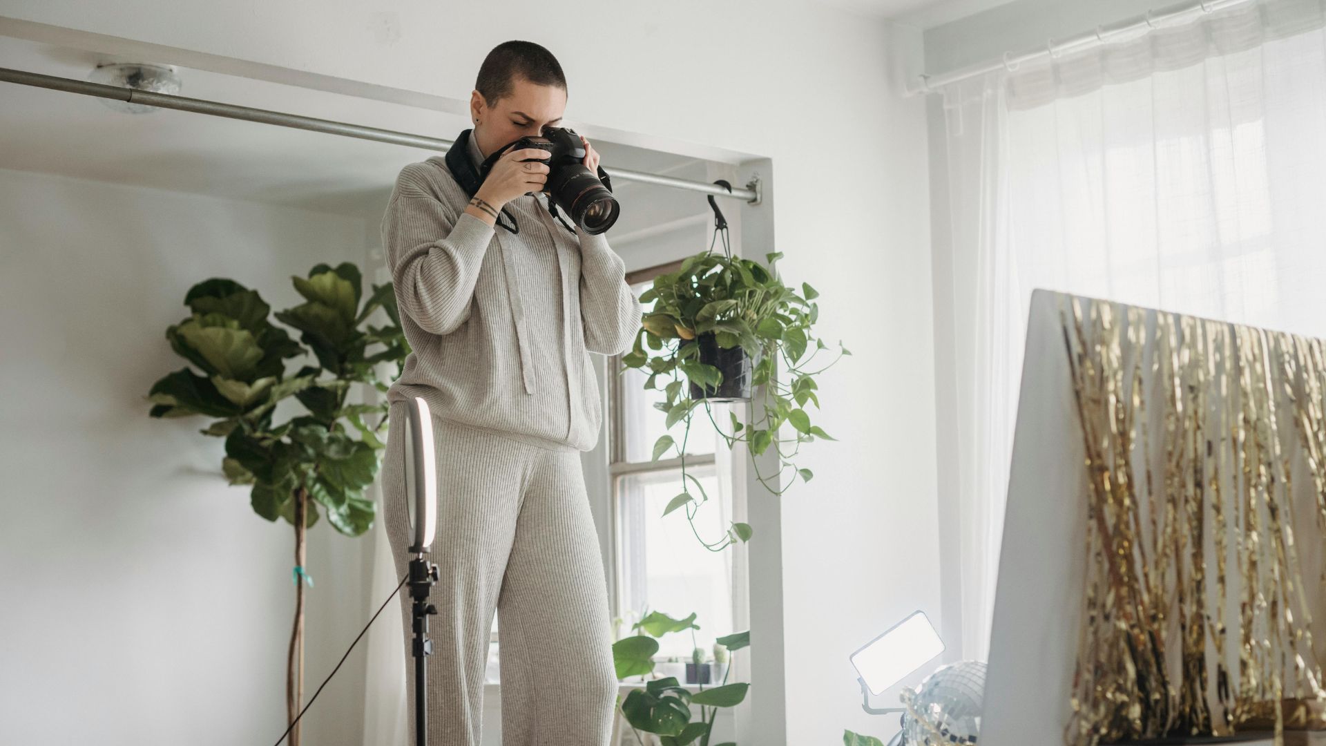
Light can make or break your shot. Window light works great for flat lays because it spreads evenly without harsh shadows. Set up near a big window and shoot midday when light stays consistent. Skip the direct sunlight though. It creates bright spots that make products look cheap.
Position your setup so window light hits at an angle. Place a white foam board or poster board opposite the window. This bounces light back and fills in shadows naturally. You just created a simple but effective lighting setup for free.
If you don’t have good window light, use an artificial light source. Tilt it diagonally down toward your arrangement. Add a diffuser to soften the light and use that bounce board trick again. Even lighting across your frame looks way more professional.
Pick the Right Lens
A 50mm lens works best for flat lay photography. Wider lenses distort edges and make objects look stretched. Tighter lenses like 100mm get you too close and limit your working space. The 50mm hits that sweet spot for natural-looking proportions.
Enable the grid guide on your camera or phone. This overlay shows you the rule of thirds lines. Align your most important items on these lines or where they cross. Your composition will instantly look more intentional.
Start with Your Story and Hero Item
Every great flat lay tells a story. Think about the narrative before you place a single item. A bowl of oatmeal by itself is just breakfast. Add a crossword puzzle and coffee mug and you’ve created a cozy morning ritual scene.
Your hero item becomes the star of your story. This focal point anchors your entire composition. Pick your hero first, then build everything else around it. The hero should typically be your largest item in the frame. Nothing else should upstage it or pull attention away.
Supporting elements reinforce your story without stealing the spotlight. A skincare product paired with a clean towel and face roller tells a self-care story. The same product with random kitchen items feels disconnected and confusing. Every prop needs a purpose that connects to your narrative.
Choose Props That Support Your Message
Props add context and depth to your flat lay photography tips. But they need to make sense together. Think about what naturally goes with your hero item in real life. Food photography works great with ingredients and cooking tools nearby.
Collect interesting pieces you can reuse across different shoots. Fabric swatches add texture. Paper scraps and confetti bring color. Vintage books and magazines create layers. Build a small collection of versatile props that work for multiple stories.
Avoid tall objects that look better from the side. They don’t translate well in overhead shots. If you must include something tall, tilt it slightly toward your camera. This helps with perspective and keeps things looking natural.
The Rule of Thirds Creates Visual Interest
The rule of thirds works perfectly for flat lay photography tips. Split your frame into nine equal boxes using imaginary lines. Put your main product where these lines cross. This naturally draws the eye to what matters most.
Don’t stick your hero product dead center. Move it slightly off to one side. This small shift adds energy to your photo. The empty space you create becomes just as important as the filled areas.
New photographers often try to fill every inch of their frame. Don’t do this. The breathing room around products actually makes them look more valuable. Check out how luxury brands use negative space in their marketing. They leave lots of empty areas on purpose.
Balance Your Visual Weight
Think about how heavy different elements feel in your frame. A dark object feels heavier than a light one. Large items carry more weight than small ones. Distribute this weight evenly across your composition.
Place heavier elements on one side and balance them with lighter ones opposite. A big dark product on the left needs something to balance it on the right. This could be several smaller items or clever use of empty space.
Your eye should move smoothly around the frame. Nothing should feel like it’s tipping over or falling out of the shot. Step back and squint at your setup. This helps you see the overall balance more clearly.
Try Common Layout Shapes
Flat lay photography tips get easier when you follow proven layout patterns. These shapes guide the eye naturally through your composition. Start with these basic formations and adjust them to fit your story.
The C-shape layout curves items around your hero product. Place supporting elements in a crescent that draws attention inward. This works great when you want to frame your main item without boxing it in completely.
V-shaped arrangements create dynamic energy. Position items in a V formation with your hero at the point or base. This layout feels active and modern. It works well for tech products and lifestyle shots.
More Layout Options to Explore
The S-curve adds elegant flow to your flat lay. Arrange items in a loose S shape across your frame. This creates natural movement and feels sophisticated. Food photography often uses this layout for recipe ingredients.
Triangular placement creates stable, balanced compositions. Put three key items at the points of a triangle. Your brain recognizes this shape subconsciously and finds it pleasing. This works for any product photography setup.
Circular or curved placements feel soft and approachable. Arrange items in a loose circle around your hero. Leave the center open or fill it with your main product. This layout feels welcoming and inclusive.
Parallel lines create order and structure. Line up items in neat rows across your frame. This works well for organized, minimalist aesthetics. Tech accessories and office supplies look great in this formation.
Strategic Color Theory Elevates Product Perception
Color choices can make or break flat lay photography tips for premium looks. Monochrome schemes feel sophisticated and put together. Pick one color family and work with different shades within that range. This creates harmony while keeping things visually interesting.
Complementary colors pack more punch but need careful handling. Use colors from opposite sides of the color wheel. Think blue with orange or purple with yellow. Make one color dominant and use the other as an accent. This stops the image from feeling too busy.
Neutral backgrounds let your products shine. White, cream, and gray provide clean backdrops that photograph well across different lighting conditions. They also make editing way easier later.
Mix Textures for Depth
Different textures add richness without cluttering your frame. Pair smooth surfaces with rough ones. Mix matte finishes with glossy elements. A marble slab provides texture without overwhelming your products. Linen adds softness. Wood grain brings warmth.
Layer your textures thoughtfully. Start with your background texture as the base. Add your products in the middle. Finish with smaller textured elements like flowers or paper. Each layer should support your overall story.
Random textures just distract from your main subject. Everything you include should have a reason for being there. If you can’t explain why something’s in your shot, take it out.
Keep Patterns Under Control
Patterns add energy but you need to use them carefully. Keep patterned items as supporting players, not stars. A striped cloth or dotted paper can frame your product without stealing focus. Limit patterns to small areas of your composition.
Mixing patterns takes practice and restraint. Stick to two patterns maximum per image. Make sure they share at least one color. Vary the scale so they don’t compete. A large floral print works fine with a small geometric pattern.
Directional Lines Guide the Viewer’s Eye
Lines move the viewer’s eye through your image in a specific path. Create these lines using object edges, shadows, or actual linear items like ribbons. Point your lines toward your main product or use them to create a visual journey.
Diagonal lines feel more dynamic than straight ones. They add movement to what could be a static shot. Angle items at 30 or 45 degrees from your frame edges. This simple change makes everything feel more alive.
Never let lines lead the eye out of your frame. Use them to circle back to your focal point instead. The longer someone looks at your photo, the more likely they’ll remember your product. Good composition techniques keep viewers engaged.
Use the Triangle Method
Arrange three key elements in a triangle to create natural balance. The triangle doesn’t need to be perfect or obvious. Your brain recognizes this shape subconsciously and finds it pleasing.
Put your hero product at one point of the triangle. Place supporting elements at the other two points. This spreads visual weight evenly across your frame. The method works great for showing multiple items without creating clutter.
Odd Numbers Feel More Natural
Groups of odd numbers look better than even numbers. Three, five, or seven items feel more organic than two, four, or six. This comes from how our brains process visual information naturally.
Three items work especially well for flat lay photography tips. Put your main product with two supporting pieces. This creates clear hierarchy while keeping things interesting. Odd numbers prevent the eye from pairing items equally.
Mix up your sizes within these groups. Combine large, medium, and small items to create rhythm. Similar-sized objects feel boring and fail to show what’s most important. Your hero product should be the biggest or most prominent element.
Scale Creates Clear Hierarchy
The size of elements tells viewers what matters most. Your main product should dominate in terms of visual weight. Supporting items should be noticeably smaller or positioned to seem less important.
Create a size progression from your biggest item to your smallest. This graduated scale feels natural and guides the eye through your photo logically. Jumping between large and small without middle sizes feels jarring and off.
Layering Adds Dimension to Flat Surfaces
Layers trick the eye into seeing depth where none exists. Start with your background as the base layer. Add your main products as the middle layer. Top it off with smaller accent pieces as the final layer.
Overlap elements slightly to show they belong together. A coffee cup sitting partially on a magazine shows they’re part of the same scene. Complete separation between every object creates a disconnected catalog feel.
Layer plates over other plates for food shots. Place dishes on trays or cutting boards. Put small items on top of books or fabric. These styling tricks create natural-looking depth in your flat lay.
Use Background Layers Strategically
Your background layer sets the foundation for everything else. Cutting boards work great for food photography. Hand towels add texture for beauty products. Sheets of colored paper bring mood to lifestyle shots.
Vintage books and magazines make wonderful background layers. They add visual interest without competing for attention. The text and images on book covers create subtle texture that enriches your composition.
Test different background materials before shooting your full setup. Some surfaces reflect light in weird ways. Others have distracting patterns or colors. Find what works best for your specific products and story.
White Space Communicates Premium Value
Empty space remains one of the most powerful flat lay photography tips for expensive looks. Luxury brands use blank areas to communicate exclusivity. The space says your product doesn’t need anything else to prove its worth.
Aim for at least 30 to 40 percent empty space in premium shots. This might feel weird at first. But the breathing room actually draws more attention to your product.
Position your white space strategically. Place it opposite your main subject to create balance. Avoid splitting empty space equally on all sides. That feels too centered and formal. Asymmetrical white space feels more modern and dynamic.
Give Products Room to Breathe
Cramming too many items into your frame cheapens the overall look. Each product needs its own space to shine. Think about how high-end stores display their merchandise. They don’t jam shelves full of stuff.
Leave at least one product width of space between major elements. This separation lets each item register clearly in the viewer’s mind. It also makes your composition feel more intentional and professional.
A common mistake is either leaving too much empty space or adding things that don’t need to be there. Find the right balance between minimalist and crowded. Every prop should have a purpose and connect to your story.
Symmetry Works for Specific Product Types
Asymmetrical layouts usually feel more dynamic. But symmetry has its place in flat lay photography tips. Perfectly centered, balanced setups work great for minimalist products. They also communicate precision and order effectively.
Beauty products, jewelry, and tech accessories often benefit from symmetrical arrangements. The balance reinforces messages of quality and careful attention to detail. Center your main product and mirror supporting elements on each side.
Break symmetry slightly to avoid looking too stiff. Perfect mirror images feel mechanical and cold. Introduce small variations in your mirrored elements. Different colors or slight position shifts maintain balance while adding life.
When to Break Symmetry
Sometimes perfect balance feels too formal for your brand. Test asymmetrical versions of symmetrical setups. Move your main product off center slightly. Adjust supporting elements to follow the rule of thirds.
Pay attention to how each version feels. Symmetrical shots feel calm and orderly. Asymmetrical ones feel more energetic and casual. Pick the approach that matches your brand’s personality and story.
Add Movement Through Smart Arrangement
Static flat lays feel lifeless and boring. Create implied movement by positioning items as if they’re being used. A pen resting on an open notebook suggests someone just set it down. Coffee spilled slightly from a cup implies a captured moment.
Angle your products at 30 or 45 degrees from the frame edges. This simple shift makes everything feel more dynamic and alive. Perfectly horizontal or vertical placements feel stiff by comparison.
Include elements that suggest action or story. A pair of scissors with cut paper scraps tells a story. An open book with reading glasses suggests someone stepped away mid-chapter. These details make your flat lay feel real instead of staged.
Create Visual Flow
Your composition should guide the eye on a specific path through the frame. Start with your hero product as the entry point. Use smaller elements to create a route to secondary items. Loop the eye back to your main product at the end.
Test your visual flow by showing your photo to someone else. Ask them to describe what they look at first, second, and third. Their answers will tell you if your composition is working as intended.
Contrast Creates Definition and Interest
Your flat lay needs contrast to prevent elements from blending together. Light products need dark backgrounds or dark accent pieces. Dark products pop against light surfaces. This applies to both color and value, which means lightness and darkness.
Texture contrast works the same way. Smooth products stand out against rough surfaces. Glossy items shine against matte backgrounds. These opposing characteristics make each element more distinct and clear.
Size contrast reinforces hierarchy in your composition. Your largest item should be significantly larger than your smallest. Gradual size changes between elements create rhythm and visual flow that feels natural.
Use Shadow and Highlight Strategically
Shadows add depth and dimension to flat lays. Position your light source at an angle to create soft shadows. These shadows show the relationship between objects and add subtle visual interest.
Keep shadow direction consistent across your entire frame. All shadows should point the same way unless you’re using multiple lights intentionally. Conflicting shadows look messy and reveal poor setup to experienced viewers.
Highlights also play an important role in flat lay photography tips. They show the form and texture of glossy objects. Control highlights by adjusting your light source or using a diffuser. Too many bright spots feel distracting and cheap.
The Golden Spiral Mimics Natural Eye Movement
The golden spiral creates compositions that feel instinctively right. This mathematical ratio appears throughout nature and art. Position your main product where the spiral’s tightest point falls. Arrange supporting elements along the spiral’s curved path.
You don’t need to follow this rule exactly. Understanding the concept helps you create natural flow in your shots. The spiral moves from large to small elements. This creates a visual journey that feels effortless to follow.
Most editing programs include a golden spiral overlay. Use it when planning your composition or cropping later. After practicing with the overlay, you’ll start seeing these natural curves everywhere in successful images.
Group Similar Items Together
Cluster related items rather than scattering them randomly. This organization helps viewers process information faster. Their eyes can take in a group as one unit instead of tracking scattered pieces individually.
Items placed close together appear related. Items separated by space appear independent. Control these relationships to tell your story clearly. This principle comes from Gestalt psychology and it really works in practice.
Simplify by Removing Elements
Start by adding all the items you want to include in your flat lay. Then slowly take them away one at a time. This simplification process helps you identify what’s actually necessary for your story.
Less is often more in flat lay photography tips. Each item you remove makes the remaining elements stronger. Your hero product gets more attention. Your supporting props become more meaningful.
Look at your arrangement with fresh eyes. Cover different sections with your hand to see how the composition changes. You might discover that blocking out certain areas makes the whole image stronger.
Edit Ruthlessly for Impact
Question every single item in your frame. Does it support your story? Does it add visual interest without distraction? Does it help guide the eye toward your hero product?
If an item doesn’t serve a clear purpose, remove it. Empty space beats unnecessary clutter every single time. This editing discipline separates amateur flat lays from professional ones.
Perspective Variation Within Overhead Shots
Most flat lays use a perfectly overhead angle. But slight variations create more interest while maintaining the flat lay style. Try shooting from a few degrees off vertical. This adds barely visible dimension to your shot.
The difference between 90 degrees and 85 degrees seems tiny. But it changes how shadows fall and how depth appears. This subtle angle reveals slightly more of vertical surfaces like product labels or book spines.
Test different heights above your subject too. Shooting from higher up captures more of your scene. It also creates more dramatic compression. Getting closer makes individual elements appear larger and more detailed.
Adjust for Different Product Types
Small products like jewelry need you to get closer. Large items like blankets or bags look better from higher up. Adjust your shooting height based on what you’re photographing and how much context you want to show.
Flat bottles and packages work great at 90 degrees. Taller items like candles or spray bottles benefit from that slight 85-degree angle. Test both approaches and pick whichever shows your product best.
The Finishing Touches That Matter
Small details separate good flat lays from great ones. Check for dust, fingerprints, and stray fibers before shooting. These tiny flaws become huge in high-resolution images. A lint roller and microfiber cloth are must-have tools.
Edge alignment creates invisible structure in your composition. Line up certain elements with your frame edges or with each other. This hidden organization makes your setup feel more intentional and professional overall.
Clean your products thoroughly before shooting. Wipe down glossy surfaces to remove fingerprints. Brush off any dust or lint from fabric items. These small details matter more than you think in the final image.
Final Check Before You Shoot
Run through a quick checklist before clicking the shutter. Does your eye travel smoothly through the frame? Can you identify the hero product immediately? Is there enough white space around your items?
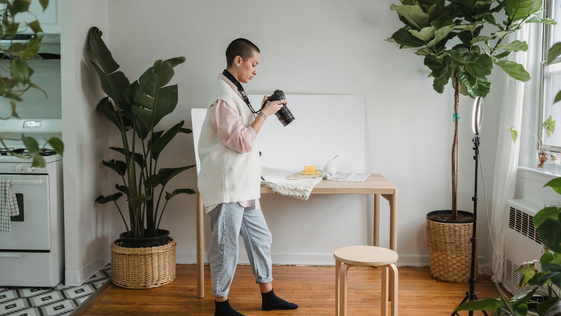
Take a test shot and review it at full size on your camera screen. Zoom in to check for problems you might miss at normal view. Look for dust, scratches, and alignment issues while you can still fix them easily.
Step back from your setup and view it from a distance. This perspective reveals balance issues you miss up close. Sometimes something that looks fine from right above feels off from farther away.
Use Tethering for Better Control
Connect your camera to your laptop or phone with a tethering app or cable. This lets you see your shots on a bigger screen immediately. You can adjust settings without taking your camera off the tripod.
Tethering saves time and helps you catch mistakes faster. You’ll spot composition problems, lighting issues, and small details that don’t show up clearly on your camera’s small screen.
Many cameras come with built-in Wi-Fi for wireless tethering. Download your camera manufacturer’s app and connect your devices. This wireless setup gives you freedom to move around while still controlling your camera.
Crop and Edit for Final Polish
Your work isn’t done when you finish shooting. Cropping can transform a good flat lay into a great one. Try different crops to find the strongest composition. Sometimes cutting out elements fully or partially creates better balance.
Having objects only partially in the frame makes the scene feel larger. It suggests there’s more happening beyond what viewers can see. This draws people into your image and makes them more engaged.
Adjust your exposure and contrast in editing software. Tweak colors to match your brand aesthetic. Create presets for consistent looks across all your flat lays. This saves time and builds recognition for your style.
Add Text and Graphics Thoughtfully
Flat lay images often have room for text overlays. The empty space you built into your composition provides perfect spots for headlines or logos. Add branding elements without covering important parts of your products.
Keep text simple and readable. Use fonts that match your brand personality. Make sure text color contrasts enough with your background. Test how your image looks at different sizes since people will view it on various devices.
Master the Basics Then Experiment
Start with simple compositions using just three to five elements. Master these basics before adding more complexity. Each additional item increases the difficulty of maintaining good balance and clear hierarchy.
Study flat lays from brands you admire and respect. Analyze why their compositions work so well. Identify which rules they’re using in each shot. Notice how they handle color, spacing, and arrangement decisions.
Build a collection of inspiring flat lays that match your style goals. Create mood boards with screenshots and notes. This becomes your visual library for problem-solving and creative inspiration when you’re stuck.
Practice With What You Already Have
You don’t need expensive products to learn flat lay photography tips. Everyday objects teach the same lessons as luxury goods do. Coffee mugs, books, plants, and simple tools make excellent practice subjects.
Shoot the same items multiple times with different arrangements. Try various color schemes and lighting setups. This repetition builds your skills faster than shooting different subjects each time.
Collect interesting props as you go. Save fabric scraps, interesting paper, and small decorative items. These pieces of ephemera give you more creative options without costing much money.
Transform Your Product Photography
These composition rules provide a solid framework for creating expensive-looking flat lays. But your unique perspective brings images to life. The difference between amateur and professional work often comes down to consistent execution of these subtle details.
Practice regularly and study work you admire. Test these rules in your own shoots. Break them intentionally once you understand why they work. Your best flat lays will combine technical skill with your creative vision.
Start shooting today with items you have on hand. Apply one or two rules per session until they become automatic. Build your skills gradually and you’ll see steady improvement in every shot you take. The storytelling approach combined with solid composition techniques will set your flat lay photography apart from the competition.

Darlene Lleno
Darlene Lleno brings a unique perspective to DIY Photography as someone who grew up surrounded by camera gear but chose words over lenses. With five years of writing experience, she specializes in photography content that’s both technically informed and genuinely passionate. Growing up with a photographer twin brother meant camera talk was everyday conversation in her household. While he mastered capturing moments, Darlene discovered she preferred being the subject and the storyteller behind the scenes. As a travel enthusiast and mother of two, she understands the importance of preserving life’s precious moments. When not exploring new destinations or writing for DIY Photography, you’ll find her reading or tending to her garden. Her approach to photography writing is refreshingly authentic, she may not be behind the camera, but she knows exactly what it takes to help others capture the shots that matter most.


Join the Discussion
DIYP Comment Policy
Be nice, be on-topic, no personal information or flames.