Why shooting in black and white will improve your landscape photography
Feb 6, 2018
Jake Traynor
Share:
Hands up who has an Instagram account. I certainly do (@jaketraynor – shameless plug), and I rarely wander outside of the landscape photography realm. What I’ve come to notice after one year of using it is just how popular colour images are.
There are some beautiful photos on Instagram. Amazing sunrises over ice shards, explosive sunsets over gentle beaches, waterfalls in the autumn glow. And then there are the images that have just had the saturation jacked all the way up – that are still incredibly popular. Let’s face it, when it comes to landscape photography on social media, it’s all about the wow-factor. So, if these are the types of images that are making names for people, why should we be shooting in black and white?
I personally believe a good black and white image is harder to accomplish than a great colour image. Let me explain.
https://www.youtube.com/watch?v=azYkD9VmoUY
Colours can be messy.
There is some debate on how many colours humans can observe. It’s believed that we cannot observe more than 10 million colours. And that’s not accounting for the fact not everyone sees colours the same, or the colourblind. Now, the RGB spectrum we are so familiar with on our computers has over 16 million colours. No matter how we see them, you can agree that’s a lot of colours.
Comparing that to the greyscale spectrum, which only has 256 shades, that’s a huge difference.
The truth is, we can become lost in colour. We worry so much about the colour temperature, hue, saturation, and colour contrast of an image that we can lose focus on other important aspects like lighting and composition.
By stripping away those frustrating aspects and limiting ourselves to the greyscale spectrum, we are left to completely rethink the way we see an image.
You’ll think about lighting differently.
One of the first things we learn as photographers is that good lighting is key. This is the same for portraits and landscapes.
Colour naturally creates contrast in an image. You’ll often find that if you take a vibrant, colourful image and convert it to black and white you’ll be left with a muddy, dull mess. This is because colours like red and green often become the same shade of grey when converted into black and white. This means when it comes to shooting you’ll need to search for your contrast in lighting, not colour.
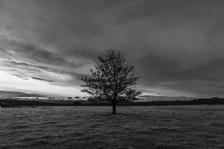
Paying attention to your lighting instead of colour will allow you to create a dynamic composition before you even press the shutter. And the beauty is, once you carry this skill over to your colour photography, you will notice a huge shift in quality over your old work.
Now, it would be untrue to say that colour plays no part in black and white photography. In fact, vibrant colours will make for a much punchier black and white image. You’ll find yourself adjusting colour sliders in editing to manipulate the tone of your greys. The idea isn’t to discard colour altogether, but to use it differently.
Shapes, textures and lines play a stronger role.
The moment you strip away colour from your scene and rely on lighting and tones, you’ll find that different shapes and textures become key to your image. While shapes, textures and lines are important in colour images they are often forgotten about.
All of a sudden, those ripples on the water and the edges of the mountain, or the lines in the sand become much more dominant. Instead of letting colour be the salient feature of your image, you can use these leading lines, textures and shapes draw people into your image, and create a journey for their eyes. This will usually lead to more of your image being looked as the brain has to work harder to decipher what’s happening. And who doesn’t want more viewing time?
Now, combining the power of shapes, textures and lines with colour isn’t an easy thing to do properly. Sometimes the result can be overcomplicated and busy. But by honing your skills with black and white images, learning the art of simplicity, and practice, practice, practice, you will be miles ahead of the game.
Emotion can be stronger in black and white.
I can go through my catalogue right now and pick out a bunch of colourful photos, that I only shot because I was chasing colour. There’s no emotion in them. They’re not telling a story. It’s just colour.
Anyone who tells you landscape photography can’t have emotion is probably the type of person who thinks a tomato is a vegetable. It’s rubbish. There’s nothing wrong with taking photos purely for the beauty of the scenery, but those images that dig deeper emotionally will have a much greater impact.
You’ve seen those “moody” images on Instagram, right? What actually makes them moody? Contrast. Black and white has a much easier job of isolating important parts of an image. Your eyes will naturally be drawn to areas of high contrast. And while not every image can lend itself to an emotional edge, certain images like cemeteries, memorial landmarks, and isolated people/animals can truly benefit from a colourless world.
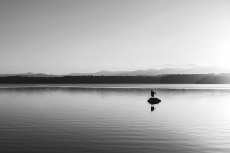
It’s true that different colours can evoke different emotions, and that shouldn’t be dismissed. But if your images are lacking emotion, the easiest way to start is monochromatic scenes.
It’s different.
There will never be a point in your photography career that you can honestly say “I’ve tried everything”. The great thing about shooting in black and white is, even if you’ve done it a million times, it will still be challenging and fresh.
Photography should always be about learning and pushing your skills. How do you accomplish this? Do things differently every now and then. Really, that should be the best reason I can give you.
About the Author
Jake Traynor is a filmmaker and landscape photographer based in Moruya, Australia. If you’d like to see more of his work, check out his website, Instagram and Facebook page. This article was also published here and shared with permission.

We love it when our readers get in touch with us to share their stories. This article was contributed to DIYP by a member of our community. If you would like to contribute an article, please contact us here.















Join the Discussion
DIYP Comment Policy
Be nice, be on-topic, no personal information or flames.