


How to Confidently Choose the Right Mat and Frame for Your Photographs
Nov 4, 2014
Lindsey Leigh Graham

We love it when our readers get in touch with us to share their stories. This article was contributed to DIYP by a member of our community. If you would like to contribute an article, please contact us here.
Share:
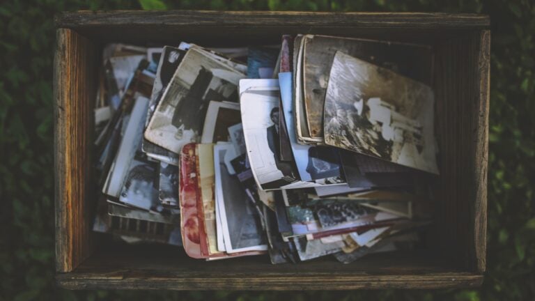
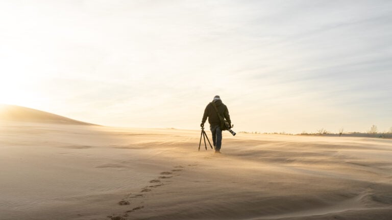
If there’s a downside in the shift to digital photography, it’s the mindless hours we now spend uploading, liking and clicking through endless online galleries. The instant gratification from the immediate applause leaves us with our best photographs buried in online albums, rather than appreciated and cherished up on our walls. It’s all too easy to ‘post’ a photo that you might have framed a decade ago, and then forget all about it.

Worse yet, if you aren’t social media savvy, these photos may sit on your memory cards, hard drive or permanent to-do list, collecting dust until you find the time to upload and share with the world.

I’m a big advocate of bucking that trend. Get your favorite photographs on the wall, where they belong! Choosing your own mat and frame allows you to incorporate your own artistic flare and decorative taste into a unique and personal wall piece. Though the options can be overwhelming, turning your photos into beautifully framed pieces of art doesn’t have to be a daunting task. Follow these guidelines and become a master of color coordination.
Types of Mats
There are three types of mats used for framing photographs: paper, alpha cellulose, and rag. Paper mats are wallet friendly, but the material found in the wood pulp will eventually deteriorate and stain the photograph underneath. Alpha cellulose mats are treated to maintain a neutral pH and considered to be ‘preservation quality.’ Rag mats are considered museum quality, and being made from 100% cotton, these mats do not require treatment to neutralize the pH.
Choosing a Mat Color


Choosing the right color mat for your photo can be tricky. It is essential that the mat does not distract from the photograph, but rather accentuates it and draws out the main focus or key element. In order to achieve continuity without overwhelming the eye, the color of the mat should match one of the colors in the photograph’s background. Be careful not to base your decision on the space where you are hanging the print, but instead on what will best compliment your work.

As you can see in the three photographs shown above, the blues in the sky and browns in the landscape are all background colors. Matching the mat to these background colors makes the focal point stand out. While these mat colors are bold, you can certainly use softer colors for less contrast.
Accent Mats
There are times when a single mat for large prints can look unfinished. In these cases, the use of an accent mat is necessary. Accent mats can help the subject pop by creating an additional border around a print.
Mats cut to fit an 11×14 frame, will usually accommodate an 8×10 photo, which leaves you with significant distance between the photograph and the frame. This can cause the photograph and mat to visually run together. The addition of an accent mat will create a distinct focus and can help pull additional color from the background, creating a finished look.


As you can see, the photograph on the top lacks the definition and the eye-catching appeal of the photo on the bottom with the yellow accent mat. I specifically chose the yellow to match the background behind the woodpecker.
Black and White
White mats generally work well with most colored walls and home decorations, and are an easy way to achieve a clean look. The colors in the photograph are able to stand out on their own as the neutral space between the photograph and the frame does not distract the eye. If you are looking to create a modern gallery like grouping, use a mat that is at least 3 inches wide.
Most photographers and studios like to use white mats with black cores for their prints. Black cores create a well defined black outline and visually sets the photograph apart from the white mat.

Black mats with a white core can add a little more drama to a photograph. They are typically most effective for photographs that contain black, white or gray—without these elements the black mat will only detract from the photograph itself.

Framing
Selecting the perfect frame for your print is all about your own personal style! Antique frames are great for older prints, or prints colored for a vintage look. Slick plastic, metal or polished frames work well with contemporary styled photos, while barn wood, dark deep-grained woods and earth tones are great for nature photos.
Browse the internet for unique options or visit your local craft store to purchase pre-cut mats and browse through the frame-lined walls. Larger frames aren’t cheap. I’ve found a few at Goodwill, and just removed the artwork already in them so that my own photo could reside there. Make sure to bring your actual photo (or photo copy if you’re worried about damaging the original in transit) with you to help make your final decision a confident one!


Most importantly, have fun with it!
About The Author
Lindsey Leigh Graham is a beach-loving photographer based in coastal South Carolina. Her favorite subjects are the wildlife and landscapes of the Lowcountry, and she creates decorative and functional pieces of wall art to display her photos. Lindsey frequently contributes to the blog at Treat.com.
We love it when our readers get in touch with us to share their stories. This article was contributed to DIYP by a member of our community. If you would like to contribute an article, please contact us here.


Join the Discussion
DIYP Comment Policy
Be nice, be on-topic, no personal information or flames.
7 responses to “How to Confidently Choose the Right Mat and Frame for Your Photographs”
Good info. I recommend getting a Logan compact mat cutter for those just starting out. Takes a lot of the frustration out of trying to do it with a straight edge and x-acto knife.
Thank you for the information. Helpful in picking matting for my old photos that I wish to display. Now I have ideas & a better prospective!
Choosing the right mat can be tricky, but it’s so important! If you choose the right color, it can really enhance a picture, you know? I love that this post pointed out that framing a picture is all about personal style. What style frame would look good with the picture, and also fit well with the rest of the decor in the room? Thanks for sharing!
Megan | http://christensenfineart.ca/framing.html
I like the idea to browse the internet for ideas and options to consider. There are so many good options out there. It is fun to look at them even just to try to get ideas. You never know, you might get some inspiration from another’s work. http://www.framersworkroomdc.com/custom-framing
Great article- To get that perfect ratio every time – you must know matting basics!
Matting is as important as farming the picture. Matting can help to protect artwork. For artists and collectors, a mat allows unframed art to be handled without touching the art.
Great information, Lindsey! I’m a newbie in the world of photography and framing, and your article helped me a long way in selecting the perfect frame for my picture.
Thanks for this very helpful information. I am new to this but now ready to dig in.