


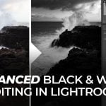
Three techniques to create dramatic black & white images
Nov 20, 2017
John Aldred
John Aldred is a photographer with over 25 years of experience in the portrait and commercial worlds. He is based in Scotland and has been an early adopter – and occasional beta tester – of almost every digital imaging technology in that time. As well as his creative visual work, John uses 3D printing, electronics and programming to create his own photography and filmmaking tools and consults for a number of brands across the industry.
Share:

I’m not the biggest fan of digital black and white conversions. They’re often just far too much work and effort to get the look that I want. There are a million different ways to make black & white conversions. Until you try a bunch of them, though, you usually don’t really know how quite they’re going to turn out. So, if I know I want black & white then I usually just shoot them on film.
But it is possible to make great black & whites digital conversions from colour shots, though. This video from Blake Rudis at f64 Academy talks us through his three-stage process to make his black & white images.
The best black & white conversion method
Blake, along with his friend Jim Welninski, from whom he learned some of these techniques believe that there’s only really one way to start a black & white conversion. That’s by using a Gradient Map adjustment layer. While it’s certainly better than simply desaturating an image, I do think that the Black & White adjustment layer also has its place.
A simple desaturation often yields very unpredictable results, because it looks purely at the RGB value, and then brings the other channels up to match. It looks at level intensity and averages them out. So, when you have a gradient array of the “pure” colours (red, magenta, blue, cyan, green and yellow) you get something that looks like this.


When you use a gradient map, though, it looks at the overall brightness of each colour. It knows that full green or full yellow is brighter than full blue or red. So, light colours stay light, dark colours stay dark. Here’s the same colour gradient with the gradient map adjustment layer applied.

So, for your initial conversion, a Gradient Map adjustment layer is going to more accurately represent the overall brightness and contrast of different colours in your image.
Advanced dodge & burn
The dodge & burn tool in Photoshop can be a wonderful thing, but it can also be quite destructive. This is a pretty standard way of creating a non-destructive dodge & burn type effect on your image. It offers you much more control over how you lighten and darken different areas of your image, and you can mask it and use the “Blend If” sliders to offer even more.

At its most basic, the technique simply involves making two curves adjustment layers. One that darkens the image, and one that brightens it. Then you paint on the masks where you want certain parts to be brighter and other parts to be darker. I have images where I’ve used several of each type of layer to really refine that control down to specific areas. It’s a great way of dodging and burning your image.
Punching Holes
This is a technique I haven’t tried. Personally, I’m not so sure I’m keen on the final result. But, this is purely a subjective personal taste kind of thing. You might like it. Essentially, you add a black layer, set it to be partially transparent (Blake likes around 75% opacity), and then paint away at the mask to let some of the light shine through.

I think I’ll still primarily stick to film when I know I want a shot to be black & white. When do try them on the computer, though I typically tend to forget about the gradient map adjustment layer. Uusally I’ll convert it in Adobe Camera Raw before it even comes into Photoshop. Maybe I will revisit a few of my digital shots and try some of those conversions again.

John Aldred
John Aldred is a photographer with over 25 years of experience in the portrait and commercial worlds. He is based in Scotland and has been an early adopter – and occasional beta tester – of almost every digital imaging technology in that time. As well as his creative visual work, John uses 3D printing, electronics and programming to create his own photography and filmmaking tools and consults for a number of brands across the industry.


Join the Discussion
DIYP Comment Policy
Be nice, be on-topic, no personal information or flames.
2 responses to “Three techniques to create dramatic black & white images”
NIK tool Silver Efex Pro offers some outstanding tools for creating black and white images.
I’m not sure which algorithm you’re using to desaturate, but luminosity desaturate doesn’t normalize them in that way. It attempts to mimic how your eye views the relative brightness of each of those colors:
https://uploads.disquscdn.com/images/c2968eca2c7a562ee2bbe952a06aea1d75036786484db0e033b812342d8eea2c.png