


The reasons why “Orange and Teal” look is so popular in movies
Feb 23, 2017
Dunja Đuđić Kalinin
Dunja Djudjic is a multi-talented artist based in Novi Sad, Serbia. With 15 years of experience as a photographer, she specializes in capturing the beauty of nature, travel, concerts, and fine art. In addition to her photography, Dunja also expresses her creativity through writing, embroidery, and jewelry making.
Share:

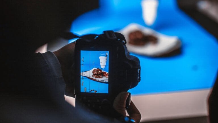
“Orange and Teal” color grading has been pretty popular in Hollywood. It’s used in many blockbuster movies, and even some YouTubers like Sam Colder like to use it in their videos. Parker Walbeck from Fulltime Filmmaker explains in this video what makes this look so popular and why it’s so widely used in movies and video clips. What is it that makes this precise color combination so appealing to both the audience and the filmmakers?
The main thing that makes this combination appealing is the color contrast orange and teal create. They are complimentary, which means they are opposite each other on the color wheel. They complement each other and create contrast when put together in a movie. I totally dig this, considering that I adore complimentary colors in photography, too. They always draw my eyes and get my attention.
This look is generally achieved by pushing blues or teals into the shadows, and oranges or yellows into the highlights, it’s as simple as that. But why orange and teal, and not some other combination of colors?
Emphasizing skin tones
The first reason is that skin tones fall somewhere in the orange color spectrum. By making them stand out against teal shadows, you make the subject more prominent and the audience finds it easier to focus on it.


Creating depth
Another reason is that the combination of orange and teal creates depth. Instead of using sharp foreground and blurry background, you can add depth to the shot by combining these two colors.
Orange and teal are not only opposite each other on the color wheel, but they have the highest contrast between their exposures of any other complimentary colors combination (at least on Goethe’s wheel of color perception). You can see this in the graph:

Replicating golden hour
Another possible reason is that orange and teal replicate the golden hour when they are combined in a shot. This is considered the most beautiful time of day, with warm, golden sunlight against a blue sky.

In order to color grade your footage perfectly, you should rely on a good LUT, or Look Up Table. It’s basically a color grading preset which makes it easy to achieve this color grading look without spending too much time editing. For all the filmmakers out there, Parker shares the link where you can purchase the LUTs for Premiere Pro. In the video, he guides you through installing and applying these LUTs to your footage. So, the filmmakers could try it out, and who knows, some future Academy Award may be yours. :)
[Color Grading with LUTs | Orange & Teal Look Explained via PetaPixel]

Dunja Đuđić Kalinin
Dunja Djudjic is a multi-talented artist based in Novi Sad, Serbia. With 15 years of experience as a photographer, she specializes in capturing the beauty of nature, travel, concerts, and fine art. In addition to her photography, Dunja also expresses her creativity through writing, embroidery, and jewelry making.
Related Posts
 How to create “orange and teal“ and many other looks using only two adjustment layers
 How to set up your lights and balance colour tones to get that orange and teal look in-camera
 Advice From J.J. Abrams: “It’s More Important You Learn What to Make Movies About Than How to Make Movies”
 Cinema Palettes breaks downs the colors from popular movies
Join the Discussion
DIYP Comment Policy
Be nice, be on-topic, no personal information or flames.
5 responses to “The reasons why “Orange and Teal” look is so popular in movies”
Teal and orange is cancer. Stop already and work hard to understand better color grading, than resorting to cheap tricks, based on a theory. Break the mold. Think outside the box for once. Stop thinking other people see things (in terms of color) the exact way you do. I for one, hate teal and orange. It is very distracting now, more so because everyone is doing it, making films look less plausible and rather odd. Who has orange skin, besides the US president? Really.
I hate teal and orange. Cheap color gimmick based on a theory. Don’t be afraid to think outside the box and discover how beautiful a rainbow is, if used properly. Resorting to teal and orange, for everything, is like an amateur graphic artist, using the lens flare filter in photoshop, for every piece he puts out, because he thinks it looks great. Silly.
Hollywood likes it. Movie watchers, however, no so much.
Oh yeah…
See it once: “That looks nice.”
See it twice: “Hmmm, I recognise this look.”
Third time: “Is this look compulsory now?”
Fourth time (and so on ad nauseum): “Please make it stop!!!”
This is why I can’t stand contemporary film.