


A new way to get film-like colors inside Lightroom
May 8, 2024
Vlad Moldovean

Sagiv Gilburd is an Israel-based commercial photographer and videographer with extensive expertise in studio work, event photography, and managing large-scale photography projects.
Share:
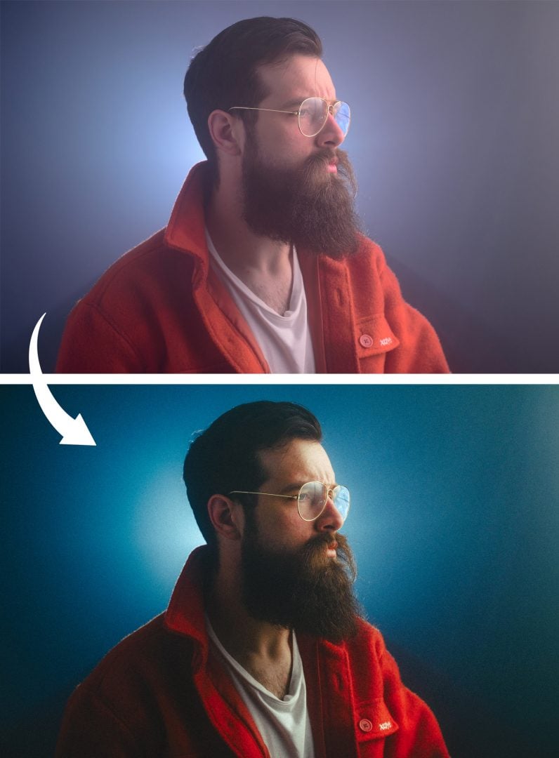
I might have stumbled upon something huge by mistake. All this time, we were all using presets that used all the tools in Lightroom to emulate the look of certain film stocks, and then we struggled to tweak those settings to correct our camera’s color profile and our exposure mistakes. Not to mention that 2 hours later, you have no idea what preset you base your edits on. Or what a pain it is if you decide that’s not the right film stock for your image mid-edit, and you have to start over because if you change the preset, your entire edit is gone as well.
That was a struggle, and now I am confident that I have a much better solution for getting film-like colors in my edits while keeping my workflow nice and tidy.
LET’S DISPEL THE MAGIC OF FILM COLORS FIRST
Some people might think that applying a film emulation preset will instantly give their photos the exact vibe of a specific image they adore, taken with that film stock. But just like snapping two pics with the same film under different lighting won’t guarantee identical results, applying the same film emulation presets won’t give you the exact look. Presets aren’t magic.
The choice of films gives you certain colors indeed. But relying solely on that to get your look is like shooting JPGs on Auto with some filter on top. There are a lot of things that influence the final color of film photography. Obviously, the first one is the film choice, but even the way you store your film also matters and will have an effect on your final colors. A film roll can be damaged by high temperatures and other outside factors and even expire. And this will affect the way it renders certain colors.
Next up are the lenses and filters you use while photographing. Any glass that the light has to travel through before it reaches the pelicula can give your images a certain color cast. Most of the time, this will be subtle, but it exists, especially with old lenses. How you shoot matters a lot, and some people even purposely underexposed or overexposed film photos to get certain colors. This is called pushing/pulling the film, and it has to be developed accordingly to get the exposure right, and this will have a significant effect on the final colors you get. And speaking of the development process, this will have a lot more influence on your colors. No matter if you do it yourself or hand the film over to a local shop, the way a film stock is processed will determine the look you get in your final image.
Now, scanning film with a digital scanner, adjusting the scanned image, and all this post-processing also has the potential to change the vibe of an image. Not to mention that some shops will correct your images in-house if you don’t tell them not to. And finally, if you print your images, the printing color spaces are another rabbit hole altogether that I don’t even want to touch with a 10-meter pole.
The main point that I’m trying to make is that picking the right film stock for your shots is just the first step. There are many other factors at play. You can choose to be more or less involved in this process, but they still exist.

HOW ABOUT A MAGICAL POSTPROCESSING WORKFLOW?
What I want are the colors from certain film stocks without having to compromise on what Lightroom sliders I can use to correct my shots. So I can edit my images from the ground up. A workflow that allows me to switch the film stock in the middle of my edit without losing all the work I’ve already put in.

So I started on the journey of creating presets that are just a base, the first step in my edits, and that will allow me to still have full control over my RAW files so I can tweak the final vibe. The thing is presets don’t work like that! But Camera profiles do! And the best part about it is that we can bake Lightroom settings into camera profiles. They are designed to be way more generalistic than presets because you can only pull on those slides so much before your images start to break, so we need some light presets for this to work. Instead of going for film emulation presets that have all the characteristics, I want to get the general color responses of film stock and bake them into a camera profile.

Remember how in my previous article about film grain I talked about the 3 layers of color on film? Well, because of their chemical mix, each of them reacts slightly differently to light, and if you plot that reaction on a graph, what you get is a COLOR RESPONSE CURVE. This is a tool they used to communicate how the film stock will work, and I bet some photographers understood it back in the day.
You’ve likely come across Davinci Resolve, known as one of the premier tools for video editing, which has been particularly praised for its exceptional color-grading capabilities. But there is one more party trick that you can do using it that will help you with film color emulation that nobody is talking about
If you create a square linear gradient going from black to white, import it in Davinci, and apply some film emulation color grade/ LUT to it, you can get some vector scopes for the film Color Response Curve of that LUT. Screenshot them!

I had success setting my waveform panel with the following settings: Top right corner of the waveform, you have a setting button: 3 lines with circles on them. I selected RGB as a mode, checked all the 3 channels, checked colorized, and unchecked extents, and the slider called waveform dragged to the left but not completely. Imagine trying to set it to 3/100. 0/100 will make them disappear. 1/100 will give very thin lines that are easy to follow, and 100/100 will make them white

Now, does this graph look similar to any tool we use daily in Lightroom?!
If you guessed Curves you are right and guess what, if you manage to copy this graph into the Adobe Lightroom curve tool with mathematical precision you can get the base for emulating any film stock while leaving all your other sliders untouched.
This is extremely important because this means you can now fine-tune the vibe of your images, compensate for the dynamic range of your camera, your exposure mistakes, the white balance, or the color cast of your lenses, like you normally do while having the base color reaction of that specific film stock.

As a final step, baking these curve presets into Camera Profiles is as simple as opening a Raw file in Adobe Camera Raw, applying the preset, and then pressing shift while saving it as a new preset. I like to combine mine with the Adobe Neutral camera profile base for a more neutral starting point with less contrast and more details in the final image. This will only work as a camera profile is locked to the camera that the RAW file originated from. But if you remove this line of code: “crs:CameraModelRestriction=” in the .xmp file you can use them with any camera you want.
That’s it! You now have your very own film emulation base. And even better, because you baked them into Camera Profiles, you can change them on the go and even know what film emulation you used days after the initial edit.
Just don’t forget to restart LR to force it to load your new profiles. Lightroom checks all your presets and camera profiles when opened and won’t check for modified files while running.
IF YOU DON’T FEEL LIKE GOING THROUGH THE ENTIRE PROCESS
You can get the Lightroom camera profiles here.
A FEW MORE TIPS FOR THE BEST RESULTS
My first recommendation is to read about the film stock you want to emulate and check out a few sample photos. Keep in mind all the factors that are at play in those sample photos, so only take notes on the common factors between them.
Take note of the ISO. This will help you accurately simulate the grain and the amount of contrast you will go for. Usually, higher ISO film exhibits less contrast and lifted black but this was often accounted for when developing film. The white balance this stock is/ was made for. For example, the T in Cinestill 800T stands for tungsten which means around 3200k and this is in part what gives Cinestill those bluish tones we love that combine so well with the red tones coming from the halation.
And as a bonus tip: Photographic film was way more capable of capturing details in the highlights than the shadows. You see, the general shape of the response curves is S-shaped. So the darks drop pretty suddenly. And compared to that, our digital cameras can capture a tonne of detail in the darker areas of the images. So for extra nostalgia points try not to lift your shadows even more, maybe even use a luminosity mask and lower the sharpness a bit in the darker part of the image. This will make your images look softer and more pleasant for your viewers.
About Vlad Moldovean
Vlad Moldovean is a photographer based in Brasov, Romania, who mainly does portrait and cinematic photography but also experiments with various techniques & technology. You can see more of Vlad’s work on his website and Instagram. This article was also published here and shared with permission.
We love it when our readers get in touch with us to share their stories. This article was contributed to DIYP by a member of our community. If you would like to contribute an article, please contact us here.


Join the Discussion
DIYP Comment Policy
Be nice, be on-topic, no personal information or flames.