


and sometimes… It’s better not to use a flash
Jun 18, 2017
Clinton lofthouse
Clinton Lofthouse is a Award-Winning Photographer, Creative Director, and artist based in the United Kingdom, who specialises in creative retouching and composites. Proud 80’s baby, reader of graphic novels and movie geek!
Share:
Sometimes it’s good to get out and flex the old photography muscles by shooting a little differently to how you normally would. It keeps the soul young and the stops the boredom from creeping in.
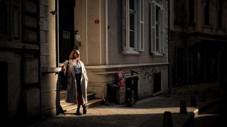
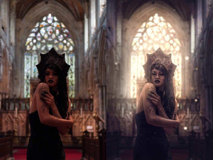
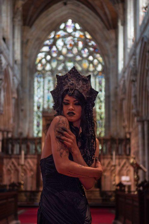
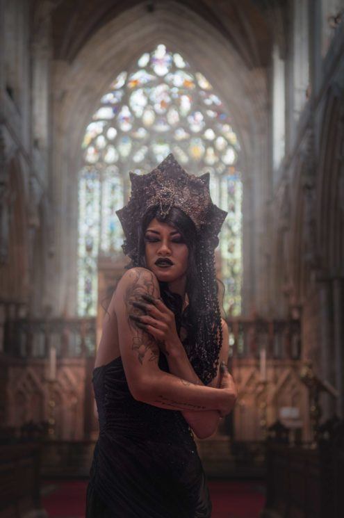
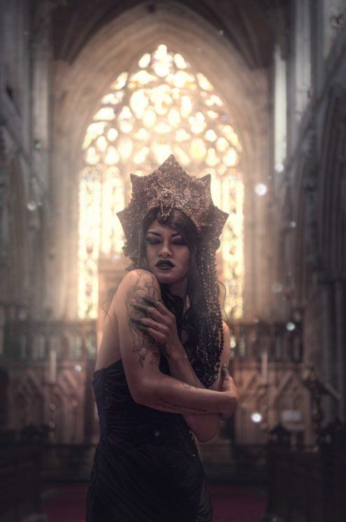
This is exactly what I did a few weeks back when I had a client shoot come in, who wanted natural light, Dark beauty themed images. I myself love flash, I pretty much always use a flash whether shooting composite or location, but I wanted to take this small challenge on. The shoot was great, I got to shoot in Selby Abbey, such a beautiful place. The thing with buildings like that though is they are usually gloomy. So natural light plus large gloomy, gothic abbey equals some ninja like editing afterward. When shooting natural light I tend to underexpose and then bring back detail later in Camera Raw. I had no choice in the abbey but to shoot dark, I even had to raise my ISO (something I hate haha) but I like a challenge now and again when editing to realize the vision in my head. SO I will walk you through the steps it took me to get to the image above.
So here is the image straight out of the camera. As you can see it is underexposed on the model, but also I had the issue of natural light from the windows above and tungsten from the lights lower down.
The First port of call was Camera Raw. I upped the shadows. I even pulled up the exposure a little. I brightened the darks a little and finally did some slight sharpen..natural light images can feel a little soft.
I then went straight on to dodge and burn. I used a curves adjustment layer for this like always. Sculpted the form and the face a little.
Looking at the image I could tell it looked way oversaturated for what I wanted, plus the skin looked red. I created a Hue/Saturation adjustment layer, clicked on the reds, then pulled down the saturation slider. I added a layer mask to the adjustment layer and inverted it. With a brush, I then painted over the skin selectively desaturating the red.
On to the background! I wanted more contrast between the model and her surroundings. One way to do this is to create more separation by lowering the contrast of the background, so the model is the greatest area of contrast. To do this I created a Curves adjustment layer and decreased the background contrast by pull up the darks a little. I then inverted the mask and painted in the adjustments around the model.
Time for a little styling. Again for to add focus to the model but add some style I decided to add some light and a little atmosphere coming from the window. Again I did this using a curves adjustment as in the last step.
The background is looking good, but my eye was tending to leave the image at the edges. So to stop this I created a vignette to keep them towards the center of the image. I did this again by using a curves adjustment layer. I pulled down the highlights. Create a layer mask, inverted it and painted in the vignette selectively.
Now for more light!!! By now you should know I really like my stylized images. So one thing that really boosts that is light. So to add more light in I created a blank layer on a linear dodge blend mode. I then with a white brush on a low opacity painted in more light. Even slightly over the model to create a wrap around.
Looking good but now let’s refine the color toning. Going with the styling and the location I went for a darker toning. I used a gradient map, using blue/purple colors. I then lowered the opacity of the gradient map to around 40 percent.
Now for some color styling. Although I liked the cool toning, my vision was that there would be a glowing light coming from the magnificent window in the background, wrapping around the model as if her faith was keeping her warm……or something to that extent. To create this light effect I create a color balance adjustment layer. I clicked on to highlights and pulled the yellow slider which turned the whites yellow. I then added a layer mask, inverted it and painted in the color with a brush.
Got to add some little details in, it can finish an image off very nicely. A good way to do this is to add some textures. I added some light particles from the Raw Exchange. I simply brought in the image and switched it to a screen blend mode, which just left the particles on the screen.
I then added a hue saturation adjustment layer, clipped it to the particles and changed the hue slider until they turned to yellow. With the move tool, I then moved them into position and using the free transform tool resized them to the size that worked for this image.
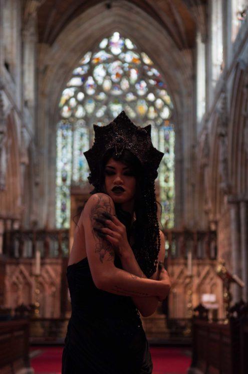
And finally, we get to the end image. All in all, this was not a very long edit. I would say it took maybe just over half an hour. One thing I do need to remind you though is it is always good to have a vision of the final image in your mind when editing. Even if it means a little thinking or planning before you even turn Photoshop on. Photography and Photoshop is all about vision. I always envision what I want before I take the image which in turn means it is easier to edit at the end. Also by knowing how you want your image to look means, you can shoot in a way that gives you a good template for editing. E.g shooting underexposed.
That’s it for this week. I hope you guys enjoyed the post, and I hope you take the time to step out of your comfort zone the results can be very surprising!
- Model: Mia Resa
- Makeup: Cyberdoll Faces
- Headpiece: Creations by Liv Free
Filed Under:
Tagged With:

Clinton lofthouse
Clinton Lofthouse is a Award-Winning Photographer, Creative Director, and artist based in the United Kingdom, who specialises in creative retouching and composites. Proud 80’s baby, reader of graphic novels and movie geek!


Join the Discussion
DIYP Comment Policy
Be nice, be on-topic, no personal information or flames.
16 responses to “and sometimes… It’s better not to use a flash”
Good work!
So i gotta ask this, since this was a planned project- if you weren’t going to use flash (or not even a reflector?), why didn’t you put your camera on a tripod and bracket the shot, one to expose for the model, and one to expose for the background? Composite them together, fix the temp (you didn’t greycard the model when you shot with her?), and you’re done. And it’s purely natural, plus you have much more latitude to work with on the images.
If i have to choose between shooting at a low iso for the best quality at the cost of an underexposed photo that will take a lot work later in post, or raise iso and get proper exposure with a bit more grain, high iso wins every single time.
i can see nobody dared to comment yet and judging by the amount of likes it might be a sign that this “sort of tutorial” is….close to random? i mean it’s 2017, you’ve got a pretty amount of followers who lately have seem to dump you, mainly because of these shitty articles ~~. cheers.
??? I have no clue what you are on about…..
Wtf? This article was awesome. I strive to make my use of flash unnoticeable (that 80s flashy look is so over), and I think it’s awesome seeing someone talking about creativity and technical knowledge every once in awhile.
i’m on about the crappy editing “hdr style” explained here and praised like it’s gold. you can pretty much get the same effect in lightroom in 2-3 minutes by pumping up those sliders and using 1-2 radial filters.
Sometimes? It’s almost always better not to use a flash. Especially an on camera flash.
Definitely on camera. But I disagree with no flash off camera. When done right, nobody should notice a flash was used.
Good point ?
Great article Clinton Lofthouse ?? really interesting to see the thought process and methods used to create the final vision – given me some suggestions for my own projects so thanks v much – keep up the good work buddy ?
Thanks man
A large reflector would have saved you 30 minutes of editing. You could have curved it up top to kill some tungsten spill, while using the backlight for your subject.
I think that would look better if it was subtly lit. It looks muddy, and the available light on her face is nasty an undefined. Second colour is always going to be a challenge when you work with stained glass churches.
Looks like a ghost ?????
A crappy shot always remains a crappy shot even is you sugar it up. It’s still sh…
I don’t know if I’d go as far to say it’s “better” to not use flash… this seems more like a tutorial of how to make due when your client makes unreasonable demands.
This image definitely would have benefited from some additional light.