


Learn how to read your camera’s histogram… through music?
Mar 24, 2020
John Aldred
John Aldred is a photographer with over 25 years of experience in the portrait and commercial worlds. He is based in Scotland and has been an early adopter – and occasional beta tester – of almost every digital imaging technology in that time. As well as his creative visual work, John uses 3D printing, electronics and programming to create his own photography and filmmaking tools and consults for a number of brands across the industry.
Share:
I thought this was quite a weird and odd video at first. It wasn’t until I was a little while in that I finally realised what he was getting at. But if you’ve been struggling to understand the histogram but you have an ear for music then this video from Tim Shields is a pretty good analogy to help you figure it out.
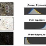
I’m not going to explain what the histogram is, because Tim does that rather well in the video already, but it’s definitely something that can be confusing to people who’ve never come across it before. And while there are many resources online to help, sometimes it can take a while for it to sink in with newer photographers – especially with all the histogram myths out there about how it’s “supposed to look”.
At the beginning of the video, Tim explains how a basic frequency monitor works when it comes to music and sound, with low frequencies on the left and high ones on the right. It’s something that anybody who’s ever seen a graphic equaliser should be able to grasp pretty quickly, especially with the demonstrations provided. From there, he talks us through how this translates to visual images with the histogram.
It’s not the most conventional way of explaining it, but everybody learns in different ways, so maybe this way will finally help everything just click into place for you?

John Aldred
John Aldred is a photographer with over 25 years of experience in the portrait and commercial worlds. He is based in Scotland and has been an early adopter – and occasional beta tester – of almost every digital imaging technology in that time. As well as his creative visual work, John uses 3D printing, electronics and programming to create his own photography and filmmaking tools and consults for a number of brands across the industry.


Join the Discussion
DIYP Comment Policy
Be nice, be on-topic, no personal information or flames.
One response to “Learn how to read your camera’s histogram… through music?”
Look at that video. Explains much more than the text. I love this piece a lot